Matt_CBY
Juniors
- Messages
- 1,964
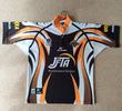
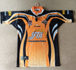
The second one isn’t a Blues jersey.
The second one isn’t a Blues jersey.
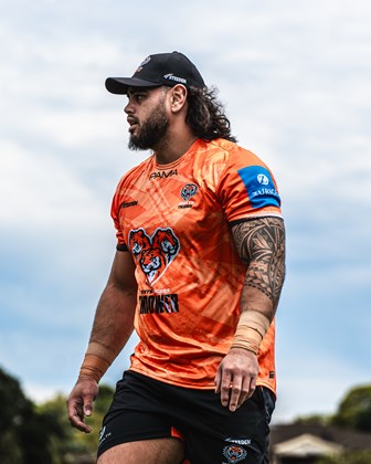
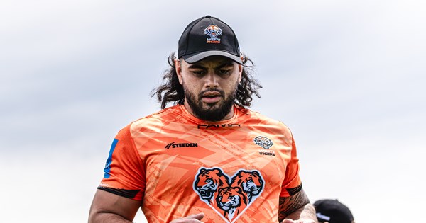
That orange hexagons look like the old 2005 jfta gf jersey, as stated too maybe a new sponsor, but seems likely it's a new jersey, bout time they changed theirsWests Tigers have called a press conference for a major announcement on Thursday, speculation that it may be announcing a new major sponsor and/or 2025 jerseys. Brydens parted ways with the club as announced in May.
Here's the Facebook reel promoting it
The show both a predominately black and orange jersey in the video, both with hexagons... so maybe they are going with the 05' look for both home and away?That orange hexagons look like the old 2005 jfta gf jersey, as stated too maybe a new sponsor, but seems likely it's a new jersey, bout time they changed theirs


Bloody hope notThat orange hexagons look like the old 2005 jfta gf jersey, as stated too maybe a new sponsor, but seems likely it's a new jersey, bout time they changed theirs


How is Pepper Money a loan shark? Is it just because they are a non-bank lender (like Wizard and Aussie Home Loans who were sponsors of the sport for years)So we are okay with loan sharks sponsoring clubs but not gambling companies?
Why the angry face? Didims get a Boo booThat orange hexagons look like the old 2005 jfta gf jersey, as stated too maybe a new sponsor, but seems likely it's a new jersey, bout time they changed theirs
please please be thisThe show both a predominately black and orange jersey in the video, both with hexagons... so maybe they are going with the 05' look for both home and away?
View attachment 96966
View attachment 96967
Way to focus off the point and on the terminology used.How is Pepper Money a loan shark? Is it just because they are a non-bank lender (like Wizard and Aussie Home Loans who were sponsors of the sport for years)
I can understand it being 2025's design, given that it's the 20th anniversary of their premiership.. BUT I still think it's way too busy for a main jersey.The show both a predominately black and orange jersey in the video, both with hexagons... so maybe they are going with the 05' look for both home and away?
View attachment 96966
View attachment 96967
I can understand it being 2025's design, given that it's the 20th anniversary of their premiership.. BUT I still think it's way too busy for a main jersey.
The 2005 Grand Final was IMO the worst combination of jerseys in a GF I've seen.. neither the Cowboys or Tigers looked great - probably peak complexity as far as main jerseys go.
Interesting take on the jersey, and I can see the point you're making - but some of the design elements are un-necessary (eg the "prongs" coming up from the bottom of the jersey) or a bit too busy IMO.I disagree, I think they actually touched on a really clever design
In the era of jersey sponsors, the best way to integrate that is to design a jersey that has a blank space across the chest and stomach. That means the only place to play with a design without any clash with a sponsor box is the shoulder and side panels.
across the entire comp, Tigers is the only brand that has an easy to recognise element that can be restricted to side panels (tiger stripes). The only others I can think of are Storm (lightning bolts), Dragons (fire) and Warriors (a maori design).
You're a bit of a moron aren't youSo we are okay with loan sharks sponsoring clubs but not gambling companies?
