MugaB
Coach
- Messages
- 15,390
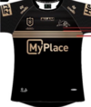
Yes the white box is total crap, they needed to do this version above and blend it into the jersey, not sure what the theory behind keeping a billboard style square, are they worried that pepper money will leave them mid season and they can just stick another sponsor over the big 'ol white box, it's not as bad as some of the other teams, but it's a worrying trend with most clubs, atleast the tigers design isn't messed with, but it doesn't look right having a big rectangle on everyone's stomach.Will be keen to see if the final jersey looks like the graphic. The V is a big improvement than what they've run around with in the past few years, and nice to see it go back over the shoulders.
I'll be keen to see how the 2005 elements look when worn. Hopefully they get the balance right so it's not completely hidden under the arms, and it doesn't come too far across the stomach.
Would have been nice if Pepper money didn't need to be in a black box... IMO, I feel this looks a lot better.
View attachment 97032
in a perfect world, the arlc will get to the point where all clubs will have to standardise the placement of sponsors, one large on the torso, one on the collar, one on each sleeve, all have to be blended into the jesery, and that's it, right now it's turning into race car uniforms
Last edited:


