What's new
The Front Row Forums

Register a free account today to become a member of the world's largest Rugby League discussion forum! Once signed in, you'll be able to participate on this site by adding your own topics and posts, as well as connect with other members through your own private inbox!

2026 Jerseys, Sponsorships, Logos

League Unlimited News

Administrator
Staff member
Messages
9,912

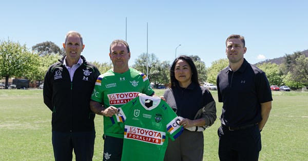
Raiders to UnderArmour official, ending ISC's assocation with the NRL.

No design changes to their 2026 jerseys.

1760319226957.png

1760319266022.png
 

steeden.

Juniors
Messages
929

Raiders to UnderArmour official, ending ISC's assocation with the NRL.

No design changes to their 2026 jerseys.

View attachment 107064

View attachment 107065
End of an era! But good for the game to have a “big brand” involved (even if only cause the bought out ISC)
 

It's Been Done

Juniors
Messages
864
End of an era! But good for the game to have a “big brand” involved (even if only cause the bought out ISC)
Truly an end of an era. 22 years in a row with the one apparel supplier is easily the longest in the NRL (beating the Broncos near 2 decade association with Nike), and probably one of the longest anywhere in professional sport. The 2014/15 ISC wet weather jackets are still the goat
 

League Unlimited News

Administrator
Staff member
Messages
9,912

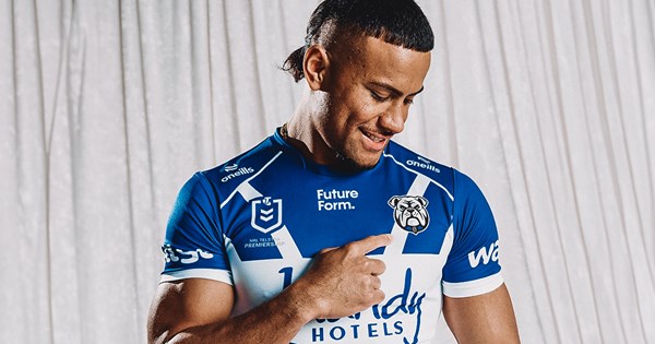
The Canterbury-Bankstown Bulldogs are proud to announce the introduction of a refreshed Club logo, to be officially adopted from November 1.

The new emblem represents a proud evolution of the Bulldogs’ identity - honouring more than 90 years of heritage while looking boldly to the future with eyes forward.

Bulldogs Chief Executive Officer Aaron Warburton said the redesign process was guided by a commitment to ensuring the Club’s visual identity continues to reflect the passion and pride of the Bulldogs family.

Built For What’s NextBuilt For What’s Next
Built For What’s Next
“This new emblem is more than just a logo – it reflects who we are, where we’ve come from, and where we’re going. It carries forward the fighting spirit that has defined this Club since 1935, while facing the future head-on with confidence and pride,” Warburton said.

We’re incredibly proud of the design and believe it strikes the right balance between paying tribute to our 90-year legacy and capturing the energy, ambition and unity that will define our future.

The refreshed logo - redrawn with a modern, digital-first approach - also draws inspiration from key elements of the Club’s visual history, woven together to create an identity that is both familiar and unmistakably built for what’s next.

The new emblem will begin rolling out across all Bulldogs platforms, merchandise, and communications in line with the launch of the 2026 season on November 1.

The Bulldogs look forward to embracing this exciting new era - and new look that represents it - with pride, unity, and the unwavering spirit that defines the Blue and White.

Forged from 90 years of history, facing forward to the future - this is who we are. A new look, same heart. Built for what’s next.


1760587521759.png
 

globalpanther

Juniors
Messages
625

The Canterbury-Bankstown Bulldogs are proud to announce the introduction of a refreshed Club logo, to be officially adopted from November 1.

The new emblem represents a proud evolution of the Bulldogs’ identity - honouring more than 90 years of heritage while looking boldly to the future with eyes forward.

Bulldogs Chief Executive Officer Aaron Warburton said the redesign process was guided by a commitment to ensuring the Club’s visual identity continues to reflect the passion and pride of the Bulldogs family.

Built For What’s NextBuilt For What’s Next
Built For What’s Next
“This new emblem is more than just a logo – it reflects who we are, where we’ve come from, and where we’re going. It carries forward the fighting spirit that has defined this Club since 1935, while facing the future head-on with confidence and pride,” Warburton said.

We’re incredibly proud of the design and believe it strikes the right balance between paying tribute to our 90-year legacy and capturing the energy, ambition and unity that will define our future.

The refreshed logo - redrawn with a modern, digital-first approach - also draws inspiration from key elements of the Club’s visual history, woven together to create an identity that is both familiar and unmistakably built for what’s next.

The new emblem will begin rolling out across all Bulldogs platforms, merchandise, and communications in line with the launch of the 2026 season on November 1.

The Bulldogs look forward to embracing this exciting new era - and new look that represents it - with pride, unity, and the unwavering spirit that defines the Blue and White.

Forged from 90 years of history, facing forward to the future - this is who we are. A new look, same heart. Built for what’s next.


View attachment 107150
Vomit!
 

Nuke

Moderator
Staff member
Messages
5,894
I feel that's a step backwards for Canterbury. I felt all year that they'd get a new logo from next year, that their shield logo of recent years was perhaps dating too quickly. I felt that their 90yrs logo would be the basis of the new logo, basically reverting to an updated version of their 80s-90s logo.

I saw the headline and thought that was what I was going to see. This logo is a bit too clipart for me and doesn't feel like it has a long lifespan ahead of it.

And it's another logo that has no name on it.
The new trend.
 

sempmrh

Juniors
Messages
1,230
I like it overall but I’m a bit surprised that they’ve made such a departure from what they’ve been using. It gives slight create-a-team in a sports game vibes, though.
 

PARRA_FAN

Coach
Messages
18,471
Does Gus have a habit of dropping the names from logos? First he dropped "Penrith" from the panthers logo, now Canterbury. Looks ordinary tbh.
 

t-ba

Post Whore
Messages
63,151
team america vomit GIF
 

Growthegame

Juniors
Messages
329
Westfence creative or whatever they call themselves.

I thought they did a good job with Manly’s logo. Swing and a miss by the guy who claims to be a Bulldogs fan on this one imo.
 
Last edited:

reanimate

Bench
Messages
4,086

The Canterbury-Bankstown Bulldogs are proud to announce the introduction of a refreshed Club logo, to be officially adopted from November 1.

The new emblem represents a proud evolution of the Bulldogs’ identity - honouring more than 90 years of heritage while looking boldly to the future with eyes forward.

Bulldogs Chief Executive Officer Aaron Warburton said the redesign process was guided by a commitment to ensuring the Club’s visual identity continues to reflect the passion and pride of the Bulldogs family.

Built For What’s NextBuilt For What’s Next
Built For What’s Next
“This new emblem is more than just a logo – it reflects who we are, where we’ve come from, and where we’re going. It carries forward the fighting spirit that has defined this Club since 1935, while facing the future head-on with confidence and pride,” Warburton said.

We’re incredibly proud of the design and believe it strikes the right balance between paying tribute to our 90-year legacy and capturing the energy, ambition and unity that will define our future.

The refreshed logo - redrawn with a modern, digital-first approach - also draws inspiration from key elements of the Club’s visual history, woven together to create an identity that is both familiar and unmistakably built for what’s next.

The new emblem will begin rolling out across all Bulldogs platforms, merchandise, and communications in line with the launch of the 2026 season on November 1.

The Bulldogs look forward to embracing this exciting new era - and new look that represents it - with pride, unity, and the unwavering spirit that defines the Blue and White.

Forged from 90 years of history, facing forward to the future - this is who we are. A new look, same heart. Built for what’s next.


View attachment 107150
That is gross.

Their shield logo and 90 year logo are both good, there was no need for this abomination.
 

Timmah

LeagueUnlimited News Editor
Staff member
Messages
101,192
Does Gus have a habit of dropping the names from logos? First he dropped "Penrith" from the panthers logo, now Canterbury. Looks ordinary tbh.
He bought Canterbury-Bankstown back onto the logo last year - prior to that it hadn't appeared on the logo since 1994.
 
Top