Victoire
Juniors
- Messages
- 1,284
Welcome to my Ted talk.
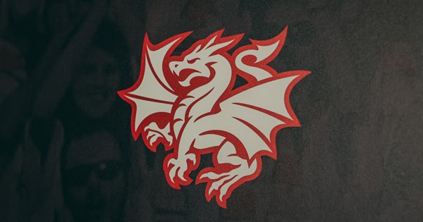
I will attempt to convince you that changing our club emblem to a modernised monotone digital corporate logo is a bad idea.
The idea to “update” the corporate logo of The Dragons sounds like the brainchild of an out-of-their-depth sports administrator who’s just attended a marketing seminar and now loudly complains around the offices that no-one cares about finance in here. Rugby league is a business, they’ll say, and businesses need to refresh their branding every so often because it demonstrates reinvigoration and a new vision… or at least that’s what they read on LinkedIn last week. However the reality is that rugby league is not entirely a business. It’s not the business that people become passionate about, it’s not balance sheets that they argue over, and it’s not business that draws crowds. There’s something much deeper than that in this game - a communal connection across generations - and to neglect its essence too much in favour of business is to fail at both. We saw this in the disastrous multiple homes strategy back in the mid 2010s when we played at an empty Stadium Australia a few times a year.
Changing the logo to a supposedly cleaner, less busy device was kicked off by Souths however many years ago, when people started seeing that rabbit sticker on every second car and wanted to copy it. Since then the Panthers, Eagles, Raiders, Dogs and the brand new Dolphins have all followed suit. Therefore, it would not exactly be a revolutionary innovation for us to do the same now – we’d just be following the leader. Way too late – as usual. The cachet of this fashion trend is well and truly gone. We may as well get Ed Hardy to supply our training gear because that shit is lame.

Supposedly the other rationale is an attempt to mimic the big American sports teams, particularly in the NFL, where they have refined the logos to a minimalist symbol in order to stand out on the players’ helmets. Who can ignore the iconic star of the Dallas Cowboys, or the simple G of the Green Bay Packers. However, these are still very much “franchise” logos, and franchises by their very nature are flexible, portable, and, importantly, disposable. The Rams logo still looks like a Rams logo whether they’re in St Louis or LA, and the jolly roger of the Raiders has dropped its anchor in LA and Oakland and Las Vegas. Perhaps removing St George and Illawarra from our logo and shifting permanently to Nevada might finally get us an invite to the Las Vegas event.

Another apparent reason for “streamlining” the club’s crest: digital platforms! You can’t have busy emblems on Instagram I suppose, perhaps it becomes indecipherable above those inane training montages that we post every Tuesday. Never mind that the 9 of the 10 most-followed clubs on Instagram are European soccer clubs – with the number one spot held by Real Madrid who have had essentially the same emblem since 1941. Speaking of soccer, the most watched sports league in the world is (surprisingly not the NFL who we are trying to mimic) the English premier League. The current leader of that league has a logo that looks like this:

I dunno, maybe old fashioned club crests are fine in that league? Because the clubs in that league are linked to traditional geographic towns and regions, creating a historic connection through the generations? Crazy stuff. Of course those “clubs” are really multi-million dollar shelf companies owned by billionaires with players from anywhere but those home towns living in obscene wealth in gated communities … but nevertheless... my point stands.
Yes we’ve had this logo since only 1978, but from a design perspective it was a progression from the original emblem from the 1950s, rather than a radical re-design. It was a club crest. I maintain that we are a football club with a crest. Not a franchise with a logo. Hopefully we keep it that way.
Thanks for coming to my Ted talk

I will attempt to convince you that changing our club emblem to a modernised monotone digital corporate logo is a bad idea.
The idea to “update” the corporate logo of The Dragons sounds like the brainchild of an out-of-their-depth sports administrator who’s just attended a marketing seminar and now loudly complains around the offices that no-one cares about finance in here. Rugby league is a business, they’ll say, and businesses need to refresh their branding every so often because it demonstrates reinvigoration and a new vision… or at least that’s what they read on LinkedIn last week. However the reality is that rugby league is not entirely a business. It’s not the business that people become passionate about, it’s not balance sheets that they argue over, and it’s not business that draws crowds. There’s something much deeper than that in this game - a communal connection across generations - and to neglect its essence too much in favour of business is to fail at both. We saw this in the disastrous multiple homes strategy back in the mid 2010s when we played at an empty Stadium Australia a few times a year.
Changing the logo to a supposedly cleaner, less busy device was kicked off by Souths however many years ago, when people started seeing that rabbit sticker on every second car and wanted to copy it. Since then the Panthers, Eagles, Raiders, Dogs and the brand new Dolphins have all followed suit. Therefore, it would not exactly be a revolutionary innovation for us to do the same now – we’d just be following the leader. Way too late – as usual. The cachet of this fashion trend is well and truly gone. We may as well get Ed Hardy to supply our training gear because that shit is lame.

Supposedly the other rationale is an attempt to mimic the big American sports teams, particularly in the NFL, where they have refined the logos to a minimalist symbol in order to stand out on the players’ helmets. Who can ignore the iconic star of the Dallas Cowboys, or the simple G of the Green Bay Packers. However, these are still very much “franchise” logos, and franchises by their very nature are flexible, portable, and, importantly, disposable. The Rams logo still looks like a Rams logo whether they’re in St Louis or LA, and the jolly roger of the Raiders has dropped its anchor in LA and Oakland and Las Vegas. Perhaps removing St George and Illawarra from our logo and shifting permanently to Nevada might finally get us an invite to the Las Vegas event.

Another apparent reason for “streamlining” the club’s crest: digital platforms! You can’t have busy emblems on Instagram I suppose, perhaps it becomes indecipherable above those inane training montages that we post every Tuesday. Never mind that the 9 of the 10 most-followed clubs on Instagram are European soccer clubs – with the number one spot held by Real Madrid who have had essentially the same emblem since 1941. Speaking of soccer, the most watched sports league in the world is (surprisingly not the NFL who we are trying to mimic) the English premier League. The current leader of that league has a logo that looks like this:
I dunno, maybe old fashioned club crests are fine in that league? Because the clubs in that league are linked to traditional geographic towns and regions, creating a historic connection through the generations? Crazy stuff. Of course those “clubs” are really multi-million dollar shelf companies owned by billionaires with players from anywhere but those home towns living in obscene wealth in gated communities … but nevertheless... my point stands.
Yes we’ve had this logo since only 1978, but from a design perspective it was a progression from the original emblem from the 1950s, rather than a radical re-design. It was a club crest. I maintain that we are a football club with a crest. Not a franchise with a logo. Hopefully we keep it that way.
Thanks for coming to my Ted talk


