Still missing the point. The clubs should be wearing the main strip most of the time as it really does impact on their ability to be recognised by passive/ neutral fans/viewers of the game. This gains a recognition of a club that can be sustained and easily familiarized to newer markets and fans. Its a longterm strategy with longterm benefits. The short term money grabs are just that and ultimately do the recognition of a club no favours for engendering loyal and longterm familiarity and support.
Great another myth within our community with (mostly) no basis in fact that has been repeated so many times that it has become true, that I'm stuck trying to talk people out of ...
I don't know why I'm even bothering because you won't read this anyway, because it's going to be long, but here we go anyway.
Brands do not need to stay unchanging to be recognisable.
Brands can support sub-brands.
Brands can, and do all the time, have specific colour schemes for specific events.
No sports brands are not particularly sacred in this regard.
Yes there are teams around the world that mange to maintain a main colour scheme and a secondary colour scheme (which sometimes change often).
Yes those teams are often bigger more recognisable teams then ours.
Yes you can create separate symbols that can come to be associated with your club.
Finally no cross promotion isn't a terrible thing.
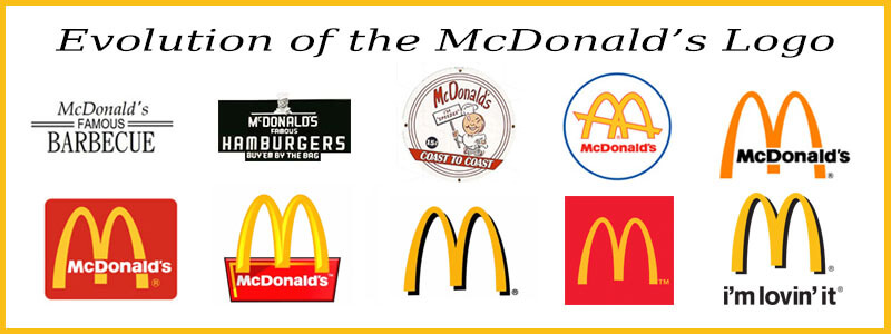
Here are some examples of some of the above.
All these logos are or were official McDonald's logos at one time or another-
Notice how they didn't always have the M and that it changed and evolved over time, also notice that for quite some time McDonald's main colour scheme wasn't red and yellow and at different times white and blue were important colours to their brand. (FYI this graphic doesn't show all the McDonald's logos that have ever existed).
On another note about McDonald's think about all the sub-brands that McDonald's has had and mantained over the years such as Mc Cafe, you could even argue that some of their products are recognisable sub-brands in their own right, such as the Big Mac.
Now for a couple of examples from sport.
This is the German soccer club St. Paulis' official logo-
However if you asked average people what the clubs logo was many would show you this-
This is the St. Pauli Totenkopf, it was and is the main logo used by the St. Pauli fan club for decades, it became so synonyms with the club that to outsiders it is arguably more recognisable then their official logo, and eventually St. Pauli made it an official club logo and it's now on the jersey on the inside under the collar on the back, it is also constantly in official club material and is even the main feature of the players tunnel onto the clubs pitch (you should look it up it's awesome, search St. Pauli welcome to hell tunnel if you're interested).
Surely I don't need to provide examples of successful sports teams (many whom are more successful and recognisable then any NRL club could ever dream of) that are constantly tinkering with colours or logos!?
For a quick example lets take St. Pauli again (though you could pick pretty much any European soccer team of note and get the same results), their official colours are brown, red, and white, most of their jersey (particularly their home jerseys) are majority brown, yet over the years they have had black, gray, pink, purple, green, yellow, almost orange brown, infinite different shades of red, etc, coloured jerseys, sure many of them have been goalie jerseys, but many haven't been either, and many of their red or white jerseys have been so radically different from their usual jerseys that they wouldn't have been instantly recognisable as St. Pauli jerseys if they didn't have St. Pauli livery on them.
They've also done charity/political jerseys, the best example of this from modern times was their LGBT jersey that had rainbows and a rainbow skull and crossbones on it.
All the brands that I've used as examples above are from companies that are much larger then your average NRL club, and they haven't been hindered by constant tweaking and playing with their brands, in most cases it's resulted in good returns for them.
At the end of the day marketing and particularly branding are by and large art forms not sciences, trying to treat them as sciences has resulted in some of the most terrible ad campaigns and branding choices of all time, and often things that everybody said wouldn't work did spectacularly, basically trying to stop brands from evolving over time or changing to cater to new markets is stupid and untimely a futile task, to do it for nostalgia soaked rose tinted glasses looking on the good old days of when one was young is even more stupid.
Mark my words, 10 years from now there'll be blokes saying "why did the Panthers change their brand from the 03 brand, that was their best logo and jersey" and the such.


