Southern Shark
Juniors
- Messages
- 1,358
I am a bit over our white version with white socks that we have worn so far in 2015. Bring on Rd 1.
The traditional sky blue, black hoops and white band clashes with whom?
I do like the black version....but really, where is the clash, so players will not know whom to pass too?
Gold coast Jersey is essentially ours.
I’m very much in favour of traditional kits, but if we were to have a year without a traditional kit, I could definitely get on board with these designs…I’ve been messing around with some different jersey ideas, thought I’d shareView attachment 55152
Yeah same. If we ever do try something for a season or 2, they should have the classic as the ‘heritage’ (like Canberra did this year) incase we make the GF. I’m really glad we were wearing a true Sharks jersey in 2016I’m very much in favour of traditional kits, but if we were to have a year without a traditional kit, I could definitely get on board with these designs…
On a related theme, I actually think any shirt that goes away from traditional should be a ‘celebration’ jersey of a former player, maybe do it every 3rd year. So 2 years of traditional strips and then the third year is the ‘Steve Rogers’ jersey, with something in the design to represent him. In the 6th year, the ‘Tommy Bishop’ jersey, 9th year, the ‘Paul Gallen’ etc… Adds a bit of a prestige to a non-traditional kit and makes them become somewhat of a collectors item.Yeah same. If we ever do try something for a season or 2, they should have the classic as the ‘heritage’ (like Canberra did this year) incase we make the GF. I’m really glad we were wearing a true Sharks jersey in 2016
Definitely prefer when the jersey is 1 main colour of black or blue with the V or horizontal line or arm bands in another colour over any of the designs where it’s top and bottom are different colours.1998 HeritageView attachment 55155
My idea of the perfect jersey in the unlikely situation that the sponsors are lenient with their coloursView attachment 55154
And an away with the same thinkingView attachment 55156
Yeah same. If we ever do try something for a season or 2, they should have the classic as the ‘heritage’ (like Canberra did this year) incase we make the GF. I’m really glad we were wearing a true Sharks jersey in 2016

The V is the original, but when I think of the Sharks I see the hoop jersey.Which one do you refer to as the classic? To me there is only 1. The original Sharks jersey from 1967
Try and jazz this up for me. If you do I'll give you a bowl of Pho
View attachment 55199


I don’t mind that as an alternate jerseyThe V is the original, but when I think of the Sharks I see the hoop jersey.
They had a good crack at the V a few years ago, but opal solar “needed” a white box behind their sponsor which made it look messy.
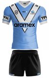
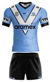
Here’s a modern version of the V. The original did have a white collar, but I think black looks cleaner so I’ve uploaded bothView attachment 55200View attachment 55201
