What's new
The Front Row Forums

Register a free account today to become a member of the world's largest Rugby League discussion forum! Once signed in, you'll be able to participate on this site by adding your own topics and posts, as well as connect with other members through your own private inbox!

Jersey

toomuchsoup

Juniors
Messages
2,255
I’m not sure how others feel, or if anyone else even thinks about this, but I think that only having sponsors that are in line with the club colours is the sign of a professional club. It shows that they’re not willing to tarnish their ‘identity’ for money and that they’re successful enough to only accept companies that will fit on their jersey. Perfect example is the Roosters. All sponsors are integrated very well. Panthers are good too

I could look past the red aramex if it was the only colourful sponsor on our jersey, but combined with the yellow and red of TFH om the arm, it looks jarring.

I also think our shade of blue needs to be a bit bolder. Not necessarily darker, but maybe a bit more saturated. Sometimes on tv it can look quite washed out.
DC66F3DE-1B4E-47F0-A170-6495B4CFA098.jpeg
The blue on the SL/Pepsi jersey was a bit over the top, but it did look good on tv.
944C6497-F675-440F-AE9F-A49C9B167294.jpeg
 

Frenzy.

Post Whore
Messages
51,344
The V is the original, but when I think of the Sharks I see the hoop jersey.

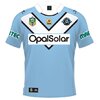
They had a good crack at the V a few years ago, but opal solar “needed” a white box behind their sponsor which made it look messy.

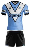
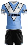
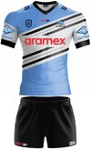
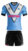
Here’s a modern version of the V. The original did have a white collar, but I think black looks cleaner so I’ve uploaded bothView attachment 55200View attachment 55201

Yeah good job. I like both but prefer the black collar as well.

Slightly wider V?
 

King Ben

Juniors
Messages
1,182
Wider V looks great because then the stupid "Telstra Premiership" text under the NRL logo will stay within the V.
 

Ozzi_78

First Grade
Messages
7,175
Damn I hate red on our jersey. We’ve had some red sponsors over the years haven’t we.
 

toomuchsoup

Juniors
Messages
2,255
I’d say we have one of the best colourways in the comp. Black white and blue is just very aesthetically pleasing. Of course I’m gonna say that as a Sharks fan, but I’d also say the broncos have a nice colourway and I hate them very much.
 

Quicksilver

Bench
Messages
4,361
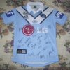
Looks great. The red doesn’t bother me - at least it’s not the old LG white box

I actually think the red looks good. I liked Fisherman’s Friend as well. Would be better than just about any colour other than black. Imagine how shit green would look.

I agree that the shape of the sponsorship on our jersey is important. A long word is better than a square logo.
 
Messages
15,216
The Ace Gutters on the sleeves looks great!!
I have to admit that I'd never heard of aramax before they started sponsoring us. Now I see their vans everywhere.
What catches my eye? the red of their name. I think for them it is great being on our jersey as it it is actually quite noticeable.
 

Chimp

Bench
Messages
2,871
The Ace Gutters on the sleeves looks great!!
I have to admit that I'd never heard of aramax before they started sponsoring us. Now I see their vans everywhere.
What catches my eye? the red of their name. I think for them it is great being on our jersey as it it is actually quite noticeable.
And with an annual turnover of $1.6billion, I’m pretty sure they’re never gonna struggle to pay us what they’ve committed to (unlike some previous sponsors), and they can presumably afford to be a very long term sponsor if they’re getting what they want from our relationship.
Now all we need to do is go get that next Premiership so that their name can be plastered all over alongside the trophy!
 

Latest posts

Top