Foreign Legion
Coach
- Messages
- 12,067
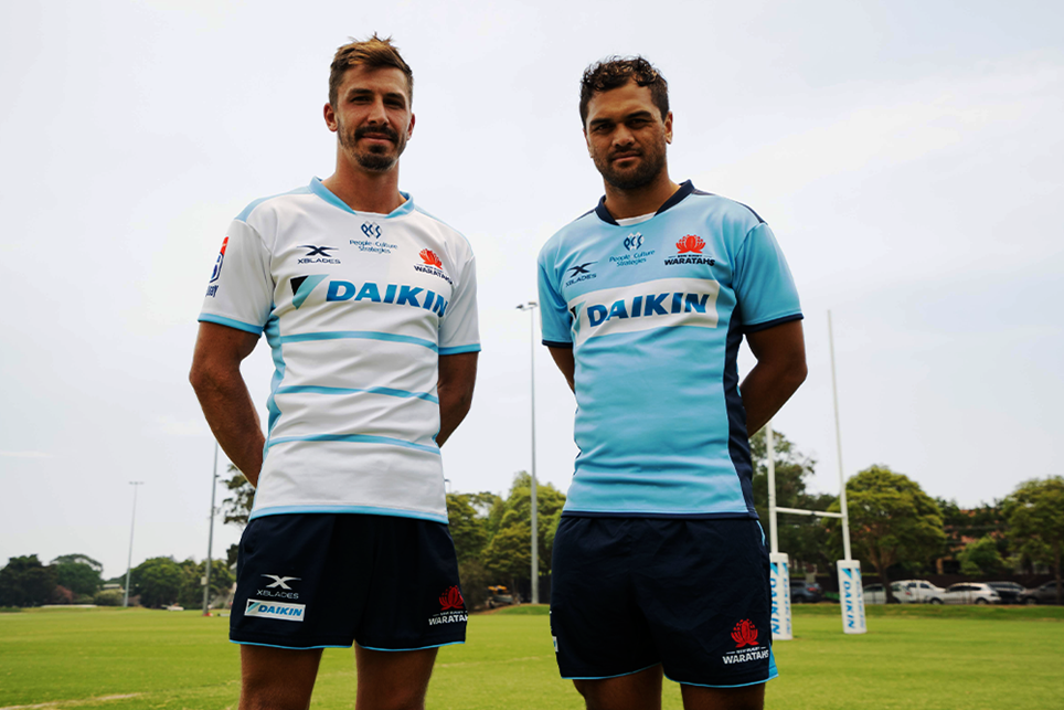
NSW Waratahs rugby away and home
Last edited by a moderator:

Apart from the ridiculous attempt at a chevron and the fact the collars look like they ran out of material I agreeThe Manly home jersey is growing on me but i think white shorts would make it look so much more Manly..
View attachment 34631
And the compulsion to put white pit stains in, just to show off a separate panel.Apart from the ridiculous attempt at a chevron and the fact the collars look like they ran out of material I agree
It was awesome when Super League also recoloured the same design for different teams, right guys?
I disagree that the 80's-90's cricket templates look good. In fact, I would suspect that a big reason for them being liked is nostalgia, and not on the merits of the designs themselves.If the template is good, it will work (the psychedelic spaghetti of Superleague Panthers and Warriors was the worst).. and we're talking cricket here - which at least has a history of common-templated strips in competitions.
For football or union or league it's not something that's typically happened in the past, so I wouldn't expect that approach.
NSW Waratahs rugby away and home
Yeah hahah. I didn't even know he was still aliveIs that K hunt?
It's more than just nostalgia. Uniformity amongst teams with "Colour rush" designs with a little bit of a pattern (the higher the better, preferably shoulders but no lower than chest) just seem to work in cricket.The lightning bolt WSC jerseys of 1992/93 and 1993/94 were mint.
Loved the name font too and pre-jersey numbers.

Looks like a video game that didn't get the licencing to use actual team identities, or an unsanctioned competition.It's more than just nostalgia. Uniformity amongst teams with "Colour rush" designs with a little bit of a pattern (the higher the better, preferably shoulders but no lower than chest) just seem to work in cricket.
View attachment 34667
Nah f**ken oath 90 crickets jerseys were the best. Especially the Michael Bevan (4 on last ball) each team having their own little design bit (Windies palm tree, Aussies stars etc)It's more than just nostalgia. Uniformity amongst teams with "Colour rush" designs with a little bit of a pattern (the higher the better, preferably shoulders but no lower than chest) just seem to work in cricket.
View attachment 34667
.jpeg")
Have X Blades got another new logo or is that a old one they are using again?NSW Waratahs rugby away and home
Correct. I have put together a pictorial of how I remember the ISC years. Apologies if there are any inaccuracies.PBL had the " licence" after World Series Cricket for 20 years.
So the matching uniforms ended 1997/98 with South Africa and NZ.
ISC actually designed an England top for 1998/99. I've seen a prototype and got outbid on it. Never seen again. Even ISC can't supply me a copy from archives.
In the pic it was same style as Australia's but in navy blue sky blue and thin red piping (if memory serves). Instead they wore the ECB made powder blue Nasser has on.
View attachment 34668


The super league jerseys really sucked if you ask me. Pretty boring that every team had the same design and players chose their own numbers.I disagree that the 80's-90's cricket templates look good. In fact, I would suspect that a big reason for them being liked is nostalgia, and not on the merits of the designs themselves.
Had Super League been a long term success, then we may have seen a younger group of fans swooning over those designs in a few years time.

why do people have this idea- there was 6 different templates for 10 teamsPretty boring that every team had the same design
