What's new
The Front Row Forums

Register a free account today to become a member of the world's largest Rugby League discussion forum! Once signed in, you'll be able to participate on this site by adding your own topics and posts, as well as connect with other members through your own private inbox!

The Game Jerseys, Logos, Mock Ups, Photos ANYTHING

unforgiven

Bench
Messages
3,138
It’s all a matter of opinion. Yes I prefer the old NSWRL logos but maybe it’s because I grew up with them and so they have special meaning and a nostalgic element to me. Some modern NRL logos are better than these IMO (eg Raiders) but on the whole my preference is the NSWRL logos for the clubs that played then. But those younger (and older) than me may have a completely different view pending what they grew up with.

The exercise here with the NFL logos is a bit of fun and designed to get more conversation going while the comp is on hold, which it has succeeded in doing. I like that they’ve done and think it’s quite clever, but by no means would I want to see the NRL take it on.

On the whole I love most of the NFL logos, some are the modern day, flashy types (eg the Patriots which I think is awesome), while others have maintained their old school roots eg the Browns, which is an orange helmet!

I hate the Browns, not us much as I used to before they moved to Baltimore, but I do like how in preseason they have completely orange helmets and then if you make the roster they then put on your stripes. Wish the Bengals would do something similar.
 
Messages
8,480
Our helmet is amazing, the only change I would have ever liked to see to it was when we wore our "color rush" uniform, that helmet needed to swap out the orange for white. I even like our jerseys and wouldn't like to see massive changes, just get rid of the 'B'.

Bring on Joe Burrow!

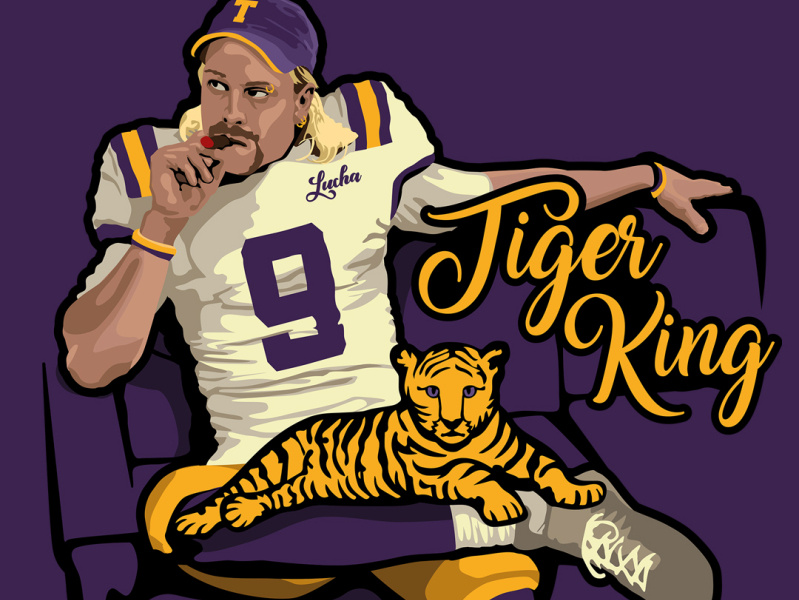
You mean Joe “Exotic” Burrow. The Tiger King.
 

GAZF

First Grade
Messages
8,752
It’s all a matter of opinion. Yes I prefer the old NSWRL logos but maybe it’s because I grew up with them and so they have special meaning and a nostalgic element to me. Some modern NRL logos are better than these IMO (eg Raiders) but on the whole my preference is the NSWRL logos for the clubs that played then. But those younger (and older) than me may have a completely different view pending what they grew up with.
I grew up with both styles. There are good ones and stinkers on both sides of the coin.
 

unforgiven

Bench
Messages
3,138
You mean Joe “Exotic” Burrow. The Tiger King.
lol

7828c7a9cdedb99ec9d78c983f0daa41.jpg
 
Messages
8,480
I grew up with both styles. There are good ones and stinkers on both sides of the coin.

whats your best and worst in the NFL?

My best is the Buffalo Bills, closely followed by the Patriots. I do like the styles of the Jets, Green Bay etc - style of just words/letters etc. But on that note..
My worst is the Titans

I found this on line - the history of logos for all the NFL teams. Interesting to see the evolution of many. Indeed many of the animal-based ones have gone from full body to just the head. While many of the old school ones are hilarious, like cartoons of the day. Check out the Browns, 49ers and Steelers!

https://www.joe.ie/uncategorized/picture-the-evolution-of-every-nfl-logo-from-every-team-355414
 

MugaB

Coach
Messages
15,010
I grew up with both styles. There are good ones and stinkers on both sides of the coin.
They all stink (nfl ones he made)
I do like the older NFLs logos like Oakland Raider, Tampa bay Bucs, Miama dolphins
 

GAZF

First Grade
Messages
8,752
whats your best and worst in the NFL?

My best is the Buffalo Bills, closely followed by the Patriots. I do like the styles of the Jets, Green Bay etc - style of just words/letters etc. But on that note..
My worst is the Titans
Best: Seahawks
Worst: Jets, though I like their new uniforms

Best in North America: Alouettes
 
Messages
8,480
Best: Seahawks
Worst: Jets, though I like their new uniforms

Best in North America: Alouettes

Just looked up Alouettes. Pretty cool, there's a few versions I saw.

The Jets, I don't mind it personally, but the colour isn't striking. If it was more of the "colour rush" green it would look a lot better IMO.

upload_2020-5-8_12-49-52.jpeg

Previous versions similar to the Newtown Jets. which of the two I prefer Newtown. Aside from he colour, The NY Jets one seems more complex, including a football in the logo and a football outline.


OIP.K-9SNCgJMYNBNyZ3ZpS7qgHaD_
upload_2020-5-8_12-45-42.jpeg

This is the best NY Jets logo for mine.

new-york-jets-logo-clipart-cliparthut-free-clipart-NURRPJ-clipart.jpg.41417d99d77663669f34896c31daafc0.jpg
 
Messages
8,480
I try to avoid laying the boot into logos made by people just having a go, unless there is valid constructive criticism that can be made. It's not fun being on the other end of it.

100% Agreed. I know you put a lot of work into this stuff like many others. I think peoples ideas and concepts are great to see, whether you actually like the ideas or not is somewhat irrelevant for mine.

Not everyone is going to like new concepts or ideas. But for me, a better form of feedback is suggesting a personal preference for something different or alteration ideas. Which would be true and doesn't shoot anyone down who puts their concepts out there. A blunt, negative reply (eg "it's crap") isn't constructive, supportive or factual (as the wording is constructed as a universal description, when it's actually an opinion of the writer).

Anyway that's my opinion. Others might think my opinion is crap.
 

GAZF

First Grade
Messages
8,752
100% Agreed. I know you put a lot of work into this stuff like many others. I think peoples ideas and concepts are great to see, whether you actually like the ideas or not is somewhat irrelevant for mine.

Not everyone is going to like new concepts or ideas. But for me, a better form of feedback is suggesting a personal preference for something different or alteration ideas. Which would be true and doesn't shoot anyone down who puts their concepts out there. A blunt, negative reply (eg "it's crap") isn't constructive, supportive or factual (as the wording is constructed as a universal description, when it's actually an opinion of the writer).

Anyway that's my opinion. Others might think my opinion is crap.
Very true on the opinion front.

It doesn't bother me so much these days if someone comes out overtly negative against something I've designed. However, if I had an internet connection when I started in MS Paint 20+ years back, I might have ended up discouraged and giving it away.

I'll add that I don't always heed my own advice, and usually feel bad about it afterwards. I'm not trying to do the same to @MugaB, but I don't think this kind of response is the best way to keep the "creator" interested in this kind of hobby, and potentially get them started on a career path.

Designs made by professionals, which are applied in the real world, are a bit of a different beast, but constructive criticism still has its place in potentially making positive change.
 
Messages
14,723
I love the Newtown Jets logo. I grew up in the 80s and loved all those logos and the mascot images they did for merchandising.
1982 Souths logo.png

Screen Shot 2020-05-08 at 4.00.56 pm.png

Logos change over the years. Right now, there seems to be a push to simplify it to an outline image for digital media.

I remember around 08/09 the NRL did the manga style mascots for kids and I loathed them on the most part. Never understood the Nth Qld one.

Screen Shot 2020-05-08 at 3.55.14 pm.png

Screen Shot 2020-05-08 at 4.07.01 pm.png

Slightly off topic I always thought the NRL should do a riff on the old Battle Beasts action figures (or Skylanders) and have the toys done as club mascots. Just slightly retool the moulds in the club colours and design some for the non animal clubs.

Battlebeasts Rabbitohs.png Battlebeasts Roosters.png
 
Last edited:

unforgiven

Bench
Messages
3,138
I love the Newtown Jets logo. I grew up in the 80s and loved all those logos and the mascot images they did for merchandising.
View attachment 38181

View attachment 38182

Logos change over the years. Right now, there seems to be a push to simplify it to an outline image for digital media.

I remember around 08/09 the NRL did the manga style mascots for kids and I loathed them on the most part. Never understood the Nth Qld one.

View attachment 38175

View attachment 38183

Slightly off topic I always thought the NRL should do a riff on the old Battle Beasts action figures (or Skylanders) and have the toys done as club mascots. Just slightly retool the moulds in the club colours and design some for the non animal clubs.

View attachment 38176 View attachment 38178
The worst was the mascots that walked around the grounds based off those manga ones. I alsways though the Tigers one logged like it had a birth defect, the thing could barely walk.
 

Hello, I'm The Doctor

First Grade
Messages
9,124
Really i feel we have opposing tastes on brandings, the U.S have terrible branding, im a huge fan of what we had in the NSWRL, and BRL in the 80s and 90s the logos, colors... everything was much better, and now more and more clubs are reverting back to that in regards to logo designs and colors, we just need to update what we already have not emulate the american cheezy brandings
I made a few logos some months ago, and put together some made by other people who frequent this site too, (like the Tigers, Rabbits, chooks, jets, dogs, magpies)

View attachment 38153 View attachment 38154 View attachment 38155 View attachment 38156

These are a collection i came up with that defines each club way moreso than the dribble that "graphic designer" did, he basically color swapped american sticker art

Nice logos...

I agree with your sentiment that the cartoonification of the NRL was shit (of the 8 teams that did it, only the Raiders was an actual improvement)

My point was that heaps of junior RL logos are just shitty Clipart versions on NRL logos or they were made 60 years ago and have never been cleaned up.

images

images

SWJRLC-logos.jpg

If the ARLC was to employ someone like yourself, GAZF or the guy who did these NFL-NRL blends and offer their services to junior clubs (and maybe later NRL clubs) we would see the quality of RL branding skyrocket across the board...
 
Messages
8,480
I love the Newtown Jets logo. I grew up in the 80s and loved all those logos and the mascot images they did for merchandising.
View attachment 38181

View attachment 38182

Logos change over the years. Right now, there seems to be a push to simplify it to an outline image for digital media.

I remember around 08/09 the NRL did the manga style mascots for kids and I loathed them on the most part. Never understood the Nth Qld one.

View attachment 38175

View attachment 38183

Slightly off topic I always thought the NRL should do a riff on the old Battle Beasts action figures (or Skylanders) and have the toys done as club mascots. Just slightly retool the moulds in the club colours and design some for the non animal clubs.

View attachment 38176 View attachment 38178

mate I agree those 80s promo logos were awesome. Do you/does anyone know where they originated from?

I recall seeing em on loads of merch, including a “ready reckoner” I had from Kentucky Fried Chicken that was on my bedroom wall. League ladder etc. They were never the official emblems of the clubs.
 
Messages
8,480
Nice logos...

I agree with your sentiment that the cartoonification of the NRL was shit (of the 8 teams that did it, only the Raiders was an actual improvement)

My point was that heaps of junior RL logos are just shitty Clipart versions on NRL logos or they were made 60 years ago and have never been cleaned up.

images

images

SWJRLC-logos.jpg

If the ARLC was to employ someone like yourself, GAZF or the guy who did these NFL-NRL blends and offer their services to junior clubs (and maybe later NRL clubs) we would see the quality of RL branding skyrocket across the board...


Over in Adelaide I’ve seen a few sporting clubs who have adopted the old Rams logo. I’ve done a double-take on a number of occasions thinking they had Rams Merch.

On this, wonder if the clubs “buy” the logo design off the club/nrl etc? Or how that works
 
Messages
14,723
mate I agree those 80s promo logos were awesome. Do you/does anyone know where they originated from?

I recall seeing em on loads of merch, including a “ready reckoner” I had from Kentucky Fried Chicken that was on my bedroom wall. League ladder etc. They were never the official emblems of the clubs.

I'd say it was a NSWRFL thing. They'd unified the logos in 1978 and they were all adopted by clubs by 1979.

I saw this on eBay once. I couldn't afford them but did take digital snaps. There's a 1982 one but I can't attach due to size. There are slight alterations in the mascot logos between years.

They were still plastering these logos on merchandise up to 1991/92. We had bed sheet sets, pillow cases, doona covers...literally everything...plates, mugs, ashtray...

Screen Shot 2020-05-08 at 5.47.47 pm.png
 
Messages
8,480
I'd say it was a NSWRFL thing. They'd unified the logos in 1978 and they were all adopted by clubs by 1979.

I saw this on eBay once. I couldn't afford them but did take digital snaps. There's a 1982 one but I can't attach due to size.

View attachment 38185

Ah yep that makes sense. How good..

My favourite excluding my club... a toss-up between the Rabbit and the Tiger. Honourable mention to the Shark. But no losers here, they are all outstanding..

Surely there’s an opportunity to relaunch these on merch at some point, and add in ones for the newer clubs.
 

Latest posts

Top