What's new
The Front Row Forums

Register a free account today to become a member of the world's largest Rugby League discussion forum! Once signed in, you'll be able to participate on this site by adding your own topics and posts, as well as connect with other members through your own private inbox!

The Game Jerseys, Logos, Mock Ups, Photos ANYTHING

Hello, I'm The Doctor

First Grade
Messages
9,124
It's weird that a Canadian team would want to play in Canadian colours, right?

TBF im pretty sure the WP only started wearing red after he left. Their original colours were just Black-White (ive always had a suspicion that this was a reference to the All Blacks since, for most, the only Rugby team they will know is the NZers)
 

hellteam

First Grade
Messages
6,536
wtf is this?? looks like maybe celebs? cbf watching all, but also, awesome!


so was this qrl team "reserve grade"(think we still had national reggies then?) , or a broncos team in the Q Cup?

RE the ugly jerseys, who the f signed these off haha i remember em being huge when i was a kid, and i always tried to figure out which teams were on them, not knowing they were mainly nonsense...

Very strange. No idea why it was televised, and why it's om YouTube now, but interesting anyway!

Broncos in 94 had a first grade team (NSWRL) a NSWRL reserve grade team, a Qld state league team. According to the below quote they also had and a BRL team. Here is some more info

"Contesting both the State League and the BRL in 1994 were the Brisbane Broncos and South
Queensland Crushers. Between the Broncos fielding a reserve grade side in the NSWRL and this season many Broncos fringe players played for Brothers but they then decided to field a full lower grade in the BRL"

From this site - http://www.rogerswebsite.com/rl/Post-BroncosHistory.pdf
 

hellteam

First Grade
Messages
6,536
d661ea56d90422a4bac79d331fe08db0


some really sheetty logos here.
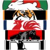
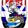
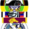
storm and the tigers are the best out of the bunch

Storm one is great. The purple next to the white lightning bolt gives it an awesome"neon" type look.
 

ComradePanda

Juniors
Messages
54
Were these jackets ever produced for the NRL or was it purely an AFL thing? They were made by a company called Vivid and I remember them doing basketball style singlets as well. I remember these seeming to be quite popular down here and the company did make a Storm one - I still see them occasionally at AAMI Park. Would have been produced about 1998/99.

The only one I could find is this Carlton one - but they all had the same basic design.

View attachment 38136

97 they did all the super league teams
HjQO8tQ.jpg


98 they did the NRL teams

ghzQKKR.jpg
 

Hello, I'm The Doctor

First Grade
Messages
9,124

Damn, some of these are f*ckin great (best fan-made Titans logo ive seen)...

This kind of thing is why I want to see the NRL create an in-house jersey/logo design unit and offer it to junior clubs across the country. Rather than junior clubs just doing a bad ClipArt copy of an NRL logo, let them put in a request with a specialist designer that the ARLC keeps on hand.

It woundnt be too long before RL across Australia had branding at a similar quality to junior/college football in the US.
 
Messages
8,480
How did he not use the Bengals for the Wests Tigers though.

Assume because the official Bengals logo is this...

upload_2020-5-7_23-26-34.jpeg

Although below is what is used to a lesser extent.. street wear etc (I’ve got a hat with the tiger on it). Not really recognised abroad but which many bengals fans would like to see as the prime logo instead of the “B”.

upload_2020-5-7_23-28-28.png
 

unforgiven

Bench
Messages
3,138
Assume because the official Bengals logo is this...

View attachment 38149

Although below is what is used to a lesser extent.. street wear etc (I’ve got a hat with the tiger on it). Not really recognised abroad but which many bengals fans would like to see as the prime logo instead of the “B”.

View attachment 38150
Yes most of us don't like the B, a lot of fans say it stands for Brown and with the contempt a lot of the fanbase hold him in it is universally disliked. A lot of fans would actually like to see the return of the leaping Tiger as the emblem.

s-l1600.jpg

DkAcl5OXcAAUodP.jpg
 

MugaB

Coach
Messages
15,391
I couldn't find where to comment on fox about how sheet these are, the concepts are fun, but execution is shoddy, cowboys for one are navy and silver, gold and white, wheres that?
The titans logo is just pasted on a flag? God knows why, im sure the pirates and titans are similar somehow, maybe he realised tennesee titans are the same shitty branding as Gold Coast, so then mixed it up. and id love to see Russell Crowes face when he sees the difference between the current souths logo and this whitingdesign NFL style nonsense, basically bugs bunny as a logo, and he'll need to look at what a tiger looks like coz tigers have white beards, the Jacksonville copy with stripes looks like a tabby cat.
I could've done better on on my flip phone from a decade ago. These are all crap
Seriously why do we want to emulate the americans, their logos stink in comparison
 
Last edited:

MugaB

Coach
Messages
15,391
Damn, some of these are f*ckin great (best fan-made Titans logo ive seen)...

This kind of thing is why I want to see the NRL create an in-house jersey/logo design unit and offer it to junior clubs across the country. Rather than junior clubs just doing a bad ClipArt copy of an NRL logo, let them put in a request with a specialist designer that the ARLC keeps on hand.

It woundnt be too long before RL across Australia had branding at a similar quality to junior/college football in the US.
Really i feel we have opposing tastes on brandings, the U.S have terrible branding, im a huge fan of what we had in the NSWRL, and BRL in the 80s and 90s the logos, colors... everything was much better, and now more and more clubs are reverting back to that in regards to logo designs and colors, we just need to update what we already have not emulate the american cheezy brandings
I made a few logos some months ago, and put together some made by other people who frequent this site too, (like the Tigers, Rabbits, chooks, jets, dogs, magpies)

20200508_033707.jpg 20200508_033834.jpg 20200508_034001.jpg 20200508_034203.jpg

These are a collection i came up with that defines each club way moreso than the dribble that "graphic designer" did, he basically color swapped american sticker art
 
Last edited:

kdalymc

Bench
Messages
4,351
strictly speaking 1997 was the first year for the “perth reds”. Prior to that they were the western reds
i realize that, but thats reaching.. Bulldogs didn't change EST when changed from berries, Easts to Sydney etc etc... Its the same club..
like old mate said all the ASL teams rocked 97 on the jacket, so its a wanky super league thing.... zero to do with the name change
 
Messages
8,480
Yes most of us don't like the B, a lot of fans say it stands for Brown and with the contempt a lot of the fanbase hold him in it is universally disliked. A lot of fans would actually like to see the return of the leaping Tiger as the emblem.

s-l1600.jpg

DkAcl5OXcAAUodP.jpg

Yep. I’d want the helmet to stay as is though, might be biased but I think it’s the best in the league.

It’s rare in these sports though to have the “full” animal in the logo, rather they generally just have its head these days. A few exceptions of course (eg Dragons) but I think it’s because they can have a more simple and menacing look.
 
Messages
8,480
Really i feel we have opposing tastes on brandings, the U.S have terrible branding, im a huge fan of what we had in the NSWRL, and BRL in the 80s and 90s the logos, colors... everything was much better, and now more and more clubs are reverting back to that in regards to logo designs and colors, we just need to update what we already have not emulate the american cheezy brandings
I made a few logos some months ago, and put together some made by other people who frequent this site too, (like the Tigers, Rabbits, chooks, jets, dogs, magpies)

View attachment 38153 View attachment 38154 View attachment 38155 View attachment 38156

These are a collection i came up with that defines each club way moreso than the dribble that "graphic designer" did, he basically color swapped american sticker art

It’s all a matter of opinion. Yes I prefer the old NSWRL logos but maybe it’s because I grew up with them and so they have special meaning and a nostalgic element to me. Some modern NRL logos are better than these IMO (eg Raiders) but on the whole my preference is the NSWRL logos for the clubs that played then. But those younger (and older) than me may have a completely different view pending what they grew up with.

The exercise here with the NFL logos is a bit of fun and designed to get more conversation going while the comp is on hold, which it has succeeded in doing. I like that they’ve done and think it’s quite clever, but by no means would I want to see the NRL take it on.

On the whole I love most of the NFL logos, some are the modern day, flashy types (eg the Patriots which I think is awesome), while others have maintained their old school roots eg the Browns, which is an orange helmet!
 

unforgiven

Bench
Messages
3,138
Yep. I’d want the helmet to stay as is though, might be biased but I think it’s the best in the league.

It’s rare in these sports though to have the “full” animal in the logo, rather they generally just have its head these days. A few exceptions of course (eg Dragons) but I think it’s because they can have a more simple and menacing look.
Our helmet is amazing, the only change I would have ever liked to see to it was when we wore our "color rush" uniform, that helmet needed to swap out the orange for white. I even like our jerseys and wouldn't like to see massive changes, just get rid of the 'B'.

Bring on Joe Burrow!
 

Latest posts

Top