What's new
The Front Row Forums

Register a free account today to become a member of the world's largest Rugby League discussion forum! Once signed in, you'll be able to participate on this site by adding your own topics and posts, as well as connect with other members through your own private inbox!

The Game Jerseys, Logos, Mock Ups, Photos ANYTHING

Messages
12,504
I'd say it was a NSWRFL thing. They'd unified the logos in 1978 and they were all adopted by clubs by 1979.

I saw this on eBay once. I couldn't afford them but did take digital snaps. There's a 1982 one but I can't attach due to size. There are slight alterations in the mascot logos between years.

They were still plastering these logos on merchandise up to 1991/92. We had bed sheet sets, pillow cases, doona covers...literally everything...plates, mugs, ashtray...

View attachment 38185


I always thought the sharks character was weird. I know they’re fins but just looks like stumps for arms.
 

MugaB

Coach
Messages
15,391
Very true on the opinion front.

It doesn't bother me so much these days if someone comes out overtly negative against something I've designed. However, if I had an internet connection when I started in MS Paint 20+ years back, I might have ended up discouraged and giving it away.

I'll add that I don't always heed my own advice, and usually feel bad about it afterwards. I'm not trying to do the same to @MugaB, but I don't think this kind of response is the best way to keep the "creator" interested in this kind of hobby, and potentially get them started on a career path.

Designs made by professionals, which are applied in the real world, are a bit of a different beast, but constructive criticism still has its place in potentially making positive change.
Yeah well if your a paid professional like guy seems to be, by looking at the link he left on all those NFL converts images, i wouldn't be flaunting them around if thats the quality of work that people will receive if im a paying customer, id want my money back, im not one for giving hobby enthusiasts a hard time, i feel just by looking at this collective, he was ticking boxes quickly in order to show off his AFL & NRL conversions as a whole without properly looking into the clubs colors or research, it all lacks effort
 

GAZF

First Grade
Messages
8,756
Yeah well if your a paid professional like guy seems to be, by looking at the link he left on all those NFL converts images, i wouldn't be flaunting them around if thats the quality of work that people will receive if im a paying customer, id want my money back, im not one for giving hobby enthusiasts a hard time, i feel just by looking at this collective, he was ticking boxes quickly in order to show off his AFL & NRL conversions as a whole without properly looking into the clubs colors or research, it all lacks effort
Cross-overs are pretty accepted as ranging from lazy to extremely detailed and thought out approaches. This set did nothing to impress me, but others have. Best response in this situation is to move along and look for something that you do like.

And posting concepts to an Instagram page, doesn't instantly make the guy a paid professional. Just seems like he was playing around with an idea and the bored media has picked it up, making it appear to be a bigger deal than it really is.
 

MugaB

Coach
Messages
15,391
Cross-overs are pretty accepted as ranging from lazy to extremely detailed and thought out approaches. This set did nothing to impress me, but others have. Best response in this situation is to move along and look for something that you do like.

And posting concepts to an Instagram page, doesn't instantly make the guy a paid professional. Just seems like he was playing around with an idea and the bored media has picked it up, making it appear to be a bigger deal than it really is.
Sounds about right, i mean if fox saw the designs you've made it would put most sports graphic designers to shame, i still believe wests should change their emblem to yours, its one of my personal favorites
 

Nuke

Moderator
Staff member
Messages
5,396
My point was that heaps of junior RL logos are just shitty Clipart versions on NRL logos or they were made 60 years ago and have never been cleaned up.
SWJRLC-logos.jpg

If the ARLC was to employ someone like yourself, GAZF or the guy who did these NFL-NRL blends and offer their services to junior clubs (and maybe later NRL clubs) we would see the quality of RL branding skyrocket across the board...

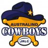
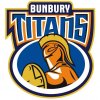
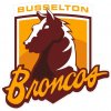
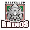
For the record, those junior clubs logos that you posted as an example were done by me, and it was the fella in charge of the junior league in WA's south-west who told me what he wanted. He actually wanted the exact NRL / SL clubs' logos with the different location names, and apparently sought and received approval from the relevant clubs (except Brisbane who needed the logo to be changed by 'x'%), but even with my limited time at the time (5yrs ago maybe?), I refused and made sure none of the logos were exact replicas. I actually submitted numerous versions per team, but he liked the ones you posted.

He then left, NRLWA then asked me again to go back to these, and only the Eaton Panthers one in your post remains today. I did purposefully keep a link to the relevant NRL club's logo, as kids can identify their club with the NRL club easier that way (and in 'outpost' states like WA, identity and recognition is more important than the likes of NSW or Qld).
I haven't looked for over a year, but last I checked, these are the logos for those junior south-west WA clubs:
images.jpeg.jpg bunbury titans.jpg busso broncos.jpg dallyellup rhinos.jpg
 

Hello, I'm The Doctor

First Grade
Messages
9,124
For the record, those junior clubs logos that you posted as an example were done by me, and it was the fella in charge of the junior league in WA's south-west who told me what he wanted. He actually wanted the exact NRL / SL clubs' logos with the different location names, and apparently sought and received approval from the relevant clubs (except Brisbane who needed the logo to be changed by 'x'%), but even with my limited time at the time (5yrs ago maybe?), I refused and made sure none of the logos were exact replicas. I actually submitted numerous versions per team, but he liked the ones you posted.

He then left, NRLWA then asked me again to go back to these, and only the Eaton Panthers one in your post remains today. I did purposefully keep a link to the relevant NRL club's logo, as kids can identify their club with the NRL club easier that way (and in 'outpost' states like WA, identity and recognition is more important than the likes of NSW or Qld).
I haven't looked for over a year, but last I checked, these are the logos for those junior south-west WA clubs:
View attachment 38197 View attachment 38198 View attachment 38199 View attachment 38200

4 of the 5 of your designs are pretty nice actually. Id put that Panthers one in particular up as an example of what a club can get if they had access to a decent designer.

I added this batch to my post because that Broncos one is just shocking. But i know what you mean about getting boxed in by a customers vision.

Just out of interest, how long did you spend doing each of these?
 

kdalymc

Bench
Messages
4,351
Fell down a bit of a Knights wormhole this afternoon and discovered two things...
1992 vs Great Britain
1992gb.jpg

And can anyone tell me what badge is on butterfields jersey here???badead09-528e-46b6-9040-b22ca2d56ff3.jpg
 

Nuke

Moderator
Staff member
Messages
5,396
4 of the 5 of your designs are pretty nice actually. Id put that Panthers one in particular up as an example of what a club can get if they had access to a decent designer.

I added this batch to my post because that Broncos one is just shocking. But i know what you mean about getting boxed in by a customers vision.

Just out of interest, how long did you spend doing each of these?

I don't remember now. It was so long ago!!

And yeah, that original Busselton Broncos one was horrendous. All the different ideas and suggestions I made and sent, I got told to add an angry eye and a menacing mouth. The one you posted, the one he liked, from memory I did as a laugh ... but they went for it.
 

PARRA_FAN

Coach
Messages
17,747
That jersey would most likely to be 1998 plus Butterfield was captain and barely missed a game.

I'm guessing that jersey was used in a trial match, maybe the NRL logo wasnt put on jersies but no idea why they'd use that logo instead of the old one.

21b589a7e67ac8b982bd667fc669e525.jpg

The first division that year wore the above logo.
 

kdalymc

Bench
Messages
4,351
That jersey would most likely to be 1998 plus Butterfield was captain and barely missed a game.

I'm guessing that jersey was used in a trial match, maybe the NRL logo wasnt put on jersies but no idea why they'd use that logo instead of the old one.

21b589a7e67ac8b982bd667fc669e525.jpg

The first division that year wore the above logo.
truuuuuuuuuuuuuuuuue..
this is the best thread on the internet- so much head scratching, surprises, gold mines and unsolved mysteries
 

flippikat

First Grade
Messages
5,274

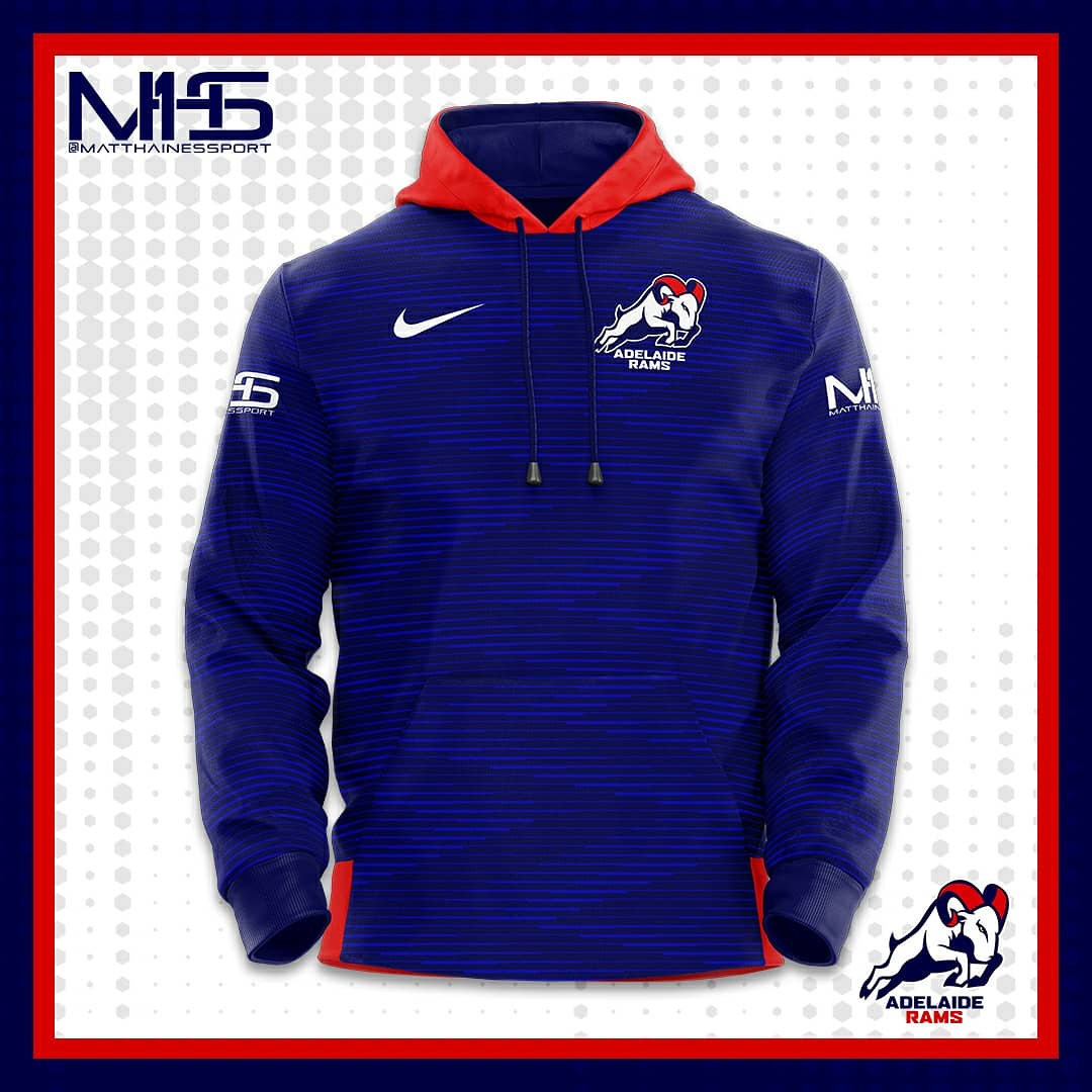
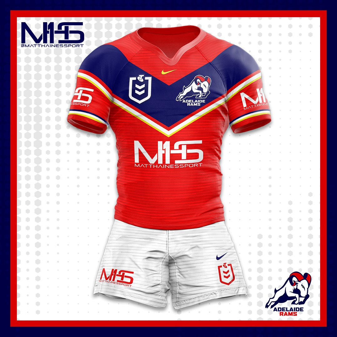
Reverse it (Red with blue V andsome white & gold trim) and you're onto a winner IMO.

The dark blue with red V is getting a little too close to Roosters territory - isn't red a typical SA sports team colour too?

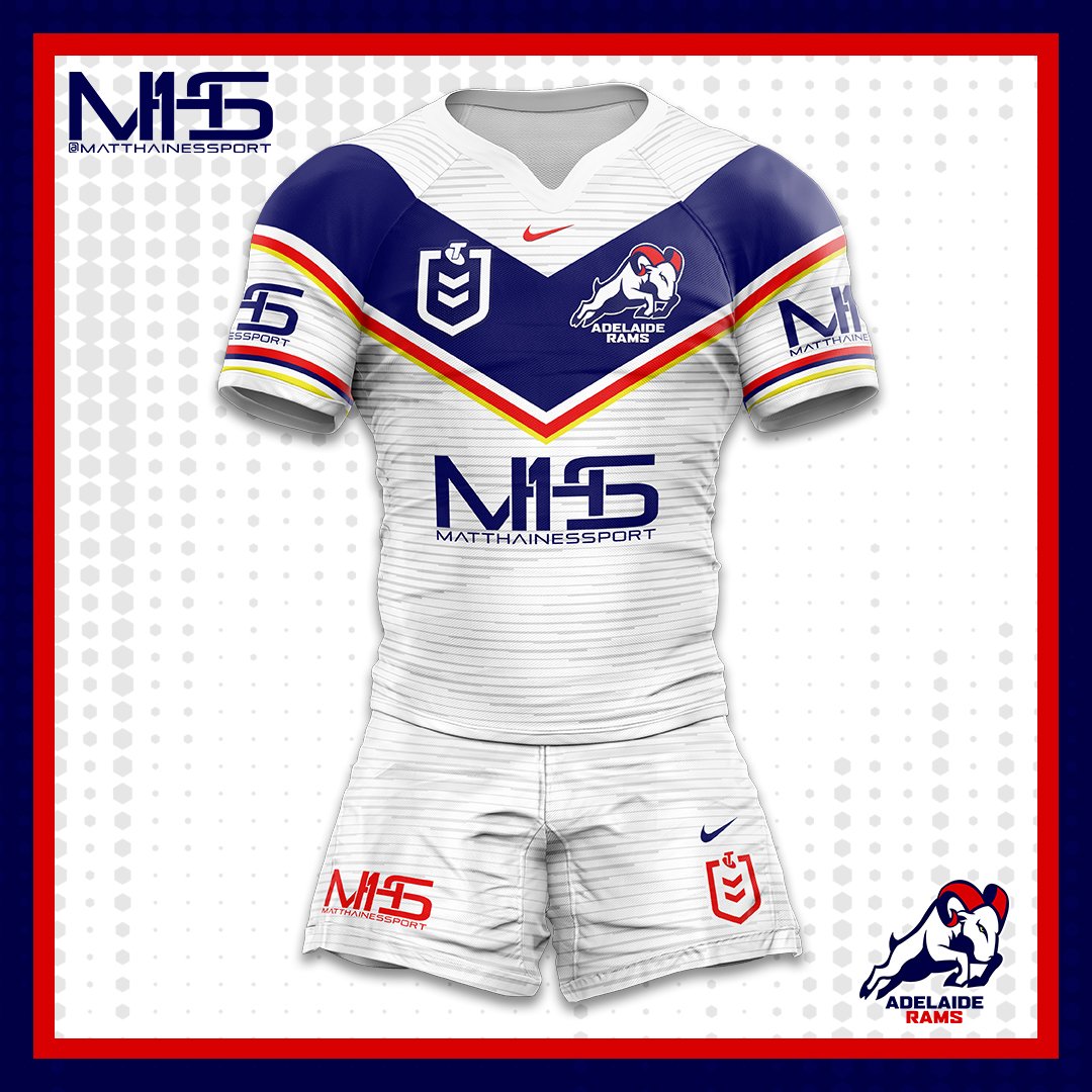
I'd be tempted to go for the inverse (red) jersey with the above red shorts for home - ie a fully red kit - the Dragons hardly ever wear full red - and a fully grey away set, with a red/blue/yellow V & trim.
 
Last edited:

sempmrh

Juniors
Messages
1,215
Reverse it (Red with blue V andsome white & gold trim) and you're onto a winner IMO.

The dark blue with red V is getting a little too close to Roosters territory - isn't red a typical SA sports team colour too?

I'd be tempted to go for the inverse (red) jersey with the above red shorts for home - ie a fully red kit - the Dragons hardly ever wear full red - and a fully grey away set, with a red/blue/yellow V & trim.
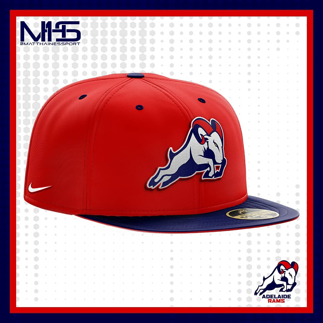
Red, blue and gold are South Australia’s sporting colours. A red dominant Rams in Adelaide would set them apart from the Crows and 36ers while still acknowledging the state colours. The only concern would be encroaching on South Australia’s state AFL team - red with a blue and gold V.
 
Messages
8,480

That is an absolute belter of a kit.

Red & Blue is probably the most common combo of colours in sport but this is probably the best arrangement of them i can recall. Has parallels to the Roosters kit but the red shorts and V really make it striking.

As for state colours, yes addition of yellow would do the trick there.

#bringbacktherams
 

flippikat

First Grade
Messages
5,274
That is an absolute belter of a kit.

Red & Blue is probably the most common combo of colours in sport but this is probably the best arrangement of them i can recall. Has parallels to the Roosters kit but the red shorts and V really make it striking.

As for state colours, yes addition of yellow would do the trick there.

#bringbacktherams

Maybe replace all the white with yellow, or gold, or mustard?

That would pull it away from a Roosters look even more.
 

Latest posts

Top