What's new
The Front Row Forums

Register a free account today to become a member of the world's largest Rugby League discussion forum! Once signed in, you'll be able to participate on this site by adding your own topics and posts, as well as connect with other members through your own private inbox!

The Game Jerseys, Logos, Mock Ups, Photos ANYTHING

beave

Coach
Messages
15,675
What about just 2 poppies on the front, but placed in a V?

Those multi poppy ones look a little like nanas curtains.........
 

kdalymc

Bench
Messages
4,349
As much as I like Gaz's WT design as a jersey, I don't think that it'd ever get accepted for the Wt's as it looks too 'Balmain'. The Wests half would cry blue murder with no white in the jersey, even though the design IS a Magpies design, the differences are just too minor to be seen by 99.8% of the fan base.

the 0.2% is us on here...

i know the merger details may be a bit different but why/ how has this worked with illawarra fans.
basically all they got out of the merger (jersey side of things) was a hyphen...

dragons logo
dragons jersey
neutral shorts

everyone still calls them st george
and once every 87 games they may wear an illawarra strip...
 

Prometheus

Juniors
Messages
1,101
thats a very nice jersey thinking outside the box. Wouldnt buy one personally, but I'm sure it would sell very well. Well done

Thanks.

What about just 2 poppies on the front, but placed in a V?

I'm not sure how you'd fashion just two poppies into a V.

i know the merger details may be a bit different but why/ how has this worked with illawarra fans.
basically all they got out of the merger (jersey side of things) was a hyphen...

dragons logo
dragons jersey
neutral shorts

everyone still calls them st george
and once every 87 games they may wear an illawarra strip...

I'm an Illawarra fan. I find people tend to just call them "The Dragons". Adopting the Red-V never bothered me, but not using the Steelers design when alternate jerseys were made compulsory really pissed me off. To their credit the Dragons introduced an Illawarra Heritage Round before the NRL had official heritage rounds and they wore it then. Now of course the traditional Illawarra jersey is our alternate strip and we wear it a fair bit, especially in Wollongong.

When the joint venture was formed it was under the rumoured threat of the NRL forcing us both into a three-way merger with Cronulla with all the home games at Shark park. The Steelers and St George each had two non-negotiable demands. We asked for half the home games to be played in Wollongong and for "Illawarra" to be in the name. The Dragons asked for the Red-V jersey and the dragon and knight logo. Everything else was negotiable. Ultimately, even the inclusion of the name "St George" in the JV was up for discussion and it was the Steelers who settled on "St George Illawarra Dragons". St George were willing to accept "Illawarra Steel Dragons" as long as they got to keep the Red-V and the logo. Keep in mind that the term "Illawarra" used to apply to the St George region as well and there are still organisations around the area that are labelled "Illawarra".
 

GAZF

First Grade
Messages
8,753
This is the best I could come up with-

ANZACJersey_zps9f968d86.jpg

I like this idea the best, needs tighter packing of the poppies so that the V is still a strong red. Like this.

stock-vector-black-poppy-pattern-90577921.jpg


It can be a complete pain in the arse finding stuff like that though.
 

Prometheus

Juniors
Messages
1,101
I've like to avoid the idea that everything the Dragons wear must have the Red-V.

In the past few years we've seen a white-v on red, a red-v on charcoal, a red-v on black, a pink-v, a red-v under a Legacy badge, a red-v above a rising sun badge, and now a red-v with cammo side panels. Enough already! We get it... the "V" is important. That doesn't mean it has to be on almost every jersey we wear.
 

steggz

Juniors
Messages
1,410
I've like to avoid the idea that everything the Dragons wear must have the Red-V.

In the past few years we've seen a white-v on red, a red-v on charcoal, a red-v on black, a pink-v, a red-v under a Legacy badge, a red-v above a rising sun badge, and now a red-v with cammo side panels. Enough already! We get it... the "V" is important. That doesn't mean it has to be on almost every jersey we wear.

I'm with you to a certain extent. It makes sense that the Women in League, Indigenous and ANZAC Day jerseys use the V. I haven't minded the Charity Shield jerseys the last couple of years. They're one-offs and they look pretty good.

They need to keep the Illawarra element, either as the away/alternate or the Heritage jersey, every single year. There are two stories melded (brought back together?) in the joint venture. As long as people remember that they will avoid things like the Wolverine monstrosity.
 

hrundi99

First Grade
Messages
8,414
As much as your designs are good quality gazf, you continue to miss the fundamental issue with WT, and that is that they are Wests Tigers, not Balmain Tigers and not Wests Magpies.

You are wasting your time with your logo design. I believe you'd be better off focusing on something which has more chance of coming to fruition.
 

GAZF

First Grade
Messages
8,753
As much as your designs are good quality gazf, you continue to miss the fundamental issue with WT, and that is that they are Wests Tigers, not Balmain Tigers and not Wests Magpies.

You are wasting your time with your logo design. I believe you'd be better off focusing on something which has more chance of coming to fruition.

Thats fair enough, WT is entitled to their own brand. I know you had a hand in some of the branding but the entire thing just doesn't work; there's way too much going on and nothing is co-ordinated, rather the logo was made and everything else was an afterthought. It has zero longevity. At the very least they should do some work to clean it up.

  • They need to scrap the current logo entirely; its a jagged mess and the details get lost at small scale. The triangular detailing belongs in the 90's along with the Florida Panthers logo which it obviously has taken cues from. The head has zero depth and the claws have too much, to the point that it detracts from the head. The bottom black part clashes with the wordmark (which is also outdated).
  • They should then pick a shade of orange and stick with it; they have one shade for the jerseys and a more yellow shade for everything else, they aren't distinct enough to use both (unlike the Raiders' dark/light green).
  • The jerseys go without saying obviously - the styling and placement of the logos are at complete odds with one another.
  • And most of all, the Magpies side needs more recognition; unlike the Dragons, the merger isn't a one-way street and both sides have a lot of history. But of late, Magpie fans have been given the finger and the brand has essentially become an abstraction of the Balmain identity. It doesn't have to be to the extent of what I proposed but they really should shift back to black as the primary colour, its the common colour between the two and doesn't detract from the "Tiger" brand (see Cincinnati Bengals, the colours, not the styling).

And to you it may be a waste of time but to me its not. Its my hobby, I made this long before WT came out with this fan submission initiative. I submitted it with the hopes of at least providing food for thought.
 

Pierced Soul

First Grade
Messages
9,202
I like the gazf designs for the west jerseys they look good. strong lines, they look like league jerseys

i also like the horizontal one by saint doc.

i reckon the new tigers jersey will be a combination of all 3 colours put into a blender to make a weird poo colour. total amalgamation!!
 

sensesmaybenumbed

Moderator
Staff member
Messages
29,225
I like this idea the best, needs tighter packing of the poppies so that the V is still a strong red. Like this.
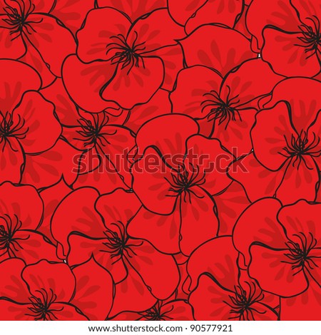
stock-vector-black-poppy-pattern-90577921.jpg


It can be a complete pain in the arse finding stuff like that though.

That's what I had in mind, a very solid red field with black outlines. Not a dragons fan obviously, but it would look good either in the v or the steelers strip all over.
 

Prometheus

Juniors
Messages
1,101
I'd like to see the Tigers in these-

TigersJerseys_zps406f4dbd.png


You'll have to forgive my use of Wikipedia templates. I know a lot of people hate them.
 

Prometheus

Juniors
Messages
1,101
I don't like white next to orange all that much. Not enough contrast. Its okay with details like trim and the thin stripes, but I wouldn't do it with large areas like white shorts next to an orange jersey.

I also considered white with thin black and orange stripes for the away.
 

Latest posts

Top