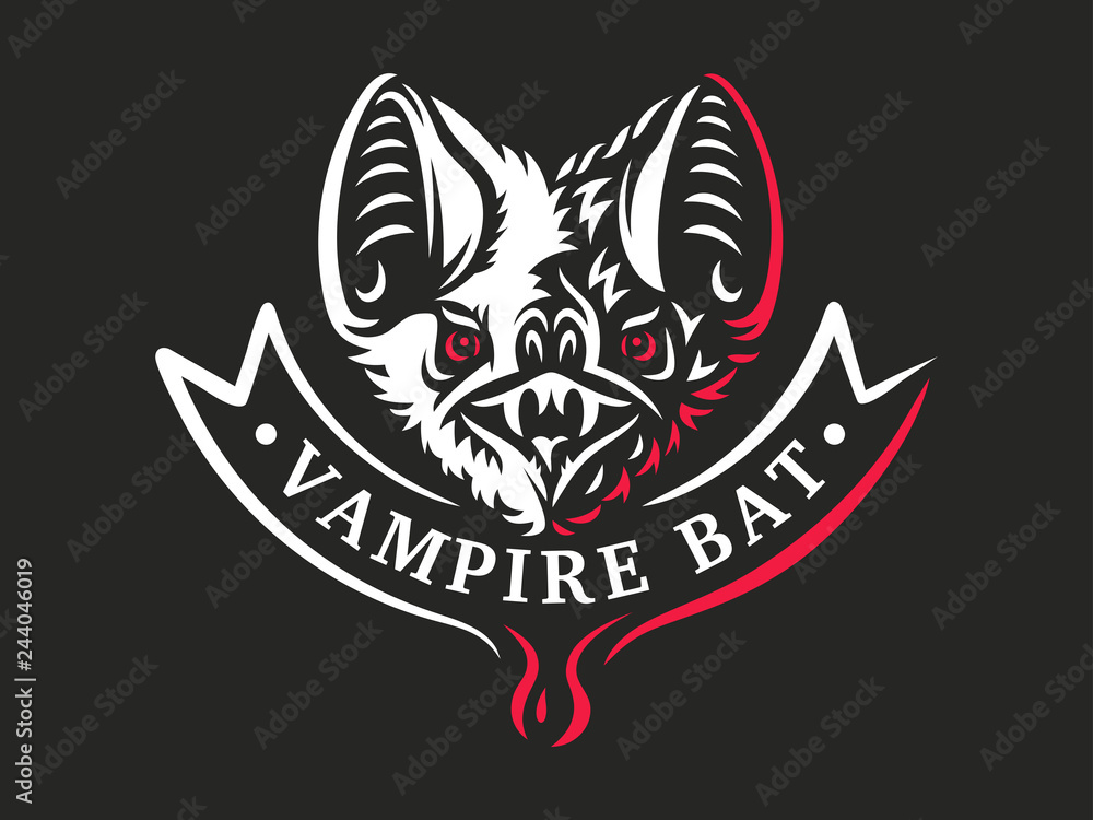
It's not my logo, it's just one that I found on the internet made by
Alexey Boychenko. I wouldn't use that exact design for a real team's logo.
The point was simply to show an image that was just the head and reasonably realistic, though obviously stylised, too give an idea of what you could do.
There're two main reasons (among many) why you might want to go down that route-
1. It provides flexibility as you can have a relatively high detail logo that will still be instantly recognisable and look good in avatars, thumbnails, and on social media in general, and it leaves room for a secondary logo that is simply an expanded full body version of the logo that could primarily be used for merchandising. Similar to the way a lot of American sports teams have primary and alternate logos that they use for different purposes.
2. It's relatively unique. If you copy the batman style silhouette trend then you'll just be one of thousands of bat logos that all look more or less the same. If you do something a bit different you'll stand out from the crowd and be able to create a more unique brand identity while still playing with the same themes.
Furthermore, creating something 'that isn't ideal for a sporting audience' isn't necessarily a bad thing. If there's a universal truth in all aesthetic artforms it's that it's better to set the trends than follow them. Sure it could fail, but you can always change it if it fails. However, if you create a new popular sports logo design motif then you'll be one step ahead of the pack before you've even really begun.

")