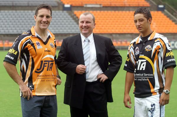
I'm a really big fan of that style where the jerseys have a honeycomb structure at their base & the jersey fades from the main colour into white (especially into white shorts).
The Panthers had a similar jersey in teal about 10 years ago that looked the goods, too. Honestly, this is pissing me off just thinking about it. Easts suck.
Everyone is entitled to an opinion.
Except yours Amadaca. It sucks!

Benji looks f**king high as a kite.

Really?
Tacky, cheap, too busy. Just wrong
What's with the multi paragraph under the NRL badge...
Thought you guys might appreciate this, it's a story on John Gearman who does a lot of the NRL logos.
Includes some interesting possible logos for Para and Cronulla
http://sportsbusinessinsider.com.au/blogs-features/brand-sport/profile-john-gearman/
"I get the sales because the fans know what they are buying wasn?t done over a coffee. I?ve had a RABBITOHS grand final t-shirt idea sitting on the computer for like 15 years. It should beat the Knights record if done right. Every now and then it gets a tweak here and there. Will it see the light of day? Who knows? "
John runs 'full boar' and did the titans, manly, raiders, cairns taipans and west coast pirates logos. He did a job for me a few months ago for the aircraft I work on up in townsville (70th anniversary logo). Can't recommend him any higher, he does a top notch job.
Whilst I don't love all the logos he's come up with , some of the stories re dealing with club marketing departments and CEO's are bloody hilarious.
Take for example when the Steelers changed their logo and they wanted one with a palm tree and a bikini girl in the background ha ha ha!
The 'Full Bore' Facebook site also has some great logo moments from history for the logo inclined
