The Mad Hatter
Coach
- Messages
- 14,868
I might have to get him to mock up a Terrey Hills Lobsters jersey and logo.
Well they wanted to call themselves 'Barriers' so you can see the assclown factor was pretty high with the organisation in the beginning ....
I love the pirates logo he has developed for us and he has done a kick ass Pirate tshirt design which I hope he WARL will sell one day.
Looks like the French have a new logo, looks good and modern http://www.ffr13.fr/index.php/equip...x.php?option=com_content&view=article&id=5651


NSW had far better jerseys than us up until 2004 or so. Always traditional all sky blue. And then they started adding side panels etc. Doesn't seem to have worked for them...
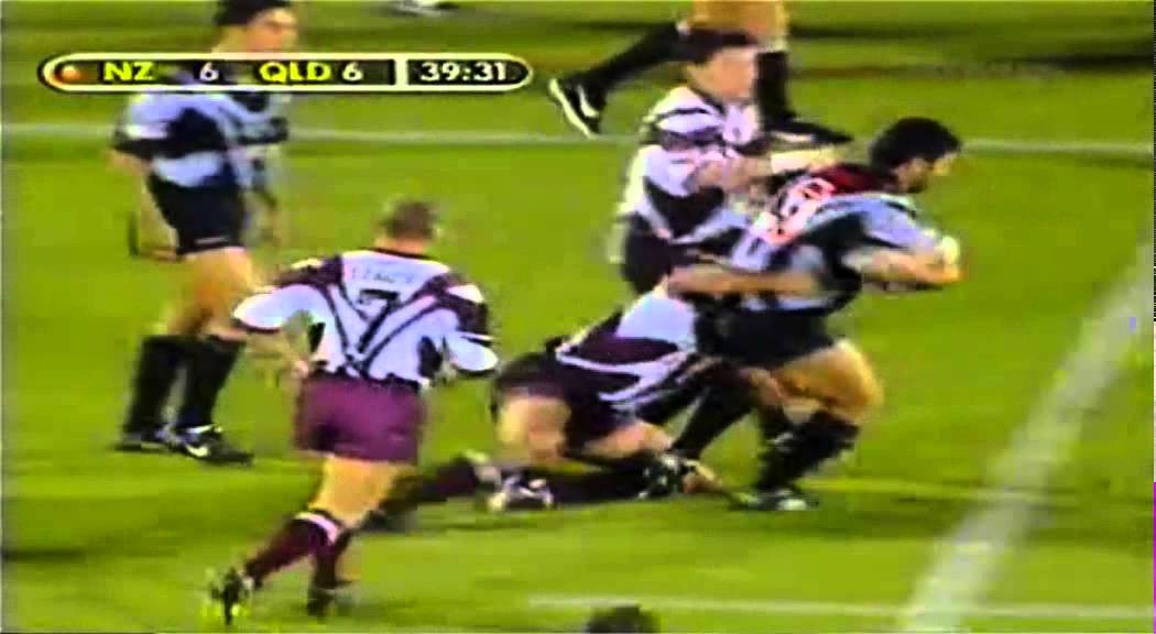
Would love to see an all Maroon and white kit, no gold. The one just above that Slater is wearing has stupid lines all over it, but looks good compared to what we are wearing now.
Back to traditional!
The current and last Qld jerseys are shit. A complete overload of clutter and piping and unnecessary elements.
These are their best looks.
Obviously don't remember our 1997 one


Its a well drawn logo but the wordmark leaves something to be desired, especially disappointing since the full skull looks amazing (yet its covered).
.


