Foreign Legion
Coach
- Messages
- 12,179

i like the steggles water mark
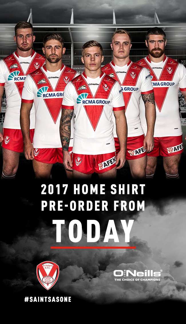
The new St George Jersey is just wrong. The angles look all wrong. If they wanted to go with something slightly different (yes it is ok to break away from the traditional red v occasionally) they could have done this. I have used the roosters away jersey and just changed the colours. Sometimes you just need to give people a chance to miss the Red V rather than trying to re-invent it every 3rd year. Look at what Manly have done. They went away from their traditional hoops for a few years and now they have brought it back and it's awesome.

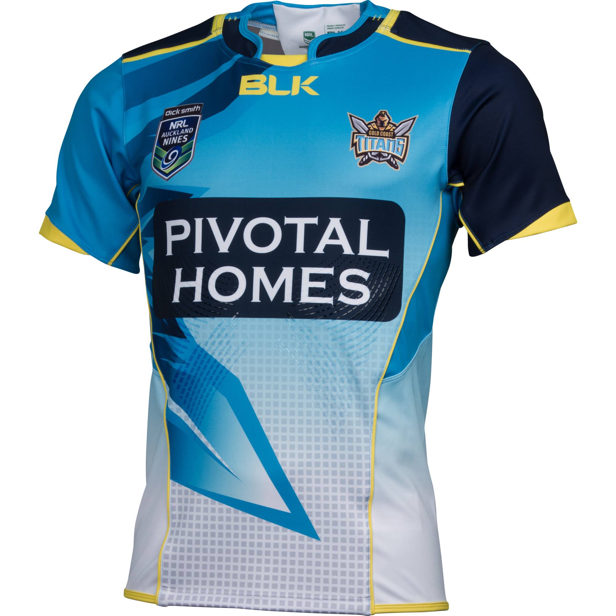
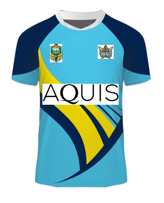
I don't know what you're taking, but it's clear you're enjoying the trip...As we anticipate Titans jersey release I thought I would do a mock. (Credit to Akuma kit designer site)

Oh my, Saints! what have you done?!??!?!?
As we anticipate Titans jersey release I thought I would do a mock. (Credit to Akuma kit designer site)
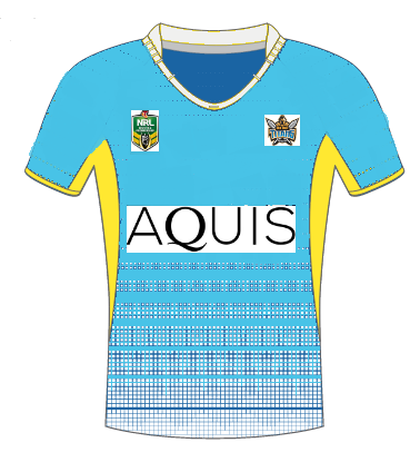
I would still like to see the Titans go with something like this design

But start with their shade of blue, fade to a very faint blue (almost white) with yellow trim on the collar and sleeves, ie vaguely similar to the colour scheme below but a simple design like above
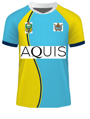
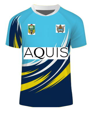
If you see my quote above (from the other thread) I tried to explain what I would like to see from a GC home jersey. Well here is my dodgy attempt to paint a picture...