What's new
The Front Row Forums

Register a free account today to become a member of the world's largest Rugby League discussion forum! Once signed in, you'll be able to participate on this site by adding your own topics and posts, as well as connect with other members through your own private inbox!

The Game Jerseys, Logos, Mock Ups, Photos ANYTHING

Messages
23,965
ths-logo2019-150.png

This is one hectically sh...t logo much prefer this one (below)

Tweed_heads_seagulls.png


or at least re-use this (would be much better)
150px-Gold_Coast_Seagulls_logo.jpg
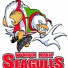
That middle one has always been awful. While they could of done better with the updated logo, it is a significant improvement on the cartoon.
 

kdalymc

Bench
Messages
4,345
all seagulls logos suck
saeaa.jpeg
saeaa2.jpg

also whats the go with that mascot, if you play on the Gc/Brisbane you can play 3 teams in your comp with the seagull mascot...
 

gzerounian

Juniors
Messages
1,094
Should tell to NSW to wear it on the correct side...
I agree. The comp your playing in on your right and your team logo on your left. This will be the first year NSW are having the origin badge for a long time maybe even ever? The ARL are too loose with rules like this. They need to stipulate where the origin logo must be placed and stipulate only one logo on the left. Coat of arms and nswrl logos could be combined into one new logo.
 

sempmrh

Juniors
Messages
1,211
I wish the Kangaroos, Blues and Maroons all had unique logos that didn’t all follow the NRL shield logo system. They deserve better than that.
 

Saint Doc

Coach
Messages
11,091
I wish the Kangaroos, Blues and Maroons all had unique logos that didn’t all follow the NRL shield logo system. They deserve better than that.

I always thought this was a great Kangaroos logo

images


And agree on the Blues and Maroons. I’m happy for the QRL, NSWRL logos to follow the proforma. But the teams deserve their own logo. The Wallabies logo is different to the Rugby Australia logo.
 

sempmrh

Juniors
Messages
1,211
I always thought this was a great Kangaroos logo

images


And agree on the Blues and Maroons. I’m happy for the QRL, NSWRL logos to follow the proforma. But the teams deserve their own logo. The Wallabies logo is different to the Rugby Australia logo.
That’s a fine logo but they have a standing Kangaroo logo they use that I would really like to see promoted to the main logo. I’m struggling to find it at the moment but it’s the one that’s displayed in different colours on a player’s jersey depending on the number of games played.
 

boatboy1269

Juniors
Messages
23
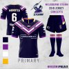
The Storm home jersey is near perfect in my opinion so there really aren’t many changes that are needed in my re-design.

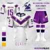
I’ve altered the chevron on the jersey so that the vee is completed, aligning the jersey more closely with their original designs. I’ve decided to stick with the more traditional chevron, rather than the lightning bolts, as I think these look a little (tiny) bit goofy. The Storm away jerseys are traditionally quite bland or uninspiring, so I’ve tried to just inverse the home so it looks more traditional.
Storm H.jpg Storm A.jpg
 

kdalymc

Bench
Messages
4,345
Someone has done a mockup of this but the white bit needs to be a lightning Bolt
And I hate white away jerseys but I could live with that.
Didn’t they actually have something close to this last year or the year before and bail
 

greenBV4

Bench
Messages
2,510
The Storm home jersey is near perfect in my opinion so there really aren’t many changes that are needed in my re-design.

I’ve altered the chevron on the jersey so that the vee is completed, aligning the jersey more closely with their original designs. I’ve decided to stick with the more traditional chevron, rather than the lightning bolts, as I think these look a little (tiny) bit goofy. The Storm away jerseys are traditionally quite bland or uninspiring, so I’ve tried to just inverse the home so it looks more traditional.

storm-h-jpg.28664
storm-a-jpg.28665

Im probably the minority in this club but I actually prefer the transitioning away from yellow/gold, and believe that the next new jersey design, like the new logo, will ditch it completely.

Navy + Silver (instead of white) = Victoria as we are the sole team
Purple = unique to the storm

So remove the yellow, change the white to silver and keep the current hooped socks and I like it!
 

sempmrh

Juniors
Messages
1,211
Im probably the minority in this club but I actually prefer the transitioning away from yellow/gold, and believe that the next new jersey design, like the new logo, will ditch it completely.

Navy + Silver (instead of white) = Victoria as we are the sole team
Purple = unique to the storm

So remove the yellow, change the white to silver and keep the current hooped socks and I like it!
I'm also in the minority when it comes to yellow. The importance of yellow is hugely overstated by a lot of fans and I think it should be an accent colour only. I even think our current home jersey has too much yellow. Keep the yellow trim on the V but get rid of the yellow collar.

I don't really want to see silver on the jerseys unless it's used as a silver to white gradient, either on a regular V or a lightning bolt V. I don't like the silver lightning bolts on the new ANZAC Day jersey. It also needs to be silver and not the "mid grey" the club has been using on off-field gear.

However, with the transition to navy, purple, white and silver it brings us in line with the VRL's colours.
 

Rooster8

Juniors
Messages
432
With comp jerseys the best they've been in years (bar some), I think the next step is to focus on club identities, especially with the relocation of a Sydney club imminent. My biggest issue is with the Roosters. When a Sydney team relocates, i believe the NRL should alter the Sydney Roosters to either Sydney Eastern Suburbs Roosters, or Eastern Suburbs Roosters. And with that, also our logo.

A while ago, Rabbits changed their logo from their cartoon oval to the now cleaner and better looking rabbit. The roosters should of done this decades ago. Our logo is a joke. We need to respect the history of the club, the logo below should be our permanent logo (ignore the shit photoshop).

g1069.png
g1180.png
 

Nuke

Moderator
Staff member
Messages
5,363
*Crushers
I don't recall any, but changing the topic momentarily, I'm glad they switched the old gold and navy blue around when they entered the ARL in 1995. I know it's not everyone's cup of tea, but to me it looked SO much better.
Am I right in thinking they kept this as a clash jersey (which, keep in mind, these were days before most teams had more than one jersey per season!)?
 

yakstorm

First Grade
Messages
6,040
SSH_13-11-2014_SHARED_23_12crushers TIP_ct300x300.jpg
They did wear a jersey similar to the one above in a few games.

Key difference is when Canterbury made the kit they introduced the red around the collar and top of the socks.

For me, I liked the Crushers kit. Sure it wasn't the most creative or the best colour combos but they were instantly recognisable and forged a strong identity over a very short period of time.
 

Latest posts

Top