What's new
The Front Row Forums

Register a free account today to become a member of the world's largest Rugby League discussion forum! Once signed in, you'll be able to participate on this site by adding your own topics and posts, as well as connect with other members through your own private inbox!

The Game Jerseys, Logos, Mock Ups, Photos ANYTHING

Messages
11,930
LIONS-1969-KIT-Final-1024x546.png
 

sempmrh

Juniors
Messages
1,210
Is there a colour Penrith hasn’t worn or had associated with them in some capacity throughout their history?
 

yakstorm

First Grade
Messages
6,030
View attachment 29425 Unsure if true? Obviously means ARL not super league, but yeah pretty interesting

Definitely true that the team was going to be called the Pumas before. If you look up IP Australia's site, you can see the registration for the trademark / logo.

Heard different reasons why they went with Reds, ranging from copyright infringement, to they just had multiple options and felt 'Reds' was a better name for them.
 

flippikat

First Grade
Messages
5,215
View attachment 29425 Unsure if true? Obviously means ARL not super league, but yeah pretty interesting

Interesting.. very much in keeping with early-mid 90s jersey trends - a dark block, and a light block separated by stripes in the middle. Eels, Broncos & Panthers had jerseys of that ilk too.. Then Norths (Citibank design) and Manly (Pepsi design) did their own spin on 'colour blocks and lines' too.. along with the original Cowboys jersey.
At a pinch you could also include the Knights original (Henny Penny) design too.. but the stripes that separated red from blue ended quite high.
 

boatboy1269

Juniors
Messages
23
Hey guys,
Forgot to post my design here last week so will share two now.

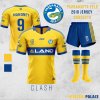
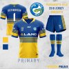
Nothing too original with the Eels jerseys because they’ve already nailed two designs in the past. When I think of Parramatta, I always think of these two jerseys. The Primary tweaks their current Heritage, removing the awful side panels and slightly lightening the blue, while the Clash is inspired by their 1980’s Away jersey with some minor tweaks to the back.

LU Eels.jpg
LU Eels 2.jpg
 

boatboy1269

Juniors
Messages
23
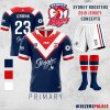
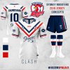
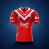
The Roosters are one of the few teams in the NRL who have always kept things traditional with their home jersey, so I’ve kept it primarily the same with my design. The most significant change is the removal of the red hoops on the sleeves, moving back to their 90s/00s sleeve design. The away shifts to a simplistic double chevron which they have used in the past but moved away from currently. I've also included a Alternate Red jersey which I am a fan of but wasn't sure if I wanted to include in my portfolio. Would be keen to hear people's thoughts on it.

LU Roosters.jpg LU Roosters 2.jpg LU Roosters 3.jpg
 

PARRA_FAN

Coach
Messages
17,676
I actually dont mind our current away jumper however I definitely love those two home and away jumpers above.
 

Latest posts

Top