What's new
The Front Row Forums

Register a free account today to become a member of the world's largest Rugby League discussion forum! Once signed in, you'll be able to participate on this site by adding your own topics and posts, as well as connect with other members through your own private inbox!

The Game Jerseys, Logos, Mock Ups, Photos ANYTHING

sempmrh

Juniors
Messages
1,213
107366040_137065411359608_3524785621116155057_o.jpg
108812882_137065394692943_8021805632064607325_o.jpg

Why on earth do they persist with changing the Blues design so often when this is perfect right here?

I mean, I know the reason - but still.
 
Messages
8,480
Why on earth do they persist with changing the Blues design so often when this is perfect right here?

I mean, I know the reason - but still.

Absolutely agree.

Sadly they have to whack bumper stickers all over any jersey though, so even these would be ruined by a garish green VB logo.

Watching some classic origin games on Kayo recently, in the days where there was only a sleeve sponsor patch (Tooheys blue / XXXX), by far the best origin jerseys for mine. Absolute classics. But sadly those days are well behind us. We’re in the age of bumper stickers, and plenty of them.
 

MugaB

Coach
Messages
15,279
I use a template and Photoshop.
Regarding your designs for the firehawks, i'd be leaning more into the black than the blue, your designs were perfect, but color choice probably not, i'd switch the blue with black,
The blue should just be a trim color, maybe just sleeves hoops, collar and numbers outlines only, really lean into orange and black for those designs... maybe the blue can be like a brighter teal blue to it, like the panthers had a decade ago, this will not clash with a burnt orange and black.. need to step away from traditional blues... too many in the NRL
Just my 2 cents, great work btw

20200715_125036.jpg
 
Last edited:

yakstorm

First Grade
Messages
6,065
NSW seemed to lose the plot when around 2008 and then it just went downhill after that...

It felt like that year, the removal of the collar and the sudden drastic increase of the dark blue on the jersey kicked off the significant decline... Didn't help that Classic just couldn't design a good jersey, most look like training kits or Canterbury rip offs, the blue on the kit changed, and relatively 'plain' or 'colour aligned' sponsors like Wizard and Sony got replaced by nib and VB.

NSW in 2000:
may-2000-geoff-toovey-of-new-south-wales-in-action-during-the-match-picture-id1028055


NSW in 2003:
craig-wing-of-the-blues-in-action-during-game-three-of-the-nrl-state-picture-id2185619


NSW in 2005:
andrew-johns-of-the-blues-in-action-during-the-state-of-origin-game-2-picture-id53071028


NSW in 2008:
peter-wallace-of-the-blues-looks-to-pass-during-match-two-of-the-arl-picture-id81525100
 

Craegus

Juniors
Messages
101
Regarding your designs for the firehawks, i'd be leaning more into the black than the blue, your designs were perfect, but color choice probably not, i'd switch the blue with black,
The blue should just be a trim color, maybe just sleeves hoops, collar and numbers outlines only, really lean into orange and black for those designs... maybe the blue can be like a brighter teal blue to it, like the panthers had a decade ago, this will not clash with a burnt orange and black.. need to step away from traditional blues... too many in the NRL
Just my 2 cents, great work btw

View attachment 39973

I didn't pick the colours for it. I used the colours used in another mockup as well as Brisbane Easts. The design was just a more realistic option over another concept that looked really poor.
 

MugaB

Coach
Messages
15,279
I didn't pick the colours for it. I used the colours used in another mockup as well as Brisbane Easts. The design was just a more realistic option over another concept that looked really poor.
I get that, just thought it better to be black and orange as the major colors, with the blue as a secondary
 

Saint Doc

Coach
Messages
11,098
NSW seemed to lose the plot when around 2008 and then it just went downhill after that...

It felt like that year, the removal of the collar and the sudden drastic increase of the dark blue on the jersey kicked off the significant decline... Didn't help that Classic just couldn't design a good jersey, most look like training kits or Canterbury rip offs, the blue on the kit changed, and relatively 'plain' or 'colour aligned' sponsors like Wizard and Sony got replaced by nib and VB.

I think 2009 and beyond was the problem.

2008 was actually one of my favourite Blues jerseys, even though it was a one-off. The centenary jersey. I know many will disagree, but I loved the white collar and kangaroo logo
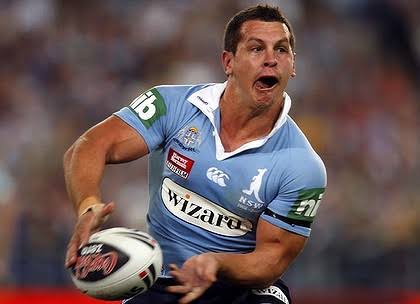
images

images
 

GAZF

First Grade
Messages
8,754
I think 2009 and beyond was the problem.

2008 was actually one of my favourite Blues jerseys, even though it was a one-off. The centenary jersey. I know many will disagree, but I loved the white collar and kangaroo logo

images

images
Pretty sure that was game 1 only.
 

Latest posts

Top