One of our best alternate kits in a long time. Sure its a PSG rip off, but done better. This will sell like hot cakes.Hull KR Alternate kit View attachment 96360
That's a really nice kit. Prefer it over the Hull KR '7' kit and the 'Venn' kit.Hull KR Alternate kit View attachment 96360
haha that whale logo looks f**ked. also f**k off with your names that don't tell anyone where you're from. southern what? f**k off
That's what I saw too.
Southern Orcas, this is what I see.
I 100% agree with this too. Compass points are not a location. A suburb / town / city / region / state / country, ect, to be represented. I know the whole franchise thing is the 'in' thing these days in the NRL, whereby they encourage people to follow a team no matter where you are as opposed to going for a team because you live in 'their' area, but have some pride in whom you represent.haha that whale logo looks f**ked. also f**k off with your names that don't tell anyone where you're from. southern what? f**k off
Hahaha Lol@SouffsI 100% agree with this too. Compass points are not a location. A suburb / town / city / region / state / country, ect, to be represented. I know the whole franchise thing is the 'in' thing these days in the NRL, whereby they encourage people to follow a team no matter where you are as opposed to going for a team because you live in 'their' area, but have some pride in whom you represent.
As long as people who support the team know where it is does it really matter? Before I moved to Sydney I had no idea where any of the suburban teams were they were just a ‘Sydney team’ - even now the likes of ‘st George’ et al Is a little dicey, ‘south Sydney’ is really pretty much the cbd adjacent rather than what most would call the south of Sydney for exampleI 100% agree with this too. Compass points are not a location. A suburb / town / city / region / state / country, ect, to be represented. I know the whole franchise thing is the 'in' thing these days in the NRL, whereby they encourage people to follow a team no matter where you are as opposed to going for a team because you live in 'their' area, but have some pride in whom you represent.
I agree with your first sentence.As long as people who support the team know where it is does it really matter? Before I moved to Sydney I had no idea where any of the suburban teams were they were just a ‘Sydney team’ - even now the likes of ‘st George’ et al Is a little dicey, ‘south Sydney’ is really pretty much the cbd adjacent rather than what most would call the south of Sydney for example
I can't believe how bland the London Broncos are visually. I presume they'd love to have the support and hearts and minds of the people of the great city of London ... but they've got a terrible logo and an uninspiring jersey that isn't unique in any way. They could do a whole lot better, and one day I hope they will. It wouldn't take much to make that kit look a lot more appealing, in my books.
Didn't they have that checkered pink,blue and yellow get up some years back, that was very cool, and uniqueI can't believe how bland the London Broncos are visually. I presume they'd love to have the support and hearts and minds of the people of the great city of London ... but they've got a terrible logo and an uninspiring jersey that isn't unique in any way. They could do a whole lot better, and one day I hope they will. It wouldn't take much to make that kit look a lot more appealing, in my books.
That top design definitely existed before the Harlequins deal. They definitely wore Harlequins colours as well like that Rugby Union one. What they rock these days are traditional Fulham colours and designs from before they were London Broncos. They've even done the quartered design in traditional Fulham colours. But they did wear a version of that top design as an away jersey this season.Was when they were linked up with Harlequins, scheme shouldn’t work but somehow it does
View attachment 96463
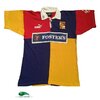
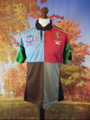
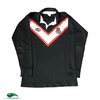
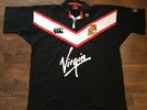
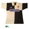
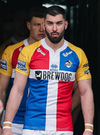
The 1st and last one is what I remember seeing, imagine being sponsored by Foster'sThat top design definitely existed before the Harlequins deal. They definitely wore Harlequins colours as well like that Rugby Union one. What they rock these days are traditional Fulham colours and designs from before they were London Broncos. They've even done the quartered design in traditional Fulham colours. But they did wear a version of that top design as an away jersey this season.
View attachment 96468
View attachment 96469
View attachment 96470
View attachment 96471
View attachment 96473
View attachment 96472
Yeh its the best of the 3, they should have saved this for the home short for 2026!That's a really nice kit. Prefer it over the Hull KR '7' kit and the 'Venn' kit.
Should steal the old world league of Am football teams name and rebrand as London Monarchs!I can't believe how bland the London Broncos are visually. I presume they'd love to have the support and hearts and minds of the people of the great city of London ... but they've got a terrible logo and an uninspiring jersey that isn't unique in any way. They could do a whole lot better, and one day I hope they will. It wouldn't take much to make that kit look a lot more appealing, in my books.
