But we've got plenty of data from the past. Australia, for example, has 25 long term high quality weather stations we can draw temperature and precipitation data from, for example. America and Europe have shitloads more.
We've also got proxies coming out the wazoo.
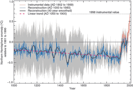
So why has it gone from this:
In the 1990 IPCC report (obviously minus the coloured commentary), to this:
https://climate.nasa.gov/vital-signs/arctic-sea-ice/
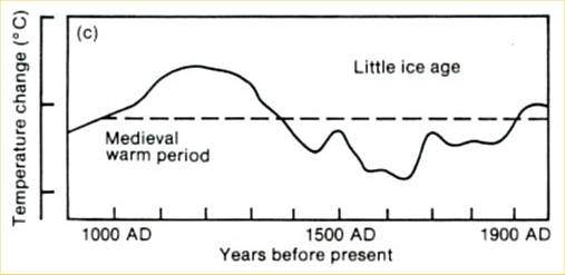
Or, from this:
From the 1990 IPCC Report.
To this:
Mann's famous (and fraudulent) hockeystick graph?
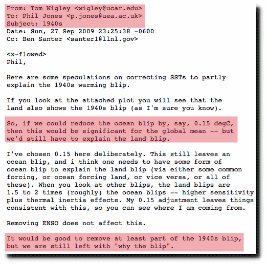
Why is there always a change where the past is erased so today looks unnatural?
Hmmm, dunno...
And why, for another example, is NOAA now using 60% "estimated" temperature data in the US? (Marked with an "E" in their temperature data, so not hard to check) Why aren't they using real, measured data?