flippikat
Bench
- Messages
- 4,523

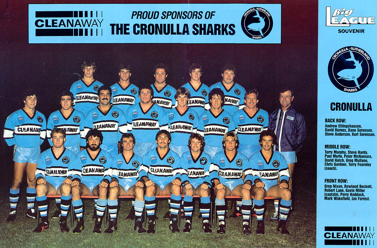
A refresher. This is from earlier in the thread, Thanks to applesauce
I'm not sure the white text for the sponsor logo works well on that shirt.. Blends in too much with yellow.
surely it should be maroon or navy blue or black to be more readable from a distance?