What's new
The Front Row Forums

Register a free account today to become a member of the world's largest Rugby League discussion forum! Once signed in, you'll be able to participate on this site by adding your own topics and posts, as well as connect with other members through your own private inbox!

The Game 2020 Jerseys/Logos/Sponsorships

Messages
8,480
+1.

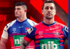
I recall when Classic first released those retro jerseys, the Knights one had the HP sponsors logos on it, then they got removed and it was a plain jersey, then they slapped those BP logos on them (oversized and the placement is too high on the front, but that's another story)

I get that clubs want the sponsorship dollars, but having so many logos on the jersey cheapens the sponsors' identity with the club and cheapens the look of the code as a whole. You talk about what current jerseys will be classics in 30 years- think 30 years ago to the 'Simply The Best' era and you can STILL remember most of the major sponsors. I challenge you to say the same for even 5 years ago without needing to look it up.

Here Here.

As for the challenge... And I'm not using Uncle Google...

er.....

I could name about a dozen gambling companies I suppose.. Jeep & St George Bank (for the Dragons - but no surprises why I know these, could rattle off a few more but wont).

Suzuki, Hino for the Storm. NRMA for the Broncos..

But to your point - indeed the Major Sponsor of yesteryear actually complimented the Jersey... And yes I could remember 10 times the amount of Sponsor companies from 30 odd years ago versus the last 10 years.. And yes so many bumper sticker sponsors demeans the code, although seeing the Sharks, Knights and Manly (for the first part of the year, Sharks for almost all of it) have little to no sponsors looked horrible. I'd love for the day again of a single major sponsor on the jersey - front n back... It could actually make some of the modern jersey designs become future classics
 

yakstorm

First Grade
Messages
5,293
i can see some of these.. But can you please show me /refer me to the Dogs one you mean?
For me the 80’s and 90’s (eg “Hyundai”) are cracking strips I refer to, but can’t recall them going back to the same pattern.. rather variants of it..

It's a bit harsh to say that a club like the Roosters or Souths have 'kept their traditional' design, yet someone like the Bulldogs hasn't. Really outside of the shocker 2018 kit (which was still easy enough to recognise) the Dogs have had a design which arguably is as close as you are going to get to their 73 - 96 designs..

Bulldogs 2019 Kit:
images

Bulldogs 1990's:
images

Bulldogs 1980's:
images


Sure some design elements have changed, ie. the V is a consistent width, versus in the mid-90's especially it seem get thinner the closer it go to the point, and the bar on the sleeve is now wider, but there were times when the Roosters kit didn't have red bars on the sleeves, and Souths only had 3 red horizontal bars, not 5 as they do now.

Regardless all 3 clubs have kits now which when wearing their home at least, fans from most eras would recognise immediately and consider relatively unchanged.

With the Sharks rumoured to be going back to their block design, the Eels making their home 1986 inspired, Warriors & Cowboys basing theirs off 1995, Knights off their 1988 design, Penrith from 1991, and well Dragons always have a V for home, hopefully most clubs are moving to a more consistent template for their home kit. Canberra as well whilst the tri-colour lines have moved up and down the sleeves a few times in recent years, the core kit has stayed the same.

Considering clubs can bring out between 5 - 7 kits a year, it's possibly not unrealistic for the NRL to consider getting all clubs to have some core 'template' which has to always be their 'primary' and only permit minor variations year on year (which will happen with jersey cuts, sponsorship placements, etc).

Caters for both the more traditionalist / brand focused and for experimentation. For some clubs, like the Roosters, they've made it clear that the experimentation doesn't appeal to them, but for those with no identity (Titans anyone?), it might save them a bit from themselves.
 
Messages
8,480
It's a bit harsh to say that a club like the Roosters or Souths have 'kept their traditional' design, yet someone like the Bulldogs hasn't. Really outside of the shocker 2018 kit (which was still easy enough to recognise) the Dogs have had a design which arguably is as close as you are going to get to their 73 - 96 designs..

Bulldogs 2019 Kit:
images

Bulldogs 1990's:
images

Bulldogs 1980's:
images


Sure some design elements have changed, ie. the V is a consistent width, versus in the mid-90's especially it seem get thinner the closer it go to the point, and the bar on the sleeve is now wider, but there were times when the Roosters kit didn't have red bars on the sleeves, and Souths only had 3 red horizontal bars, not 5 as they do now.

Regardless all 3 clubs have kits now which when wearing their home at least, fans from most eras would recognise immediately and consider relatively unchanged.

With the Sharks rumoured to be going back to their block design, the Eels making their home 1986 inspired, Warriors & Cowboys basing theirs off 1995, Knights off their 1988 design, Penrith from 1991, and well Dragons always have a V for home, hopefully most clubs are moving to a more consistent template for their home kit. Canberra as well whilst the tri-colour lines have moved up and down the sleeves a few times in recent years, the core kit has stayed the same.

Considering clubs can bring out between 5 - 7 kits a year, it's possibly not unrealistic for the NRL to consider getting all clubs to have some core 'template' which has to always be their 'primary' and only permit minor variations year on year (which will happen with jersey cuts, sponsorship placements, etc).

Caters for both the more traditionalist / brand focused and for experimentation. For some clubs, like the Roosters, they've made it clear that the experimentation doesn't appeal to them, but for those with no identity (Titans anyone?), it might save them a bit from themselves.

Mate cheers for the post and yeah last years is bang on. Must be early onset of memory-loss..
 

Groth

Juniors
Messages
19
From what i can see in the knights jersey tease photo it looks as if the '03 world sevens jersey will be their away.. or at least very similar.

Very welcome change for mine
 

sempmrh

Juniors
Messages
1,194
I think the collars on those Knights jerseys are different to the sneak peak video from a few weeks ago.

Something about those jerseys doesn't sit right with me and I'm not sure what it is.
 

MugaB

Coach
Messages
11,807
From what i can see in the knights jersey tease photo it looks as if the '03 world sevens jersey will be their away.. or at least very similar.

Very welcome change for mine
Almost your avatar for the away, they just ruinied by adding white sleeves, and white at the bottom
 

kdalymc

Bench
Messages
4,312
Such a useless 'alternate' design.... How do we reduce our clashes with mainly white jerseys....let's just half our blue area to grey....
This was fine. The only other white team was Dragons. And they've played eachother for 900 years with no issue.
Dumb change tho
 

Latest posts

Top