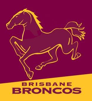
Dreadful. The head is horrible. It should look something like this:HORRIBLE 2013 logos from the Broncos...

http://www.broncos.com.au/news-display/Broncos-Launch-Special-Logos-for-2013-Membership/61806

The idea of going back to the old Horsey was good, but the one they came up with was fairly lazy. It's just the new head on the old body. But of course I'll give it a while to grow on me first.
The new head on the old logo sticks out like a sore thumb.
Prancing horse reminds me of Soward.
Why? Because the Dragons are acknowledging the "Close the Gap" Round Monday night and Jamie Soward is of Indigenous heritage? I'm getting sick of your racist comments, BunniesLoser. They began last week in Superthread and are now continuing on into this thread. Pull your head in you bigot.
They needed to go with a yellow Bronco.
Trawling through all the 'bronco' logos out there on google, it seems it's a pretty hard animal to make a logo for. A lot of them look like Dragons or Shetland sheep dogs.

^dragon-esque

^sheepdog-esque

That's a f**king brilliant design.
