Zigwaa
Bench
- Messages
- 2,744
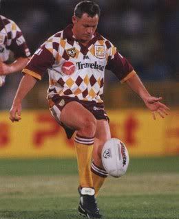
The Bronco on the right reminds me of Dean Young. Running fast and not looking at what's in front of him. We know how that ended for Deano...
:lol::lol:
The Bronco on the right reminds me of Dean Young. Running fast and not looking at what's in front of him. We know how that ended for Deano...
Regarding the new-old Broncos hybrid logo (a mouthful if I ever typed one) I think the problem isn't the head transplant, although that does take a bit of getting used to. Rather it is the front leg being tucked up like a horse that is prancing around a dressage course (or whatever it is called). In contrast, the original Broncos logo had that front leg outstretched, and when combined with the snorting Bronco head gave the image of angry beast turning on a twenty cent piece to go and get amongst the action.
I don't have enough posts to link to the old logo to show what I mean, but have a squiz if you care: upload.wikimedia.org/wikipedia/en/f/f7/Brisbane_1988.jpg
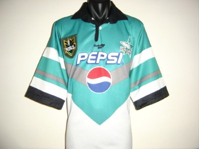
It can't not be the top one, that screams Sharks in the 90's to me. They wouldn't be dumb enough to commemorate a super league jersey.
Love that sharks 95 jersey, although I bet theylll slap the sponsor right over the top of the stripes instead of incorporating it in like Reebok

.jpg)
its a crap jersey though. the superleague one.
bring back the 96 jersey
And I also recall seeing the Roosters in a white alternate jersey with a solid V made up of horizontal blue & red stripes - can't find a picture of it anywhere, but would love to see it brought back.

This one??
90s jerseys have been revived in past few seasons for the Warriors (1995 original jersey), Panthers (Allsorts black & allsorts white), Manly (Pepsi jersey) & Newcastle (vertical stripes) - and why not?
Up until Superleague's horrid templates, the 1990s was a great time for jersey design.
Some 1990s jerseys I'd love to see in upcoming seasons are:
Warriors 1995 away (White, with red/green/blue trim)
http://upload.wikimedia.org/wikiped...New_Zealand_Warriors_away_jersey_1995.svg.png
a Gold Coast "big stripes" jersey
http://www.oldrugbyshirts.com/img/s...rs-home-rugby-shirt-1992-to-1993-s_1007_1.jpg
Penrith 1995 diagonal "alternate" jersey
http://en.wikipedia.org/wiki/File:Penrith_Panthers_Alternate_Jersey_1995.svg
And I also recall seeing the Roosters in a white alternate jersey with a solid V made up of horizontal blue & red stripes - can't find a picture of it anywhere, but would love to see it brought back.