Foreign Legion
Coach
- Messages
- 12,087
Very nice indeed... I think it's time to change the logo
Souths take note.
God the Roosters have the best merch/jersey design/sponsorship intergration. It's all class and as an organisation really get it.
Roosters alternate for 2015.

i dont get why there's a red box. surely you cna make the stripes go across and stop just before the lettering, and even through the spaces like the bottom stripe could continue between the S and the second G. someone get on MS Paint!!
but credit in this day and age, at least its a red box unlike the f**king white box nrma used on the 2014 broncos away jersey
This, OR the company that spends a gazillion in sponsorship wants it's logo in white letters reversed out of a red background.
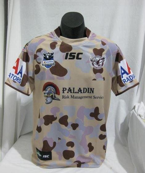
Manly ANZAC jersey. Oh dear...


Manly ANZAC jersey. Oh dear...

While looking for the Manly 2012 ANZAC jersey on Goole images I found this:
:sarcasm:
