Russell Crowe's Band
Referee
- Messages
- 22,026
Sharks WIL
apologies about the size

apologies about the size
Last edited:
Yeh, im usually an advocate for traditional jerseys. But the Roosters Blue jumper is just so dull.
And this Red one looks AWESOME!!!!!
I think it's clean and subtle, Doc. Could use an old school collar though
The second from the right looks like Croatia.Wigan are letting fans vote on next year's home jersey
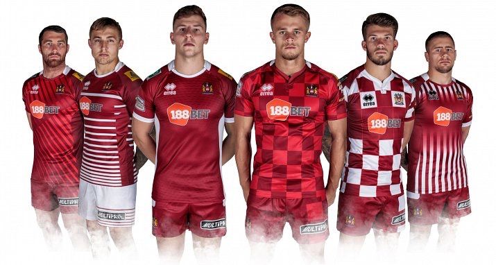
Members get an email link
Fans can go in to the retail store to vote (smart...likely to buy something while they're there!)
")
The sky blue one?
its a winner IMO
Sharks WIL
apologies about the size
What's with the extra sponsor on the chest?
I remember the Bullfilth having an extra sponsor on the lower back of their jersey and the NRL said they couldn't have it. Maybe Cronulla is just for WIL round?
I think it's clean and subtle, Doc. Could use an old school collar though.


preachI am one of the biggest defenders of traditional kits.
But I have to agree with HITD here, the Roosters jersey bores me too.
I much prefer their striped jerseys over the years.
And for some reason, I really dislike it when teams have a coloured jersey and white shorts (i.e. Roosters, Manly, old Titans). I think it looks weak. Would rather roosters in navy shorts and Manly in maroon shorts.
Titans look much better these days with matching shorts
Despite the Prince-Rogers photo there didn't the Titans ultimately match the shorts with the kit once it got onto the field?

