What's new
The Front Row Forums

Register a free account today to become a member of the world's largest Rugby League discussion forum! Once signed in, you'll be able to participate on this site by adding your own topics and posts, as well as connect with other members through your own private inbox!

2016 Jerseys, Sponsorship, Logos Discussion

The Marshall

Juniors
Messages
625
Hopefully parra have some decent stuff this year

Our stuff always looks cheap and tacky

I think that's because your stuff is made by Blades the dogs had Blades for a couple of years and the quality and designs were terrible. On the other hand since they have moved to Canterbury its been the complete opposite besides some nine's jerseys.
 

kdalymc

Bench
Messages
4,320
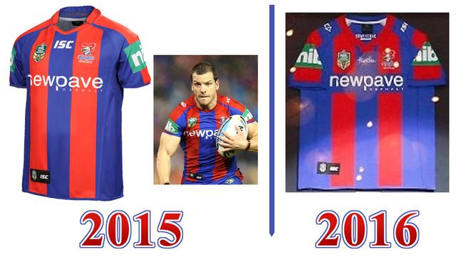
The 2016 Newcastle jersey hasn't lost any stripes down the side. It seems as though the shoulder and sleeves have gone back to the 1997 style of being hoops (as opposed to one big red stripe that runs down from the collar over the shoulder and down the sleeve). The front of the collar is a different shape now too, I see.
The red vertical stripes on the front of the jersey seem to be a wee bit thinner as well.
The other real difference that I can see by the photo posted in here is -as already mentioned- the Newpave sponsorship has a blue box behind it now ('Why?' is a question I'd like answered! It's not necessary...), and that little Huntley logo up top on the front.
NK%20main%20jersey%20comparison2015-2016.jpg


The slightly increased presence of blue on the 2016 version tends to make me think the alternate will have more of a red theme ... which I'm not unhappy with.
I know they did an almost all-red kit in about 2006 that wasn't all that well-received, but that wasn't handled the best in my opinion. If they'd used their regular blue shorts and socks, it would have been fine.

Holy f**k you're right. Just looks like it when it's spread flat,
The 1997 did actually have red side panels so looked more even too
 

steeden.

Juniors
Messages
708
Why don't I have permission to view this image?

yeah not too sure, was on my phone. Anyway, it looks like this (and also shows a closer look of the ISC collar, which is at throwback to last decade somewhat)
11176548-large.jpg


Looks to be keeping with the three year rotation of jerseys. 2013 was predominantly black with some white/gold Vs. 2014 was a single horizontal butcher stripe, and 2015 (for the 150 year celebrations) was the traditional irregular hoops
 
Last edited:

LESStar58

Referee
Messages
25,496
yeah not too sure, was on my phone. Anyway, it looks like this (and also shows a closer look of the ISC collar, which is at throwback to last decade somewhat)
11176548-large.jpg


Looks to be keeping with the three year rotation of jerseys. 2013 was predominantly black with some white/gold Vs. 2014 was a single horizontal butcher stripe, and 2015 (for the 150 year celebrations) was the traditional irregular hoops

That is a solid shirt
 

Nuke

Moderator
Staff member
Messages
5,071
Holy f**k you're right. Just looks like it when it's spread flat,
The 1997 did actually have red side panels so looked more even too

Yes, the 1997-2000 jersey included another red stripe down each side, and the sleeves were hooped all the way down.
102473-newcastle-knights.jpg
 

Nuke

Moderator
Staff member
Messages
5,071
I love those shorts! They had them for the first 10-11 years of existence (I still have a couple of pairs); 1988-1996 with one stripe, 1997-2000 with two (although the checkers were gone after 1997 I think.
 

phonetic

Juniors
Messages
1,626
So does that hull jersey have two major sponsors in the middle of the vee?

SL jerseys Starting to resemble Italian continental cycling teams in terms of slapdash sponsorship showings.
 

some11

Referee
Messages
23,464
It would be in Minstergate's interests to inquire about integrating the branding a bit.
 

Latest posts

Top