What's new
The Front Row Forums

Register a free account today to become a member of the world's largest Rugby League discussion forum! Once signed in, you'll be able to participate on this site by adding your own topics and posts, as well as connect with other members through your own private inbox!

2016 Jerseys, Sponsorship, Logos Discussion

flippikat

Bench
Messages
4,766
It now seems that the stripe across the chest is the new thing - Cowboys, Eels, 2014-15 Dragons away, Broncos U20's, etc...

Not that its inherently a bad look, just gets boring seeing all teams trot out slight variations on the one theme.

It's not new for teams to copy each other though.. just look at how Norths (Citibank design), Manly (Pepsi shirt) & the Cowboys (1995 jersey) all made variations of the "block and stripes" concept that Penrith pioneered with the allsorts jersey in 1991.

Plus before that you had the 1986 Eels, and 1988 Broncos & Knights designs that were variations on blocks & stripes too.
 

big hit!

Bench
Messages
3,452
i give those cowboys kits four thumbs down.

i agree with some..............build an identity around a home kit. new releases can incorporate minor modifications.

i guess there's no better time to release a shit kit set than just after a premiership. most fans won't give a shit.
 

insert.pause

First Grade
Messages
6,446
WIL jersey is random, I really don't get what stars & space are supposed to do with it other than being pink/purple.

Nine's jersey looks warriors-esque

H&A aren't too bad.
 

LESStar58

Referee
Messages
25,496
A clearer look at the Cowboys from the online shop:

home:
NQ16HJS1P-F-400.jpg


away:
NQ16AJS1P-400.jpg


indigenous:
NQ16HJS5P-PJY16-D0-LS-400.jpg


wil:
NQ16HJS3P-F-400.jpg


9's:
NQ16HJS4P-F-4001.jpg

The away and the Indigenous look great. The home is awful and the WIL is naff.
 

LESStar58

Referee
Messages
25,496
I love simple designs, with traditional designs, but as a 9s jumper that is epic! Beautifully done, also live that all clubs are represented in the jumper, goes well with the spirit that the 9s comp is played in.

The Dragons appear to have kick started a dreadful Ed Hardy tattoo jersey trend...
 

beave

Coach
Messages
15,638
The best analogy I can come up with in regards to the Cowbs jerseys is watching someone down the pub playing darts, hitting the bullseye only for the dart to bounce off and hit old mate in the foot.

Hitting the bullseye- adopting blue+grey as the catch cry/theme and dropping the yellow. Big thumbs up and a mad amount of kudos for the club going back down this path.

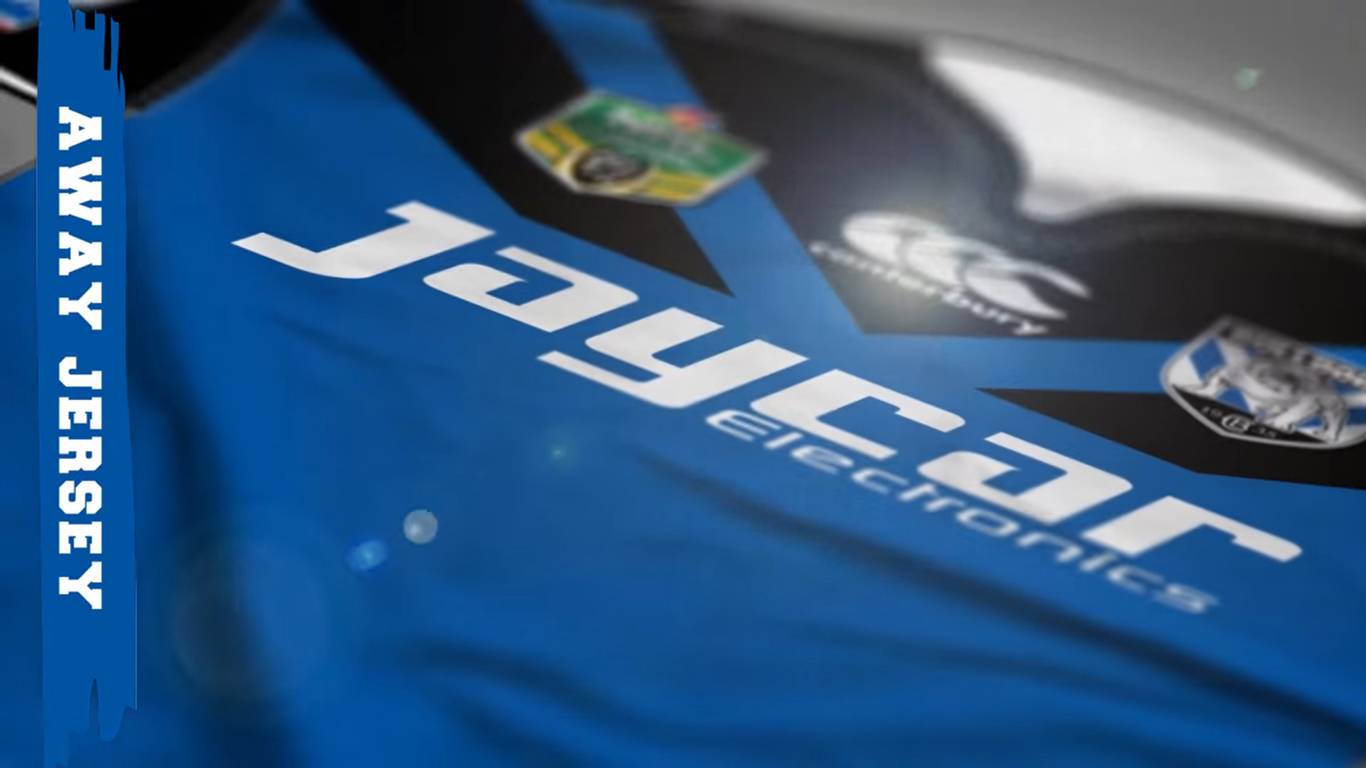
Hitting the foot- everything else about the damn things. The themed jerseys are what they are, whatever, wonder where the anzac jersey is though??...... So onto the home and away. The instagram pics do them no justice so I'll stick with the other images for judgement. They seriously look like the cheap ass team polos you buy your pop for xmas. The collars are woeful but may not be the clubs fault as i think ISC are doing that for everyone. Sleeve sponsor integration is crap. Having graduated and double sized stripes through the logos (who keeps allowing stripes through the logo area? Honestly!!!!)is a fail, having 2 different sized stripes for a start is a fail IMO. Makes it too busy through the chest. The away at least when you squint kinda looks like the 1995 but other than that, pffffffft. Im owed a jersey from our GF win after a bet, I think it will be the away jersey I will demand from my mate, thank chr!st im not paying for it because they're pretty average jerseys IMO.

Always 1 step forward but 2 steps back for us and our merch. Drives me friggin nuts.
 

Saint Doc

Coach
Messages
11,065
The Dragons appear to have kick started a dreadful Ed Hardy tattoo jersey trend...

Haha yeah the 3 previous warriors jerseys and 2 previous dogs jerseys on the same style had nothing to do with it...it was the dragons who started it :sarcasm:
 

carcharias

Immortal
Messages
43,120
The away is dogshit
Grey?
The home looks like a boring club Union jersey
The indigenous looks like they stuck everything left over in the arts and crafts box on it
The purple one looks like it has nothing to do with the Cowboys what so ever - I'm sure the storm love it.
And the nines looks like the dogs gave them one of their recent shit ideas.
 

Rex Terp

First Grade
Messages
6,808
The nines jersey is the only one of the Cowboys ones I like.

They seem like weird choices to me. Not sure what the go is. But very average.
 

GAZF

First Grade
Messages
8,744
It's not new for teams to copy each other though.. just look at how Norths (Citibank design), Manly (Pepsi shirt) & the Cowboys (1995 jersey) all made variations of the "block and stripes" concept that Penrith pioneered with the allsorts jersey in 1991.

Plus before that you had the 1986 Eels, and 1988 Broncos & Knights designs that were variations on blocks & stripes too.

I'll concede that but those styles were longer term trend. 1986 Eels all the way to the mid-late 1990's is a long time. Now trends sweep through the league in 1-3 seasons and then disappear. Following these trends is an easy trap to fall into.
 

beave

Coach
Messages
15,638
Is it just me or does the cowbs 9's jersey look like the warriors logo????? Toyota logo being the tongue, team and nrl logos the eyes........

NQ16HJS4P-F-4001.jpg
 
Last edited:

thorson1987

Coach
Messages
16,907
I actually don't mind those cowboys jerseys. (except the indigenous and WIL ones).

As someone said, swapping the shorts around on the home and away jersey would make them look better.
 

LESStar58

Referee
Messages
25,496
Haha yeah the 3 previous warriors jerseys and 2 previous dogs jerseys on the same style had nothing to do with it...it was the dragons who started it :sarcasm:

They also started the trend of giving away penalty tries in grand finals... :sarcasm:
 

Timmah

LeagueUnlimited News Editor
Staff member
Messages
100,949
Is it just me or does the cowbs 9's jersey look like the warriors logo????? Toyota logo being the tongue, team and nrl logos the eyes........

NQ16HJS4P-F-4001.jpg

First thing that cropped to mind with that one was the Bulldogs' away kit lol

20151102191809-CBY2.jpg
 

flippikat

Bench
Messages
4,766
I'll concede that but those styles were longer term trend. 1986 Eels all the way to the mid-late 1990's is a long time. Now trends sweep through the league in 1-3 seasons and then disappear. Following these trends is an easy trap to fall into.

True, but at least the most frustrating recent trend - un-necessary side panels - seems to be on the way out. :)

I'd love to see blocks & stripes make a comeback as a trend, though.
 

Latest posts

Top