What's new
The Front Row Forums

Register a free account today to become a member of the world's largest Rugby League discussion forum! Once signed in, you'll be able to participate on this site by adding your own topics and posts, as well as connect with other members through your own private inbox!

2016 Jerseys, Sponsorship, Logos Discussion

carcharias

Immortal
Messages
43,120
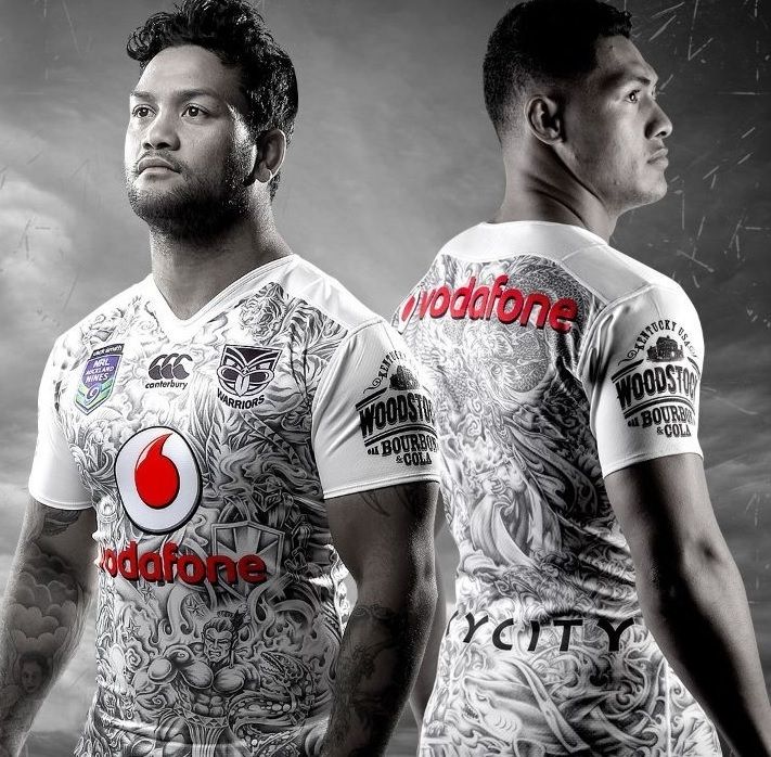
If I'm honest, this is exactly what I thought when I looked at them
The shitty collars on them make them look like horrid polo shirts

I got nothing against the team
its the shirts.
maybe its the stripes and the ugly colour combo.
That particular blue and grey and yellow are all wrong together
Just crap.
 

mxlegend99

Referee
Messages
23,146
Warriors 9s jersey

2016%20nines_zpssgvgfyk7.jpg


Edit: Sorry about the page stretch, image resized now :)
Are we sure this is legit? It actually looks.... good. I really like it. Not getting smashed in the face with millions of bright colours.
 

Charlie124

First Grade
Messages
8,509
Ok that's a better look. Love the home and away ones, WIL is a bit meh and I'm not a fan of the nines one but last years was worse, we're probably one team that weren't "out there" enough with our nines jersey design, it's boring compared to most others.

Overall I'm happy though, I didn't mind the vee design we had for the last couple of years so I wouldn't have been opposed to an updated version of that but this one is nice and simple.
 

GAZF

First Grade
Messages
8,744
Don't mind the Cowboys on seeing the detailed pics. The existing stripes are pretty outdated as is and don't really suit a tighter jersey. Seems like the chest stripe is the new V though.
 

DiegoNT

First Grade
Messages
9,378
Maybe the instagram pics had to much going on in the back ground and all the colourful jerseys (indigenous, 9s, wil) together, but when they are on their own the jerseys ain't that bad.
 

some11

Referee
Messages
23,632
First time I've seen sleeves that run down to the forearm.

Apart from that they look pretty good.
 

PARRA_FAN

Coach
Messages
17,358
Do you think it would look better if it was white shorts with the home jersey and the other way around for the away jersey?

Either way it looks pretty good, and so does that Nines jumper.
 

kdalymc

Bench
Messages
4,322
^Yes!
A full white away kit is ridiculous. Melbourne did it a few years ago... Ewww

Also Lol at the stubby cooler fans


I like the cows 9s jersey, it reminds me of the "let's go overflow"
 
Last edited:

Hello, I'm The Doctor

First Grade
Messages
9,124
I just wish they would pick a design, stick to it and try to build a proper f*cking brand....

The Home is nice and im glad the away is in grey instead of white.

Edit: i do love that they have ditched the V. that is so overused in RL.
 

hellteam

First Grade
Messages
6,532
I would like to see a photoshopped version of that Cowboys pic with the home and away shorts switched around....
 

Charlie124

First Grade
Messages
8,509
I just wish they would pick a design, stick to it and try to build a proper f*cking brand....

The Home is nice and im glad the away is in grey instead of white.

Edit: i do love that they have ditched the V. that is so overused in RL.

Why? And who else has really done this besides lol@50uff$ and the Dragons? I can't think of any other clubs who've kept the same designs year after year. I didn't mind the V designs from the last couple of years but as others have said, every team has a bloody V now. The more I look at the new home and away jerseys the more I like them.
 

Lambretta

First Grade
Messages
8,689
Why? And who else has really done this besides lol@50uff$ and the Dragons? I can't think of any other clubs who've kept the same designs year after year. I didn't mind the V designs from the last couple of years but as others have said, every team has a bloody V now. The more I look at the new home and away jerseys the more I like them.

Roosters, Souths and Dragons have a definitive brand

They're the only clubs

Newcastle and the Broncos keep trying to do it and then get distracted by fashions of the day
 

Lambretta

First Grade
Messages
8,689
The detailed pictures of the Cowboy's home and away jerseys are much, much better than the original picture put up. Maybe it was the grainy quality on my phone

I agree that they'd probably look better if dark shirt, light shorts and vice versa. But most fans wear shirts with boardies in Townsville, so as long as they wear white boardies, they'll look fine on supporters :p

The collar threw me. It did look like a polo shirt on first glance, but on second look it isn't a deal breaker
 

GAZF

First Grade
Messages
8,744
Oh, and another vote here for getting away from the over-used V

It now seems that the stripe across the chest is the new thing - Cowboys, Eels, 2014-15 Dragons away, Broncos U20's, etc...

Not that its inherently a bad look, just gets boring seeing all teams trot out slight variations on the one theme.
 

Latest posts

Top