- Messages
- 5,427
That's the 2016 heritage jersey
Fair enough. My bad. I was away travelling for 3 months midseason and apart from checking the scores online on the weekends, I didn't really pay an awful lot of attention to the footy.
That's the 2016 heritage jersey
ahh the yearly "Q logo" post.
Next on the rotation but be the "interlocking letter logos", yes?!
I had no idea i had a fan club...
Or is it "stalker"?
"interlocking letter logos"?
As in monograms? Very AFL kind of thing.
In other news,
So I've solved the mystery about the fact sometimes the new redv looks great and sometimes it looks warped.
It's all got to do with the size of the jersey.
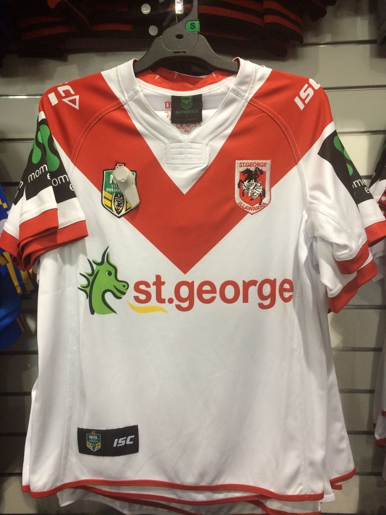
I just saw them in person for the first time. Size small is pretty close to perfect. I'd say that is what is shown in the Mick Simmons picture above

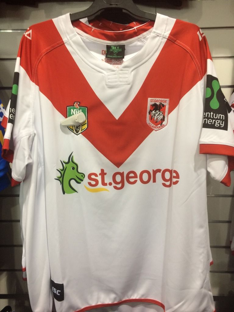
But the bigger the jersey, the more and more warped it looks. I'm an XL, I still thought it looked good, but much beyond that it became all out of shape. Here is the biggest jersey on the rack for comparison

Maybe they have been designed to eliminate potential nipple stags?They just look like factory seconds. I just want to push the logos up 5cm each its annoying me. It is very un-ISC like to produce such a wonky chevron.
I don't know why, but I really like the look of the third oneThis is interesting. Perhaps these were the other logo options?

Club monograms are generally a rugby (league or union) thing, it's kind of funny that AFL has turned to them."interlocking letter logos"?
As in monograms? Very AFL kind of thing.
Come on @Hello, I'm The Doctor tell him your idea!!


In other news,
So I've solved the mystery about the fact sometimes the new redv looks great and sometimes it looks warped.
It's all got to do with the size of the jersey.
I just saw them in person for the first time. Size small is pretty close to perfect. I'd say that is what is shown in the Mick Simmons picture above

But the bigger the jersey, the more and more warped it looks. I'm an XL, I still thought it looked good, but much beyond that it became all out of shape. Here is the biggest jersey on the rack for comparison

The Dragons logo is at least 2cm above the NRL logo. Regardless of the drunken 'V' surely you could take a minute to line the logos up.
Overall those 2 pics are like a woman topless at 20 and again at 50. Its all just drooped and gone a bit wonky.
Your last paragraph could have done with some inverted commas to really drive it home.The only way to avoid the 50 year old version in your analogy looking worse than the 20 year old version is to whack in some fakies. Which would then highlight the rest of the flaws in the 50 year old. In this instance, they're obviously trying to go back to a more organic historical execution.
The top of the Telstra T is lined up with the top of the Dragons logo. It's a conscious decision that probably came from the NRL. I've dealt with them before, they're a bit funny like that. Not funny 'hah ha' but more funny 'there is some seriously flawed logic in your requirements but if you tell me it has to look like this and i keep telling you it shouldn't but you keep telling me it has to, don't come to me when people say it looks rubbish' funny.
Your last paragraph could have done with some inverted commas to really drive it home.
It looks like the bottoms of the logos are aligned, not the tops, if anything.
Given club logos are so cartoonish, id like to see them produce a simplified version and classic versions for casual fanwear.

Clearly this can never happen.......


