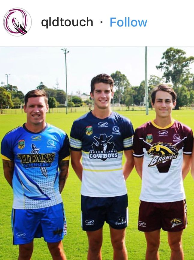
Couldn't they just base a new home jersey (either of the 2 on the left) on this "heritage" design which would then allow the "heritage" to fit in nicely as their "away".
View attachment 17737
Beave maybe you should follow your touch football team instead!

I really like this. The middle one (black top and bottom) is a bit close to Penrith's Allsorts jersey, so I'd go with the following set:
HOME: Blue yoke, multicolour stripes, BLUE under the stripes.
AWAY: Blue yoke, multicolour stripes, WHITE under the stripes.
ALTERNATE: Blue yoke, multicolour stripes, GREEN under the stripes. (Anyone care to do a mockup of that? Vodafone logo may need a box or a different colour instead of red)
Like the look but the horse has bolted unfortunately. Unless the Warriors rebrand to Auckland with the introduction of NZ2, I wouldn't want to see them switch colours yet again.I think this is what you had in mind:
View attachment 17771
Not bad if they are willing to ditch the black. Green one would be unnecessary. The good thing about having the black is that it incorporates both the old and the new which should keep everyone happy.
If you replaced the big cowboys logo with a Toyota badge half this forum would jizz their pants.The big logo in the middle ruins it.
They have 4 logos in a diamond arrangement, NRL Touch (left), manufacturer (top middle), QLD Touch (right) and the ridic oversize team logo (bottom middle), looks terrible.
They should wear the green specifically on away trips to CanberraI think this is what you had in mind:
View attachment 17771
Not bad if they are willing to ditch the black. Green one would be unnecessary. The good thing about having the black is that it incorporates both the old and the new which should keep everyone happy.


Beave maybe you should follow your touch football team instead!

Take a look at how well the grey, yellow and navy combination has been presented on Matt Scott's training top as opposed to the all navy jersey and shorts. That training top has the perfect ratio of the 3 colours and cannot be mistaken for anything other then NQLD. Their last couple of jerseys have not embraced this.
View attachment 17635
They should wear the green specifically on away trips to Canberra
I think this is what you had in mind:
View attachment 17771
Not bad if they are willing to ditch the black. Green one would be unnecessary. The good thing about having the black is that it incorporates both the old and the new which should keep everyone happy.
With SL-era rules?


I think this is what you had in mind:
View attachment 17771
Not bad if they are willing to ditch the black. Green one would be unnecessary. The good thing about having the black is that it incorporates both the old and the new which should keep everyone happy.
Now Ive seen a mock-up, I'd be inclined to just use the blue and the green one. Who needs a white away jersey anyway?
If you replaced the big cowboys logo with a Toyota badge half this forum would jizz their pants.
