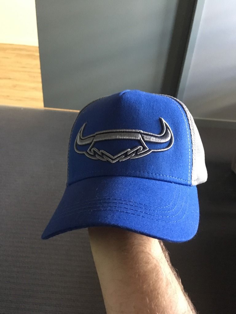
I was talking about this on the cowbs forum last week. Our horns logo is pretty tired these days. Whilst I don’t mind when the star and the word mark is removed and just the horns by thselves are used (there’s a trucker hat this year that just has the horns and its not too bad)
i really think a refresh is in order.
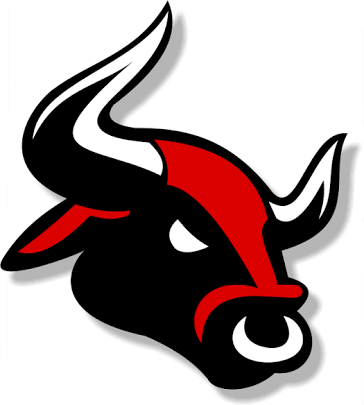
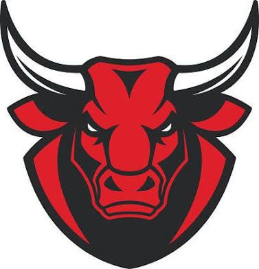
There’s 2 paths they can go down. Continue focusing in on the cow/bull element with something along the lines of these
^ i actually think with some colour tweaks (change the red/ black to navy/grey) and simplification this one could look really good
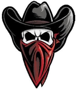
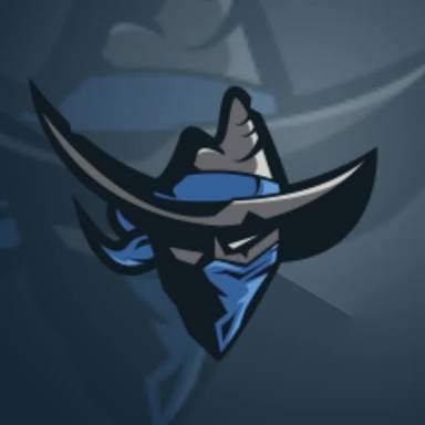
Or the could focus more on the human element of their name with something like these-
^ this is too busy but just an example of an idea
^^ i actually love this one. The hat looks legit akubra, agressive enough and not too busy for embroidery/merch. I’d love if they went down the path of something like this.

