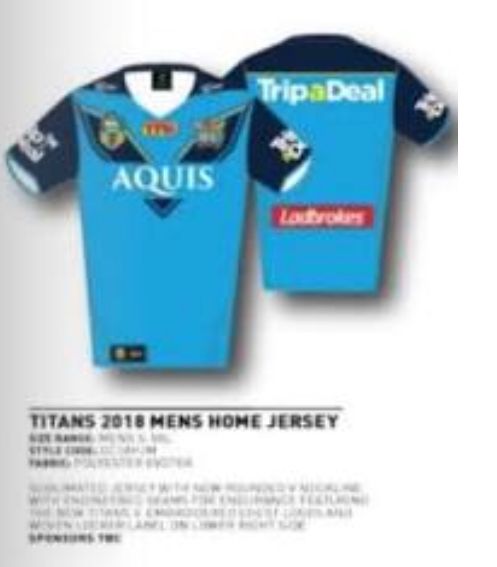
I am very underwhelmed by the jersey.
They need to bring back GOLD, its core to our brand. And stop with helmets and swords. The sponsor is also too high up on the chest.
GAZF's design is impressive and most of his designs are on point for whatever clubs, reps or nations he is working on.
http://gazf.info/gold-coast-titans-primary-2018/#respond
I'm sick and tired of people working at these jersey companies just producing substandard designs.
GASF attempts to expand on the Greek theme, which may be a bit too far but is certainly something new and he is is buying into the brand.
He has a strong golden V which isn't cut by any sponsors. He has a focus on light blue or as he terms it pacific blue. The numbering on the back is a thing of beauty.
The Titans should considering commissioning him.
Redeeming qualities of the 2018 jersey are that it is largely light blue and not dark.
I think the best design involves these elements;
1. Majority light blue
2. Gold V
3. Dark blue on shoulders, perhaps blended
4. I liked the sleeves of 2015, throw back to 2007 side panels
I'm sorry I can't be positive about it. I'll still buy one. And I appreciate that TFH has done us a solid favour by stepping up as major sponsor.


