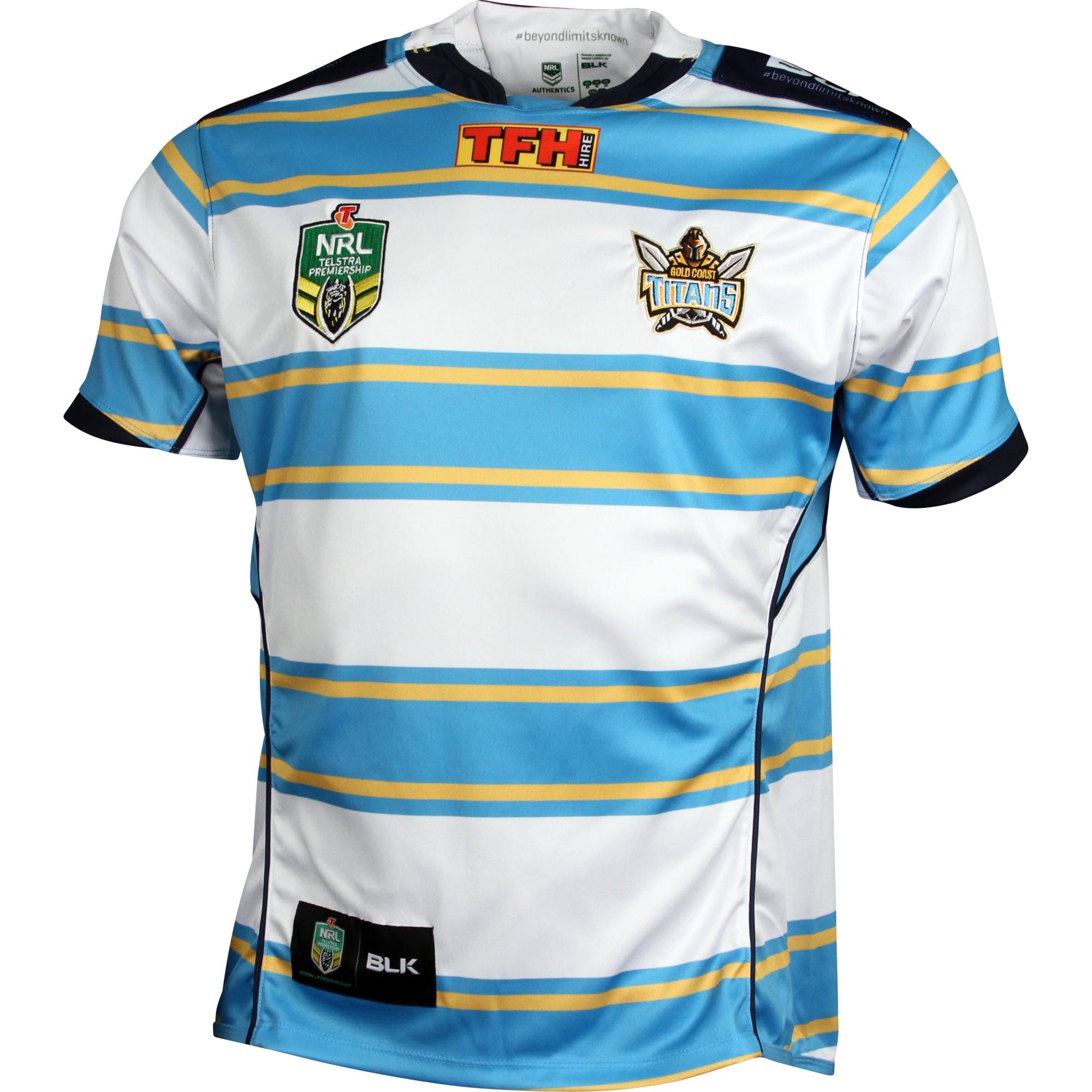
Dated. You can still have a classic design that doesn't look dated, maybe not in rugby league, but they do exist."Dated"? ...... or "CLASSIC"!!!!
Home: (but with a lighter shade of blue)

Away:

Not hard

Not hard


Ive always thought the butcher stripes had the most potential, but they keep f*ckingup the colour order. It should be
Home:

Away:

The gold should NOT be on the blue....
Home: (but with a lighter shade of blue)

Away:

Not hard
We have a winner, see Titans it really isn’t that hard!


They’ve been doing it for about 10 yearsEven the AFL is now jumping on the ‘give the premiers their own premiers logo’ just like the Preimer league does. How long till we see this in the NRL? Maybe a gold NRL logo?
View attachment 16804
Ive always thought the butcher stripes had the most potential, but they keep f*ckingup the colour order. It should be
Home:

Away:

The gold should NOT be on the blue....
This was their best design but they still messed it up with unnecessary piping and panels. Otherwise, the colours are really well balanced and the amber-yellow is a nice variation on their regular gold.
Seems odd to think but plenty of clubs have made at least 2-3 changes in the last ten years.
Broncos - Nike & ISC
Bulldogs - Nike, Blades & Canterbury
Dragons - adidas, Reebok, ISC, Blades
Panthers - ISC, Asics, Classic
Eels - ISC, Blades, back to ISC
Tigers - Blades & ISC
Storm - Reebok, Kooga/BLK, Star, ISC
Knights - Kooga, Blades, ISC
Oh god, a classic turning into a walking billboard.
Seems odd to think but plenty of clubs have made at least 2-3 changes in the last ten years.
Broncos - Nike & ISC
Bulldogs - Nike, Blades & Canterbury
Dragons - adidas, Reebok, ISC, Blades
Panthers - ISC, Asics, Classic
Eels - ISC, Blades, back to ISC
Tigers - Blades & ISC
Storm - Reebok, Kooga/BLK, Star, ISC
Knights - Kooga, Blades, ISC
