What's new
The Front Row Forums

Register a free account today to become a member of the world's largest Rugby League discussion forum! Once signed in, you'll be able to participate on this site by adding your own topics and posts, as well as connect with other members through your own private inbox!

2019 Jerseys/Logos/Sponsorships

gzerounian

Juniors
Messages
1,094
There is the perfect amount of yellow on the jersey now in my opinion. From memory didn't they have yellow numbers in 2017 then back to white in 2018?
 

Timmah

LeagueUnlimited News Editor
Staff member
Messages
100,985
There is the perfect amount of yellow on the jersey now in my opinion. From memory didn't they have yellow numbers in 2017 then back to white in 2018?
I can't remember precisely, I thought the yellow numbers were only on heritage jumpers
 

Cumberland Throw

First Grade
Messages
6,543
The nrl Telstra prem logo looks ok when it backs on to a solid colour..

Looks weird when it runs through a V

And looks very weird when it runs through a solid colour but the backing shield is a total different colour to the jersey.. ie sharks..

Why did they make it so hard for themselves .
 

sempmrh

Juniors
Messages
1,211
I can't remember precisely, I thought the yellow numbers were only on heritage jumpers
The numbers in 2017 were yellow all year before going back to white in 2018. I would have to check on the 2018 heritage jersey but I believe they were white, too.
 
Messages
8,480
Tonight’s game is a perfect example to me of a jersey thats sponsorship blends in beautifully on the design versus another that’s sponsorships look completely mismatched.

The storm jersey is a cracker.
The Broncos looks like bumper stickers have been slapped all over it.
 

gzerounian

Juniors
Messages
1,094
The Broncos "gold" just keeps getting deeper every year just like their "maroon" has. Their numbers are actually purple but that might not be their fault as the NRL supplies the numbers. Making both colours lighter would just make them look so much more "Broncos"
Screen Shot 2019-03-14 at 9.29.56 PM.png
 
Last edited:

Timmah

LeagueUnlimited News Editor
Staff member
Messages
100,985
The Broncos "gold" just keeps getting deeper every year just like their "maroon" has. Their numbers are actually purple but that might not be there fault as the NRL supplies the numbers. Making both colours lighter would just make them look so much more "Broncos"
View attachment 28061
It's so deep I would argue the referees kit should've been either yellow or green tonight, the red is a greater clash on the long angle camera.
 

DeeJ

Bench
Messages
3,119
Watching the Broncos tonight, the shorts and even parts of both jerseys reminded me of the old Brisbane Bears uniform.

nma-acc-20182042-255-wm_o3_640.jpg
 

Lambretta

First Grade
Messages
8,689
I have to say I thought both the kits on display tonight looked brilliant

OK, so the Broncos shades are darker, but I prefer that.

Both kits were clean, nicely designed, not busy, no stupid side panels and uniquely represented their clubs

Thumbs up from me
 

kdalymc

Bench
Messages
4,345
The nrl Telstra prem logo looks ok when it backs on to a solid colour..

Looks weird when it runs through a V

And looks very weird when it runs through a solid colour but the backing shield is a total different colour to the jersey.. ie sharks..

Why did they make it so hard for themselves .
I have said it before, but it’s been absolutely f**ked up in its roll out and execution.
Some also mentioned some teams have a ‘badge’ whilst some just have the outline... this is so bodgy.
And the different colours, dont get me started. Trust nrl to f**k up everything they touch
 

gzerounian

Juniors
Messages
1,094
I have said it before, but it’s been absolutely f**ked up in its roll out and execution.
Some also mentioned some teams have a ‘badge’ whilst some just have the outline... this is so bodgy.
And the different colours, dont get me started. Trust nrl to f**k up everything they touch
I posted this very early on but if they wanted a badge, they should have done this. Knowing what we know now, I would change the the yellow into white and make the telstra logo coloured so that it would match exactly with the on field grass logo we saw last night.
IMG_20190315_081026.jpg
 

Artiste

Bench
Messages
2,960
Hope the Tigers use more orange this year, no one else has orange.
As a Manly fan I wish we'd do more with our uniform, some shade of blue accent or at least more white. Bring back the white shorts. We seem to have the exact same uniform for the last 3 years now. Bit boring..
 

hrundi99

First Grade
Messages
8,414
Hope the Tigers use more orange this year, no one else has orange.
As a Manly fan I wish we'd do more with our uniform, some shade of blue accent or at least more white. Bring back the white shorts. We seem to have the exact same uniform for the last 3 years now. Bit boring..

Huh? They've changed the stripes and they look a lot better.
 

Saint Doc

Coach
Messages
11,091
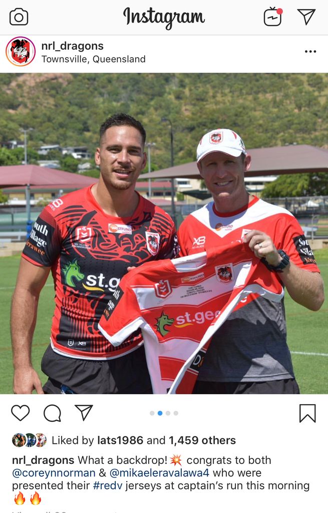
Dragons playing in our alternate jersey tomorrow (disappointing - no reason not to start the season in the red v)

Also what looks like their Captains Run / Run Out Jersey
5C40E8B4-C6F5-42DA-B888-3FE5231F66C0.jpg


76392948-E4B1-4471-B44A-9106A30F714E.jpg
 

Timmah

LeagueUnlimited News Editor
Staff member
Messages
100,985
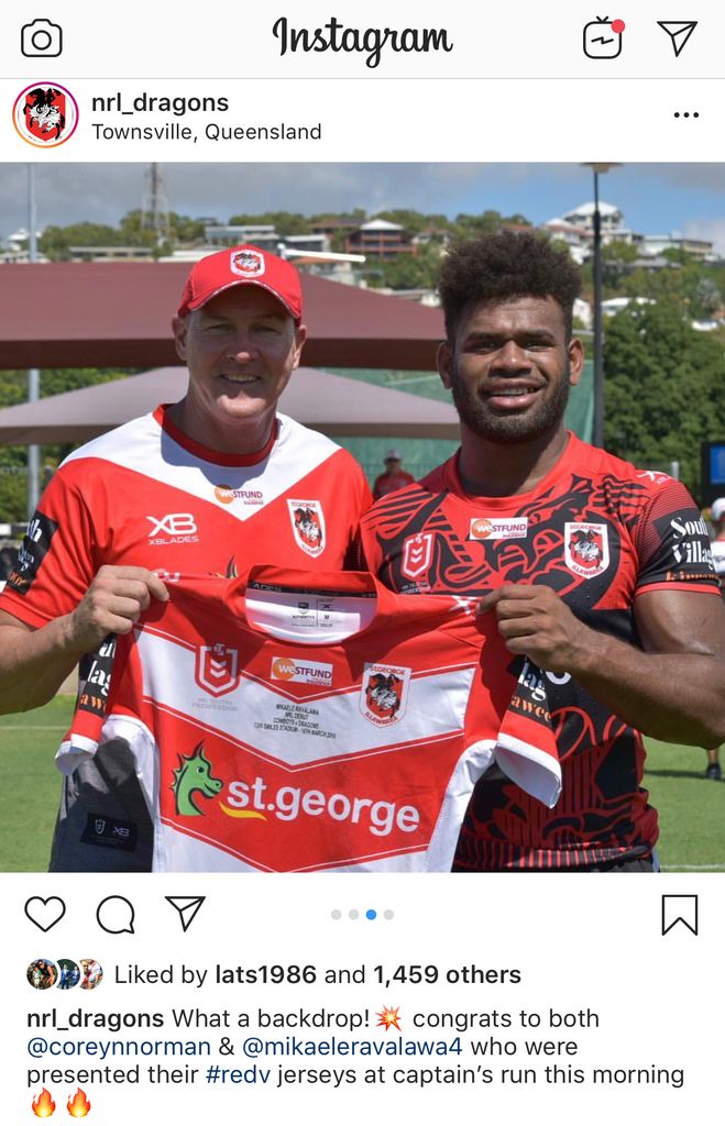
Dragons playing in our alternate jersey tomorrow (disappointing - no reason not to start the season in the red v)

Also what looks like their Captains Run / Run Out Jersey
5C40E8B4-C6F5-42DA-B888-3FE5231F66C0.jpg


76392948-E4B1-4471-B44A-9106A30F714E.jpg
When I saw the referee kit listed as green I thought that might be the case. It'll probably only be seen a handful of times this season.
 

Latest posts

Top