What's new
The Front Row Forums

Register a free account today to become a member of the world's largest Rugby League discussion forum! Once signed in, you'll be able to participate on this site by adding your own topics and posts, as well as connect with other members through your own private inbox!

2019 Jerseys/Logos/Sponsorships

greenBV4

Bench
Messages
2,510
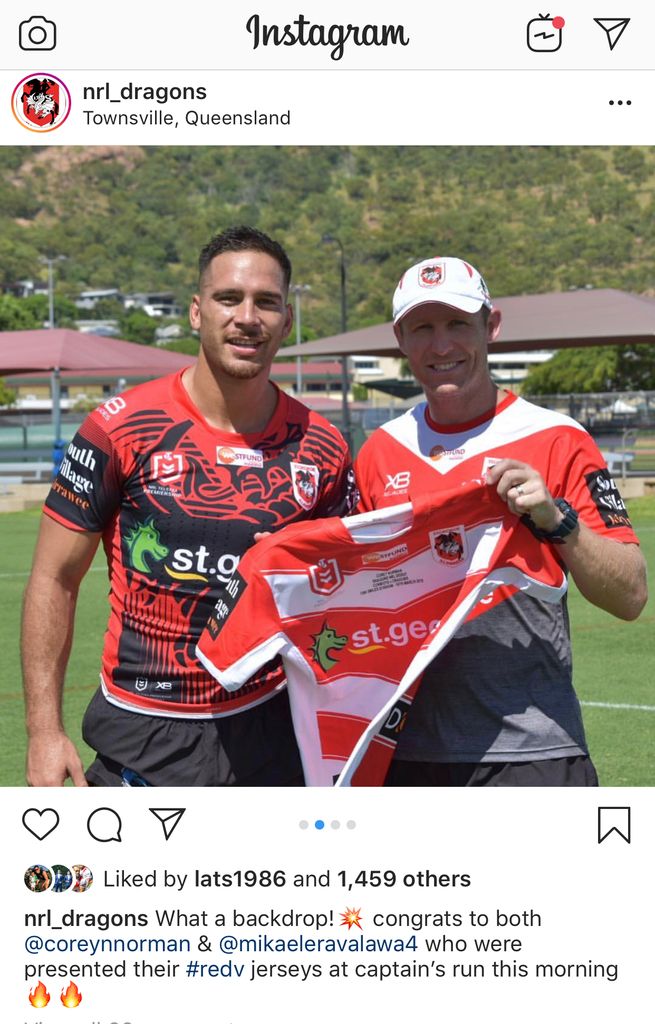
Dragons playing in our alternate jersey tomorrow (disappointing - no reason not to start the season in the red v)

Also what looks like their Captains Run / Run Out Jersey

5C40E8B4-C6F5-42DA-B888-3FE5231F66C0.jpg
do run out jerseys usually have the premiership logo (I'm 99% sure storm's doesnt)? could it be an alternate jersey?
 

Rooster8

Juniors
Messages
432
How good do jerseys look with only a main sponsor! While the circumstances are terrible, the Sharks jersey looks so much better with just a main sponsor on the front and blank everywhere else. Can't imagine how further good the current jerseys would look if the NRL/clubs had enough money to only allow 1 sponsor on the jersey, and enforce club branding over sponsor branding.
 

sempmrh

Juniors
Messages
1,211
How good do jerseys look with only a main sponsor! While the circumstances are terrible, the Sharks jersey looks so much better with just a main sponsor on the front and blank everywhere else. Can't imagine how further good the current jerseys would look if the NRL/clubs had enough money to only allow 1 sponsor on the jersey, and enforce club branding over sponsor branding.
Even if every club was rolling in money they’d never go backwards when it comes to sponsorship.
 

Cumberland Throw

First Grade
Messages
6,543
Even if every club was rolling in money they’d never go backwards when it comes to sponsorship.

They are going backwards now.

South's don't have sleeve or top back

Newcastle no top back

Sharks no back top bottom or sleeve

Eels no bottom back

Manly no top back

Etc


This year be perfect just to restrict back to 1 sponsor
 

sempmrh

Juniors
Messages
1,211
They are going backwards now.

South's don't have sleeve or top back

Newcastle no top back

Sharks no back top bottom or sleeve

Eels no bottom back

Manly no top back

Etc


This year be perfect just to restrict back to 1 sponsor
That's not a choice they've made, though. If those clubs could get a sponsor to fill those positions they would.

It's really only the Broncos and the Bulldogs who have made a choice to have one less sponsor by keeping the apparel brand logo below the collar instead of moving it to the shoulders to fit another one in.
 

greenBV4

Bench
Messages
2,510
neds betting did a 2019 jersey ranking,

I think I disagree with nearly all of this..

.....
2019 NRL Jersey Rankings
Written by James Caughlin
March 15, 2019


The NRL is back and that means one thing, a whole bunch of new jerseys!

The NRL is always a mixed bag when it comes to jerseys, leave me out of Super Hero Round, but there are actually some rippers this season.

We have ranked the jerseys of every team from worst to first and if you don’t agree with the rankings… well that’s what the comments section is for.

16 – Sharks
It’s been a rough offseason for the Sharks and it’s only fitting they come in at the bottom of the jersey rankings.

While a sponsorless jersey might have an appeal to some, it does look like the Best ‘n’ Less version of the Sharks colour scheme.

15 – Knights
We get a last against second last jersey match-up this Friday night so it might be a good opportunity to find a radio call of this game.

The Knights had a good thing going with the blue and red stripes, but this 1988 throwback that predates about half their squad perhaps should have stayed in 1988.

14 – Raiders
Can you hear that? It’s the boring horn. Nobody in the nation’s capital will mind if the side wins a few games looking like this though.

13 – Rabbitohs
It’s beginning to look a lot like Christmas with the Bunnies red and green scheme.

Problem is the red stripes are either too big or too small depending on what they are going for.

They also get marked down for having an away strip that just changes the trim from black to white.

12 – Eels
Navy and yellow is a fantastic colour scheme for a jersey… when done right.

This is not.

If you’re wearing this out and about you won’t be sneaking up on anybody.

11 – Storm
The Storm have had some brilliant jerseys over the years but… this is not one of them.

Purple can serve a purpose, just ask Prince, and there’s something kind of fitting about Purple Bricks sponsoring them as well.

10 – Warriors
Now we get to the nicer jerseys and thankfully there are more good jerseys than bad.

The Warriors have gone for a classic look that can’t help but bring back memories of Stacey Jones and company in the early years of the team.

9 – Broncos
On its own, the Broncos yellow away jersey is one of the best in the competition but the home one that does slightly drag down the average.

They’ve stuck with the maroon look that’s synonymous with the Broncos and for the most part kept the winning formula.

8 – Sea Eagles
The Sea Eagles away jersey follows a similar pattern to some of the higher ranked jerseys with a classic V stripe look and the home jersey is pretty much the same as last year’s one, which was a solid entry if unspectacular.

7 – Panthers
The Panthers have hit a home run with this jersey that will make them one of the most aesthetically pleasing teams this season.

It’s not flashy, it’s not overdone, it just works.

6 – Bulldogs
You will sense a running pattern in some of the higher ranked jerseys in this list, tradition.

The Bulldogs white and blue mix looks excellent.

5 – Dragons
A classic style of jersey, the Red V is an iconic look and… as much fun as it would be to pot it, it just looks good. Add in an away jersey that is very unique and it’s an excellent combination.

4 – Roosters
You may be sick of seeing them at the business end of the season but you can’t mess with a classic design and the tricolours have to be in the mix in this list.

3 – Cowboys
No changes to the 2018 strip and in all honesty, why would you change something that looks that nice?

2 – Titans
It’s a bold change for the Titans to go away from the ocean blue to a more navy blue colour scheme but it works well.

They haven’t ditched that light blue look completely with the heritage jersey though as a flashback to their foundation year.

We are also big fans of the Neds logo smack bang in the middle!

1 – Tigers
The Tigers look for 2019 was already considered as top notch when it was released and having seen it in person it lives up to the billing.
.....
- https://www.neds.com.au/blog/2019/0...8kox6-yn8t2L5CzRtK_QmEWifbNP3lYb7VfRjAFSTcVaU
 

grouch

First Grade
Messages
8,393
neds betting did a 2019 jersey ranking,

I think I disagree with nearly all of this..

.....
2019 NRL Jersey Rankings
Written by James Caughlin
March 15, 2019


The NRL is back and that means one thing, a whole bunch of new jerseys!

The NRL is always a mixed bag when it comes to jerseys, leave me out of Super Hero Round, but there are actually some rippers this season.

We have ranked the jerseys of every team from worst to first and if you don’t agree with the rankings… well that’s what the comments section is for.

16 – Sharks
It’s been a rough offseason for the Sharks and it’s only fitting they come in at the bottom of the jersey rankings.

While a sponsorless jersey might have an appeal to some, it does look like the Best ‘n’ Less version of the Sharks colour scheme.

15 – Knights
We get a last against second last jersey match-up this Friday night so it might be a good opportunity to find a radio call of this game.

The Knights had a good thing going with the blue and red stripes, but this 1988 throwback that predates about half their squad perhaps should have stayed in 1988.

14 – Raiders
Can you hear that? It’s the boring horn. Nobody in the nation’s capital will mind if the side wins a few games looking like this though.

13 – Rabbitohs
It’s beginning to look a lot like Christmas with the Bunnies red and green scheme.

Problem is the red stripes are either too big or too small depending on what they are going for.

They also get marked down for having an away strip that just changes the trim from black to white.

12 – Eels
Navy and yellow is a fantastic colour scheme for a jersey… when done right.

This is not.

If you’re wearing this out and about you won’t be sneaking up on anybody.

11 – Storm
The Storm have had some brilliant jerseys over the years but… this is not one of them.

Purple can serve a purpose, just ask Prince, and there’s something kind of fitting about Purple Bricks sponsoring them as well.

10 – Warriors
Now we get to the nicer jerseys and thankfully there are more good jerseys than bad.

The Warriors have gone for a classic look that can’t help but bring back memories of Stacey Jones and company in the early years of the team.

9 – Broncos
On its own, the Broncos yellow away jersey is one of the best in the competition but the home one that does slightly drag down the average.

They’ve stuck with the maroon look that’s synonymous with the Broncos and for the most part kept the winning formula.

8 – Sea Eagles
The Sea Eagles away jersey follows a similar pattern to some of the higher ranked jerseys with a classic V stripe look and the home jersey is pretty much the same as last year’s one, which was a solid entry if unspectacular.

7 – Panthers
The Panthers have hit a home run with this jersey that will make them one of the most aesthetically pleasing teams this season.

It’s not flashy, it’s not overdone, it just works.

6 – Bulldogs
You will sense a running pattern in some of the higher ranked jerseys in this list, tradition.

The Bulldogs white and blue mix looks excellent.

5 – Dragons
A classic style of jersey, the Red V is an iconic look and… as much fun as it would be to pot it, it just looks good. Add in an away jersey that is very unique and it’s an excellent combination.

4 – Roosters
You may be sick of seeing them at the business end of the season but you can’t mess with a classic design and the tricolours have to be in the mix in this list.

3 – Cowboys
No changes to the 2018 strip and in all honesty, why would you change something that looks that nice?

2 – Titans
It’s a bold change for the Titans to go away from the ocean blue to a more navy blue colour scheme but it works well.

They haven’t ditched that light blue look completely with the heritage jersey though as a flashback to their foundation year.

We are also big fans of the Neds logo smack bang in the middle!

1 – Tigers
The Tigers look for 2019 was already considered as top notch when it was released and having seen it in person it lives up to the billing.
.....
- https://www.neds.com.au/blog/2019/0...8kox6-yn8t2L5CzRtK_QmEWifbNP3lYb7VfRjAFSTcVaU
Best argument yet for why sports betting should be illegal
 

DlEHARD

Juniors
Messages
823
I really wanna give it to NEDS over that pathetic review. But the link no longer works.

Edit; OK it's because it is blocked in my country.
 
Last edited:

Cumberland Throw

First Grade
Messages
6,543
That's not a choice they've made, though. If those clubs could get a sponsor to fill those positions they would.

It's really only the Broncos and the Bulldogs who have made a choice to have one less sponsor by keeping the apparel brand logo below the collar instead of moving it to the shoulders to fit another one in.

Roosters and NZ warriors

Actually just whack their front sponsor on the back as well just to fill a slot..

I doubt they actually get paid more for it .

We just need a blanket rule 1 sponsor on the back, I'd say only broncos would blow up
 

Latest posts

Top