What's new
The Front Row Forums

Register a free account today to become a member of the world's largest Rugby League discussion forum! Once signed in, you'll be able to participate on this site by adding your own topics and posts, as well as connect with other members through your own private inbox!

2019 Jerseys/Logos/Sponsorships

Amacd

Juniors
Messages
52
Zoo (or whatever they are called) will be a good change for the Titans. They've mainly done rugby union up to now but what I've seen have been simple, and they have a good template.

Here is the Reds 2019 jersey by them

ef66e7cbbf85d74d4e16e2a165d10ee1
This isnt done by zoo, it is a seprate company. Zoo apparently had problems earlier this year with distribution which allowed them to change suppliers. There has been a rumour that they are indeed the same company but as of yet this is unconfirmed. But i do agree zoo has produced quite good designs which the titans have lacked
 

gzerounian

Juniors
Messages
1,094
Zoo (or whatever they are called) will be a good change for the Titans. They've mainly done rugby union up to now but what I've seen have been simple, and they have a good template.

Here is the Reds 2019 jersey by them

ef66e7cbbf85d74d4e16e2a165d10ee1
At first glance I thought this was the new ISC Qld Origin Jersey. Their logo is very similar to ISC
 

Diesel

Referee
Messages
23,779
Looks terrible

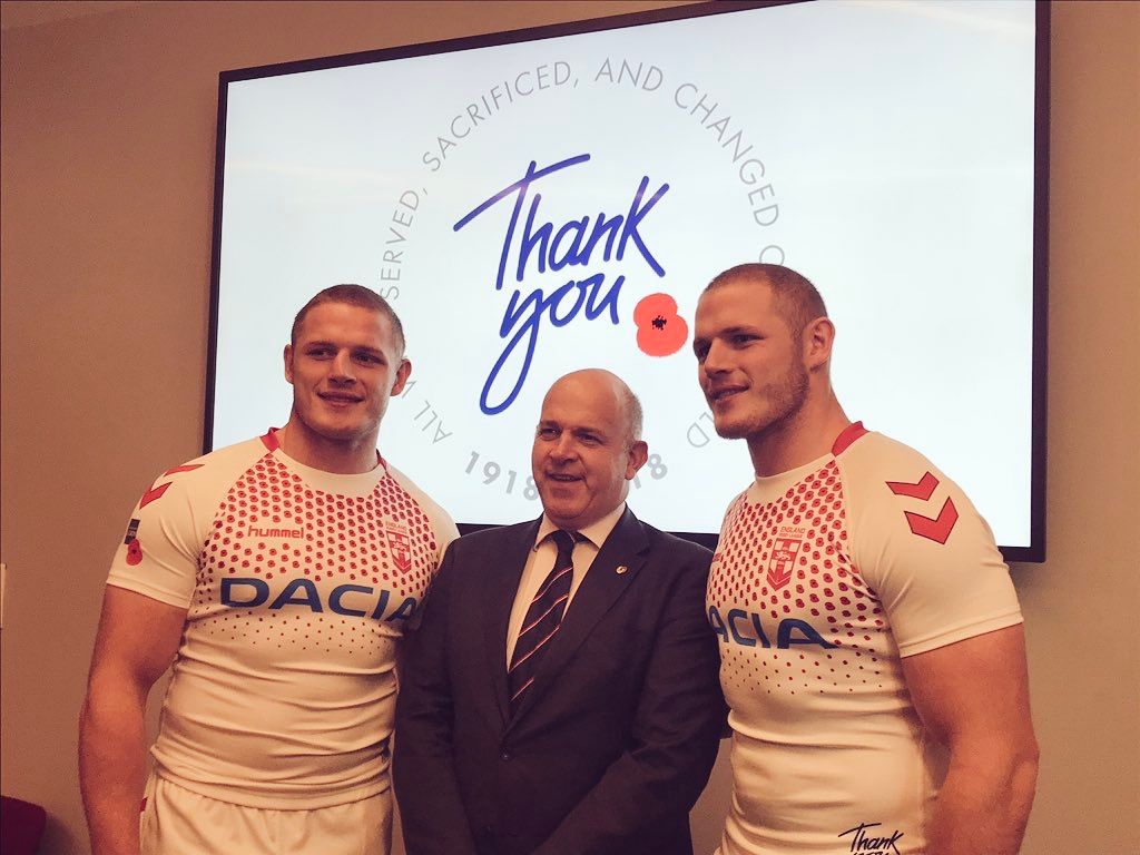
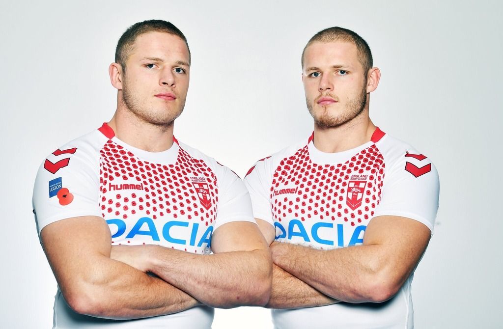
If the wanted poppies on the jersey, why not incoroparate it into a St George’s cross?
 

Pommy

Coach
Messages
14,657
I don’t hate the design but Hummel need to work on the cut of their shirt. It seems to look stupid on everyone.
 

beave

Coach
Messages
15,679
When Hummel did NQ jerseys in the mid 2k’s, the f**king things were very short in body. A XXL was more like a L of all the other brands.
 

Lucev23

Juniors
Messages
44
This isnt done by zoo, it is a seprate company. Zoo apparently had problems earlier this year with distribution which allowed them to change suppliers. There has been a rumour that they are indeed the same company but as of yet this is unconfirmed. But i do agree zoo has produced quite good designs which the titans have lacked
From what I've been told it is the same company essentially.
 

greenBV4

Bench
Messages
2,510
Definitely a tease, hopefully that means we get to see the whole thing soon

that "s" with the lightning bolt was used for the whole finals series this year
 

sempmrh

Juniors
Messages
1,215
This popped up on ISC’s Instagram yesterday for their end of year sale. At a glance it might not look different - but it is.

476968A4-EB06-4BCF-BA86-C171EC240CDB.jpeg
 

greenBV4

Bench
Messages
2,510
Melbourne Storm have today unveiled a new logo ahead of the 2019 season.

Created in collaboration with brand agency WiteKite, the Club is proud to unveil the new logo, which is a natural evolution of the 20-year brandmark of this season.

The progression of the brand will see Storm continue to take an exciting and innovative leap into the future.

The purple trademark remains as an unwavering reminder of what the Storm army and their city are proud to stand behind. The only NRL team to wear the colour - purple has become a symbol of unity and passion for Storm fans and Melburnians over the last 20 years.


Purple will be accompanied by Navy and Grey - a respectful nod to the past whilst embracing a bold, fresh approach to the future. While the iconic Storm Man holding the lightning bolt remain critical elements to the identity of the Club.

The new logo will feature on the Club's 2019 apparel, at Storm's AAMI Park headquarters, while membership packs will also feature the fresh look.

Melbourne Storm CEO Dave Donaghy highlighted the importance of continuing to acknowledge the Club's history while using it as a platform to drive future success.

"Always synonymous with Melbourne Storm will be purple, Storm man and the lightning bolt and that was in the forefront of our mind when determining the brandmark for 2019, following our 20-year celebration.

"The Storm mindset is simple, to be the most professional and respected sporting organisation in Australia by constantly striving to lead the way, both on and off the field. The new logo and brand will be a symbol for the entire Club to stand behind as we step collectively into the future."

The energetic, electric and fresh look will see Melbourne Storm enter 2019 and beyond with a focus on staying ahead of its competition as it continues to strive for sustained success.
- https://www.melbournestorm.com.au/news/2018/10/17/storm-launch-into-a-new-era/
 

Attachments

  • Screen Shot 2018-10-17 at 9.05.20 am.png
    Screen Shot 2018-10-17 at 9.05.20 am.png
    121.6 KB · Views: 8
  • Screen Shot 2018-10-17 at 9.07.15 am.png
    Screen Shot 2018-10-17 at 9.07.15 am.png
    142.9 KB · Views: 7
  • Screen Shot 2018-10-17 at 9.07.29 am.png
    Screen Shot 2018-10-17 at 9.07.29 am.png
    346.1 KB · Views: 8
Last edited:

greenBV4

Bench
Messages
2,510
I don't mind it, the wordmark looks a bit off.. but the logo is simple slick and works well with or without the wordmark, and can also be monotone or other colours

Screen Shot 2018-10-17 at 9.07.29 am.png Screen Shot 2018-10-17 at 9.07.15 am.png Screen Shot 2018-10-17 at 9.05.20 am.png 44118519_10161150721260615_7740435252497088512_n.jpg

my only concern is how it will look on the jersey, especially with the vee it could easily be lost

biggest complaint on social media is the lack of yellow
 
Last edited:

Latest posts

Top