thorson1987
Coach
- Messages
- 16,907
that 2012-2013 is f**king beautiful.
Won't go back to it though.
Illawarra Mafia and all that jazz.
that 2012-2013 is f**king beautiful.
Top left was what I tried to push for.Disclaimer: by no means am I implying that any of these mockups are improvements...in fact in trying to improve the jersey I am convinced now that they have got it 100% correct the way it is. I'm just having a bit of fun with it that's all.
View attachment 24962
I like it too. Its like the Manly Pepsi jersey. Simple but very effective when there are 13 of them on the field.Top left was what I tried to push for.
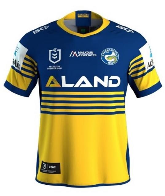
Love this Jersey so much. Should be their main and sleeve sponsors should be shot.Parra heritage jersey. Same as last year's. Chest sponsor must have changed at the last minute as all of the merchandise still shows Malkoun Associates

*eagerly awaits Timmahs “but but but the shoulders!!!”
Love this Jersey so much. Should be their main and sleeve sponsors should be shot.
Probably so the home counts as a "dark" and the away counts as a "light".Why are they two shades of green?

Most of the teams who change their jerseys regularly have already been released. We all know what the Roosters, Dragons and Rabbits are gonna submit as their jerseys, so it's only really Manly, Sharks and the Storm who we are yet still unclear about, although most likely they will keep the same jerseys as last year.
Most of the teams who change their jerseys regularly have already been released. We all know what the Roosters, Dragons and Rabbits are gonna submit as their jerseys, so it's only really Manly, Sharks and the Storm who we are yet still unclear about, although most likely they will keep the same jerseys as last year.
