What's new
The Front Row Forums

Register a free account today to become a member of the world's largest Rugby League discussion forum! Once signed in, you'll be able to participate on this site by adding your own topics and posts, as well as connect with other members through your own private inbox!

2019 Jerseys/Logos/Sponsorships

GAZF

First Grade
Messages
8,754
no mate, I absolutley hate it. We’ve had some shockers in our day but it’s our worst along side the 2008-2010 abstract bulls head one.

I’m not one to harp on and say ‘old school’ is the best school, but NQ nailed it with the original 1995 jersey, and then into 1996 where they flipped the jersey upside down for the the home. Simple, classy and timeless.

GazF has done a modern take on it, this shits all over ‘bullhorns on titties’ every day of the week.
The original is a better design than their current one but its not suited to tighter fits and the number of logos on jerseys these days. The version of mine that you posted would suffer greatly from the addition of sleeve sponsors and/or a change to the vertically stacked Toyota logo.

Something that's based on this could work but you'd struggle to replicate the original given the circumstances.
 

beave

Coach
Messages
15,677
The original is a better design than their current one but its not suited to tighter fits and the number of logos on jerseys these days. The version of mine that you posted would suffer greatly from the addition of sleeve sponsors and/or a change to the vertically stacked Toyota logo.

Something that's based on this could work but you'd struggle to replicate the original given the circumstances.

agreed mate, your version with some tweaks is still 100000% better than ‘horns on titties’.
 

Blues Riff

Bench
Messages
3,351
Bring back the jubblies.

d9f283f0b6bc27ed8297fcf4d380a97c
 

kdalymc

Bench
Messages
4,349
He's wearing it back to front, bless him.
I was, sorry lads.

Nah serious tho, there were both up near the collarbone and felt really wierd. Jumped straight online and see the players version the actual Broncos were wearing and it was the same story...

Like a few years ago when Tigers logos were under the armpits
 

mn_tibor

Juniors
Messages
226
I was, sorry lads.

Nah serious tho, there were both up near the collarbone and felt really wierd. Jumped straight online and see the players version the actual Broncos were wearing and it was the same story...

Like a few years ago when Tigers logos were under the armpits

I just checked them it out in Rebel against last years and the Broncos logon actually doesn't seem much different to last years. The new Telstra Premiership logo starts at the top or slightly above where the Telstra logo was on the old one which makes it fell very high. I agree that they do generally look ridiculously high though.
 

boatboy1269

Juniors
Messages
23
The original is a better design than their current one but its not suited to tighter fits and the number of logos on jerseys these days. The version of mine that you posted would suffer greatly from the addition of sleeve sponsors and/or a change to the vertically stacked Toyota logo.

Something that's based on this could work but you'd struggle to replicate the original given the circumstances.
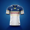
I still think it could work, but even then it would take some sacrifice from Toyota.

I really would be disappointed if they don't move back to it (or something similar in 2020), it's by far their best jersey.
 

Attachments

  • Cowboys.jpg
    Cowboys.jpg
    82.5 KB · Views: 47

sempmrh

Juniors
Messages
1,213
When you compare photos of the new Broncos home and away jerseys on their website, the Telstra Premiership, Broncos and ISC logos are in line with collar on the home while they're sitting lower and in a more normal position on the away. It's the design that's pushing them up - and the logos look spaced a little closer together on the home, too.
 

callmack1

Moderator
Staff member
Messages
12,155
Latest members email for Souths confirms that Aqualand is indeed our new main sponsor as it appears ath the bottom of the newsletter!!
 

Timmah

LeagueUnlimited News Editor
Staff member
Messages
100,987
Broncos team photo today, a good look at their home kit and how it'll pair with shorts and socks.

 
Messages
711
It looks like the Sea Eagles jersey of the mid-to-late 90’s, which was predominantly white.

God, that NRL logo though. I can’t see myself buying a jersey while that’s in force.
 

Timmah

LeagueUnlimited News Editor
Staff member
Messages
100,987
A predominantly gold jersey? I suppose it looks decent enough out of context, but the Broncos just aren’t quite the Broncos without a maroon jumper, IMO.
Press play on the video, it's maroon top and bottom with a gold centre strip, similar design to Cronulla's historical jerseys
 

toomuchsoup

Juniors
Messages
2,255
Last years Broncos was nearly perfect.
This is rubbish compared to it, but they’ve had much worse in the past

At least it looks somewhat like a broncos kit
 

LineBall

Juniors
Messages
1,719
Last years Broncos was nearly perfect.
This is rubbish compared to it, but they’ve had much worse in the past

At least it looks somewhat like a broncos kit
It looks like I might be in the minority, but I quite like the Broncos jersey. It's neat/tidy and uncomplicated. I just wish the wide gold band would go all the way round the back of the jersey as well.
 

Latest posts

Top