What's new
The Front Row Forums

Register a free account today to become a member of the world's largest Rugby League discussion forum! Once signed in, you'll be able to participate on this site by adding your own topics and posts, as well as connect with other members through your own private inbox!

The Game 2021 Jerseys, Sponsorship, Logos etc

MugaB

Coach
Messages
15,043
I just can't keep this one short...

I really don't mind the new design at all, and am of the opinion that a shift in this direction will appeal to a wider market. As cherised as the classic design is, a new fan is less likely to buy a plain jersey (solely consisting of bright colours) to wear casually. The new design at the very least is inoffensive visually and a solid base than can be re-designed iteratively to keep the identity fresh.

Due to the club having had a "jobs for the boys" mentality for decades, all of our success happening in a narrow timeframe, and two ill-advised departures in the late 90's-early 00's, the classic design has never really evolved outside of the changing of the direction of the stripes in 2003-05. The (generally) most rusted-on of fans exist in the age range of 35-60, who have great memories of the green machine era in this design and aren't young enough to be as open to change. Changing the visual direction of the club is certainly easier than telling the Dragons to get rid of the red V, but there is still a huge amount of equity in the look, that fans of other clubs (in this age range) even have a reverence for. But these fans aren't the target audience the club is out to capture, and solely catering to a demographic that is ageing (and will eventually die out) at the expense of the growing newer demographics is bad business for a club that was established in the age of expansion.

Yes, the transition could have been a bit smoother by gradually introducing navy. With the shorts included, the look is very navy-dominant from front-on while the balance looking from the back is about right. A thick green stripe on the shorts would have balanced the colours out a bit better. Navy is absolutely everywhere in the league, and adopting a more desaturated and slightly lighter colour (more slate-ish) would have provided a better differentiator. The contrast between the green and silver is pretty weak, but since it's tied to the new logo they are unlikely to change them; in this case, a thin navy keyline where the two colours meet may have worked. The away design is way too light on green, and perhaps the navy/green could have been swapped while keeping silver as the base.

I would like to think that some of my badgering to the club over the years has influenced this new direction a bit. There are some noticable similarities with a rebrand submitted to the club in 2013/14, right down to the colours and logo font, along with the jersey design submitted for the contest in 2016. This is also just as likely to be parallel thinking, and me being a pompous fool.

I hope the club sticks with their guns on this shift, and doesn't give in to the most vocal fan faction as RL generally does. As much as I love the classic design, it has stronger appeal to the already converted than it does to a new generation of fans. The last thing you can accuse the club of in the last 15-20 years is forcing change for change's sake in this department. Popularity comes in waves for small market teams like the Raiders, and the club should be capitalising on it's current resurgence to maximise the generation of new fans to supplement the one that waned in the late 90's. Just as importantly, the club needs to maintain a balance with the exisiting older generation of fans, like me and most others here. Using the heritage design a lot in the coming years and keeping the traditional blue/gold stripes will also help a new design like this gain acceptance.
Im not a canberra fan, so my opinion on why they need a colour change isn't valid from their own business point of view, but why navy and why silver?
Lime is unique, and sets this club apart from the navy/blue rabble of the rest of the league, unfortunately this just says to me we just want to be the same, or are they hoping the new designs remind fans of the area of the brumbies? is it a throwback to the Queanbeyan Blues, ...not sure, but i look at this new combo of colors and know they have horribly failed, and are going to be close to ruining their identity as the broncos seem to do everytime they short change on the gold, or wests without the orange, they need to lean into what makes them unique, like how the storm have with purple, or how recently penrith and pink
 
Messages
8,480
Im not a canberra fan, so my opinion on why they need a colour change isn't valid from their own business point of view, but why navy and why silver?
Lime is unique, and sets this club apart from the navy/blue rabble of the rest of the league, unfortunately this just says to me we just want to be the same, or are they hoping the new designs remind fans of the area of the brumbies? is it a throwback to the Queanbeyan Blues, ...not sure, but i look at this new combo of colors and know they have horribly failed, and are going to be close to ruining their identity as the broncos seem to do everytime they short change on the gold, or wests without the orange, they need to lean into what makes them unique, like how the storm have with purple, or how recently penrith and pink

I agree.

The jersey isn't the only club merchandise you can purchase to wear around casually. I don't wear my dragons jerseys around town - but I have other polos, jackets etc I do.

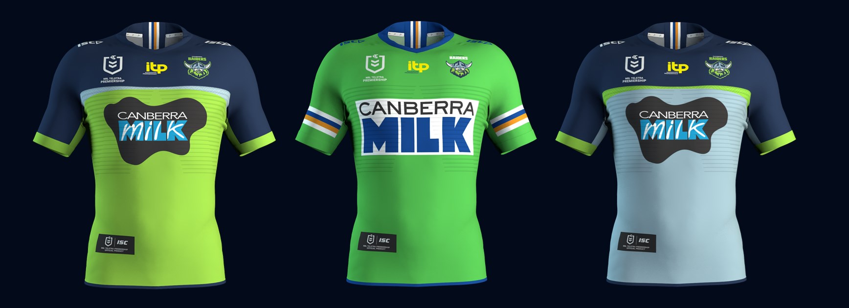
Canberra have possibly had the most distinct jerseys in the comp with the predominant lime green number. While I don't mind the new jersey design this year on it's own - indeed it seems to angle towards "conformity". I hate conformity in this sense.... jerseys....

Simple, unique, well-integrated jerseys are the best by me. Indeed the new 2021 "new" Raiders ones are simple, unique, and sponsors are integrated "ok enough"...

But the left is a different green (yes I know they've changed shades over the years), the right is far more full of conformity. All the comp needs is another blue team in a sea of blue teams.

But look at that absolute banger in the middle!!


milk_website_lead.jpg
.

I don't mind teams giving things a go with their designs. But the jersey shouldn't ever be designed to cater for wearing casually IMO (even though Souths fans do it all the time).
 

MugaB

Coach
Messages
15,043
I agree.

The jersey isn't the only club merchandise you can purchase to wear around casually. I don't wear my dragons jerseys around town - but I have other polos, jackets etc I do.

Canberra have possibly had the most distinct jerseys in the comp with the predominant lime green number. While I don't mind the new jersey design this year on it's own - indeed it seems to angle towards "conformity". I hate conformity in this sense.... jerseys....

Simple, unique, well-integrated jerseys are the best by me. Indeed the new 2021 "new" Raiders ones are simple, unique, and sponsors are integrated "ok enough"...

But the left is a different green (yes I know they've changed shades over the years), the right is far more full of conformity. All the comp needs is another blue team in a sea of blue teams.

But look at that absolute banger in the middle!!


milk_website_lead.jpg
.

I don't mind teams giving things a go with their designs. But the jersey shouldn't ever be designed to cater for wearing casually IMO (even though Souths fans do it all the time).
Another thing that also burns me with sponsor intergration and jerseys these days are the shoulder sponsor covering the stripes that define the jersey, if im a club or a sponsor i want as many billboards (fans) i can get my hands on, not just TV veiwers, people walking the streets in the clubs attire, now if you want me to pay $160 on a billboard jersey or a $70 polo, its gotta show the right colors, look great, and not impead the design, not if they can help it.. i look at parramattas 2020 home jersey and the stripes on the sleeves firstly dont go all the way round, the sponsor is just slapped ontop of the strips, effectively killing the look of what made the jersey special, and the identity of the 4 gold and blue stripes that they are famous for. If im a pawwa fan i buy it coz it looks close to the 80s premiership jerseys, but for $160, its not worth it, when the designers and clubs are agreeing on making merchandise unwearable aswell as expensive, there needs to some sort of policing by the ARLC to atleast make these jerseys both affordable and not look trash and still service the sponsors, it would sell way more merchandise, and promote the game overall
 
Last edited:
Messages
8,480
Another thing that also burns me with sponsor intergration and jerseys these days are the shoulder sponsor covering the stripes that define the jersey, if im a club or a sponsor i want as many billboards (fans) i can get my hands on, not just TV veiwers, people walking the streets in the clubs attire, now if you want me to pay $160 on a billboard jersey or a $70 polo, its gotta show the right colors, look great, and not impead the design, not if they can help it.. i look at parramattas 2020 home jersey and the stripes on the sleeves firstly dont go all the way round, the sponsor is just slapped ontop of the strips, effectively killing the look of what made the jersey special, and the identity of the 4 gold and blue stripes that they are famous for. If im a pawwa fan i buy it coz it looks close to the 80s premiership jerseys, but for $160, is not worth it, when the designers and clubs are agreeing on making merchandise unwearable aswell as expensive, there needs to some sort of policing by the ARLC to atleast make these jerseys both affordable and not look trash and still service the sponsors, it would sell way more merchandise, and promote the game overall


Agreed agreed agreed.

The Stripes on the Raiders Classic is their party piece. They've got Big red Square sleeve sponsors but fro what I've seen they've at least put them above (not over) the yellow, white, blue piping.

Sadly the Newtown Jets white sleeve hoops - a signature of their jersey - have had sponsors slapped over them for a while now - and again this year.
 

MugaB

Coach
Messages
15,043
Agreed agreed agreed.

The Stripes on the Raiders Classic is their party piece. They've got Big red Square sleeve sponsors but fro what I've seen they've at least put them above (not over) the yellow, white, blue piping.

Sadly the Newtown Jets white sleeve hoops - a signature of their jersey - have had sponsors slapped over them for a while now - and again this year.
Newtown jets = Dumb
Parramatta Eels = Dumbest
 

kdalymc

Bench
Messages
4,343
Overall a pretty good year for jerseys. Hopefully Canberra come to their senses and make the heritage their main
your drunk bro? u missed 2020?
this year is down hillllll.


and yep, canberra f**ked up. and theyve realised it before round one......
 

toomuchsoup

Juniors
Messages
2,255
your drunk bro? u missed 2020?
this year is down hillllll.
I mean as an overall view of the comp. I can individually find problems with most of them, but each teams full kit represents their clubs Identity pretty well. For example, if Canberra were wearing their home jersey in this pic and the Titans wore mainly navy again, it wouldn’t do it


and yep, canberra f**ked up. and theyve realised it before round one......
 

Saint Doc

Coach
Messages
11,091
your drunk bro? u missed 2020?
this year is down hillllll.


and yep, canberra f**ked up. and theyve realised it before round one......

Home jerseys

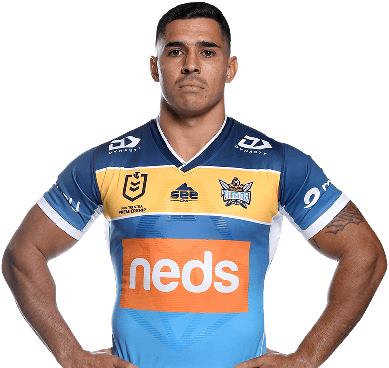
Better
Titans
Warriors
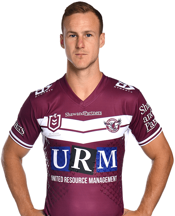
Manly (shorts)

Worse
Raiders (but, heritage)
Tigers

Others
Steady/equal
 

GAZF

First Grade
Messages
8,752
Im not a canberra fan, so my opinion on why they need a colour change isn't valid from their own business point of view, but why navy and why silver?
Lime is unique, and sets this club apart from the navy/blue rabble of the rest of the league, unfortunately this just says to me we just want to be the same, or are they hoping the new designs remind fans of the area of the brumbies? is it a throwback to the Queanbeyan Blues, ...not sure, but i look at this new combo of colors and know they have horribly failed, and are going to be close to ruining their identity as the broncos seem to do everytime they short change on the gold, or wests without the orange, they need to lean into what makes them unique, like how the storm have with purple, or how recently penrith and pink
They still have a predominantly lime jersey when all angles are considered. Historically, Melbourne's use of purple and Penrith's use of pink has been even more limited than Canberra's use of green in 2021 (other than a few patches here and there for Melbourne). Saying that a club has horribly failed and has ruined their identity on this basis is hyperbole.

The previous logo set was made to match the 2000-2002 jersey, whose colours were vilified. Then the club shifted back to its classic design and for the next 20 years, there were 3 greens, white, blue, yellow, black and silver on any given jersey. The whole identity became a mess within 3 years of adopting the logo and should have been addressed way before now. Navy and silver were logical choices, as white/royal/blue/gold would look silly with the logo design as it is, and other dark colours would drift away from the core identity. Its true that plenty of other teams use navy in their identity, but there's also solid practical and marketable reasoning for doing so.

I actually went to rebel this morning and bought a heritage jersey because I have great memories of that period of football as a kid. A lot of the arguments against the change in the home/away stem from a nostalgic point of view, rather than one based on a design's merits or its practicality. The 2021 Eels jerseys have been judged in this thread as being too plain (away) and/or featuring an unnecessary sponsor box (all of them) - guess which overwhelmingly popular jersey does both of these things...

Let's just give the home/away design a season or two. It isn't objectively horrible by any means, just different to expectation.
 

The Great Dane

First Grade
Messages
7,957
There's also this weird thing going on in here where, for some reason, everybody thinks that any change made to the branding or marketing of a club is bad or negatively effects the clubs core identity.

That is simply a misunderstanding of how branding works, and furthermore a stagnate brand is just as bad, if not worse on occasion, then making poor changes to a brand.
 

Reflector

Bench
Messages
2,537
Another thing that also burns me with sponsor intergration and jerseys these days are the shoulder sponsor covering the stripes that define the jersey, if im a club or a sponsor i want as many billboards (fans) i can get my hands on, not just TV veiwers, people walking the streets in the clubs attire, now if you want me to pay $160 on a billboard jersey or a $70 polo, its gotta show the right colors, look great, and not impead the design, not if they can help it.. i look at parramattas 2020 home jersey and the stripes on the sleeves firstly dont go all the way round, the sponsor is just slapped ontop of the strips, effectively killing the look of what made the jersey special, and the identity of the 4 gold and blue stripes that they are famous for. If im a pawwa fan i buy it coz it looks close to the 80s premiership jerseys, but for $160, its not worth it, when the designers and clubs are agreeing on making merchandise unwearable aswell as expensive, there needs to some sort of policing by the ARLC to atleast make these jerseys both affordable and not look trash and still service the sponsors, it would sell way more merchandise, and promote the game overall


Definitely. Slapping sponsorships on with little thought for the design element makes the game look unprofessional. Brand integration should be key to any organisation that wants that professional look.
 

GAZF

First Grade
Messages
8,752
Definitely. Slapping sponsorships on with little thought for the design element makes the game look unprofessional. Brand integration should be key to any organisation that wants that professional look.
Sponsors also seem to be gradually shifting higher on the shoulder where the jersey hardly bunches up. This means that sleeve stripes are being pushed further down the sleeve where they are less visible. Stripes over the shoulder may become more commonplace in the future as a result, like the New England Patriots and Indianapolis Colts.
 

Latest posts

Top