What's new
The Front Row Forums

Register a free account today to become a member of the world's largest Rugby League discussion forum! Once signed in, you'll be able to participate on this site by adding your own topics and posts, as well as connect with other members through your own private inbox!

The Game 2021 Jerseys, Sponsorship, Logos etc

kdalymc

Bench
Messages
4,343
Maybe Canberra forgot they also have yellow? Instead of becoming the 27th blue team in the NRL, do something with the yellow.
It's shit, but unique..?
 

cooko

Juniors
Messages
520
Maybe Canberra forgot they also have yellow? Instead of becoming the 27th blue team in the NRL, do something with the yellow.
It's shit, but unique..?
Maybe canberra forgot they're from the ACT who's colours are royal blue and gold. And then maybe they forgot that they took their other colours from Hall RLFC who's colours were green and white.
 

kdalymc

Bench
Messages
4,343
Maybe canberra forgot they're from the ACT who's colours are royal blue and gold. And then maybe they forgot that they took their other colours from Hall RLFC who's colours were green and white.
Canberra is a city not a state. I know there won't ever be another ACT team but don't treat them like a state team. They picked lime, it was unique. Now they're aiming towards blue, which isn't.
 

GAZF

First Grade
Messages
8,752
Maybe Canberra forgot they also have yellow? Instead of becoming the 27th blue team in the NRL, do something with the yellow.
It's shit, but unique..?
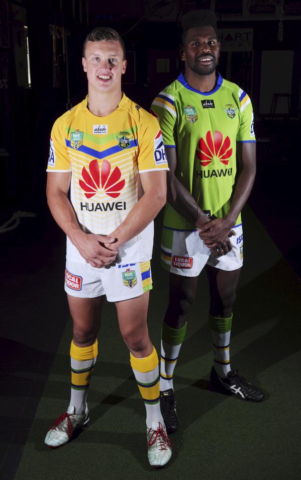
B1KmNR_CYAEmx4B.jpg

Yeah, the old "pissed on shoulders" design was an unmitigated success. The average Raiders fan has 11 of them hanging in their wardrobe.
 

Hello, I'm The Doctor

First Grade
Messages
9,124
Canberra is a city not a state. I know there won't ever be another ACT team but don't treat them like a state team. They picked lime, it was unique. Now they're aiming towards blue, which isn't.

man, way to pick them f*ck nits...

While we’re at it, im actually pretty sure storms dont have people riding the clouds. Hmmm...
 

MugaB

Coach
Messages
15,043
I like canberra wearing lime, its unique, and the green they keep going back to tends to look dull, and this new color combo is crap, not because of the navy, but the way they've used it, their green needs to be ontop, and the navy beneath
 

sempmrh

Juniors
Messages
1,210
I don’t like the new State of Origin logo. Just like the previous Telstra Premiership logo, the previous Origin logo was better. I’m surprised it doesn’t at the very least have at least the State of Origin text under the shield or the Ampol logo on top.

I like the new Puma Maroons jersey but I think it would have been improved by having a white collar. It’s very clean, though - the complete look, shorts and all. Hopefully the Blues are similarly clean - but they don’t exactly have a good track record.
 

GAZF

First Grade
Messages
8,752
I like canberra wearing lime, its unique, and the green they keep going back to tends to look dull, and this new color combo is crap, not because of the navy, but the way they've used it, their green needs to be ontop, and the navy beneath
I prefer the duller green of last year's jersey when the classic design is used. It parallels the clubs wonder years, and contrasts better with the usual white/blue/gold. Going by old photos and merch, the original shade was gaudy and washed out, but the design always looked better balanced and "mature" as the green became darker. The brighter green works well on the new design because it has a dark colour to compliment it and makes for a better contrasting and more legible logo.

Flipping the green and navy on the new jersey would just make things worse imo. Can't really push the yoke line any further up as there is a lot of traffic there as it is. Eliminating the yoke (but keeping the sleeves navy) is an option, but might look a bit "template-y". Working more green into the sleeves could also work, but too much would make it less marketable for casual wear.
 

Timmah

LeagueUnlimited News Editor
Staff member
Messages
100,985
I don’t like the new State of Origin logo. Just like the previous Telstra Premiership logo, the previous Origin logo was better. I’m surprised it doesn’t at the very least have at least the State of Origin text under the shield or the Ampol logo on top.
I think it depends on the applications as to how its presented.

On the NRL website in the draw pages they just use the icon version with no text (similar to NRL).

But when it's used in a larger format - e.g. a corporate hospitality doc, they do exactly what you said

https://www.nrl.com/siteassets/corp...dining--soo-melbourne-2021---booking-form.pdf
 

GAZF

First Grade
Messages
8,752

Latest posts

Top