What's new
The Front Row Forums

Register a free account today to become a member of the world's largest Rugby League discussion forum! Once signed in, you'll be able to participate on this site by adding your own topics and posts, as well as connect with other members through your own private inbox!

The Game 2021 Jerseys, Sponsorship, Logos etc

parrawentyfan

Juniors
Messages
745
You know what, I thought I would hate the Eels and Storm jerseys but...

They don't look that bad. Yes they are a bit boring but at least they are not messy. The sponsor integration is decent.

I think both jerseys look better from far away than up close. For Melbourne the yellow numbers make a big difference.
 

Hello, I'm The Doctor

First Grade
Messages
9,124
Parra look GREAT!!! (I get the hate now, but once people get used to this, I think it will be one of their most popular jumpers ever).

The darker shade of Gold looks great, So much better than the old floresent canary yellow they used to use.
 

Hello, I'm The Doctor

First Grade
Messages
9,124
Early winner of worse kit of the year goes to eels! Looks,like they are wearing a yellow afl guernsey over a blue tshirt!

Nah, all of the hate is just cognitive dissonance; we are just not used to it yet.

The arms feel weirds now, But wait until the end of the season. Once people are used to it, I think most Parra fans will love it.
 

The Great Dane

First Grade
Messages
7,957
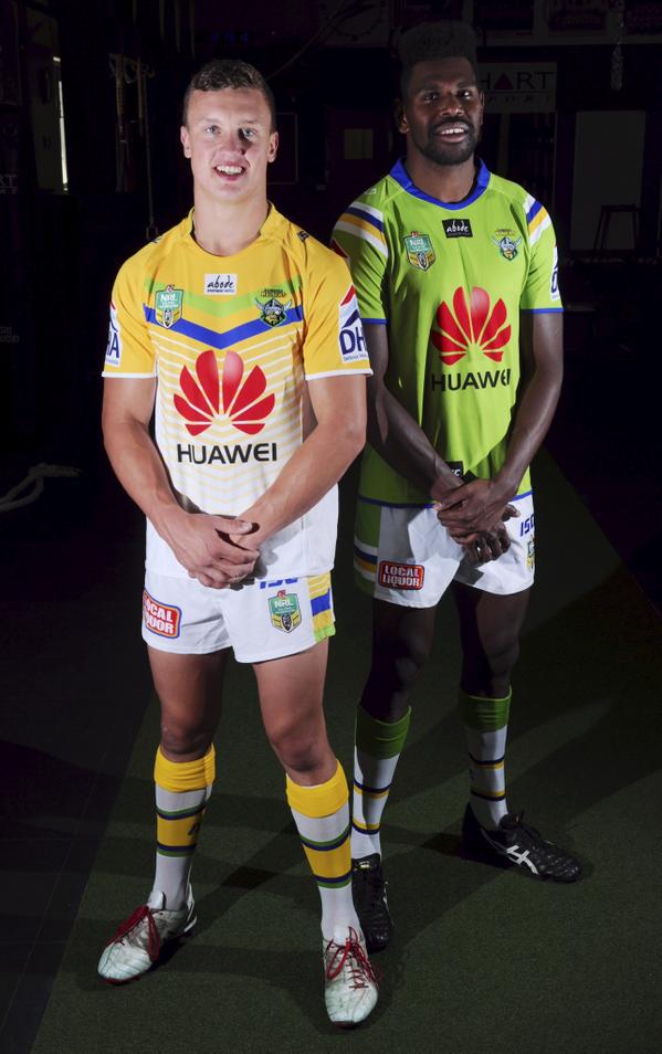
B1KmNR_CYAEmx4B.jpg

Yeah, the old "pissed on shoulders" design was an unmitigated success. The average Raiders fan has 11 of them hanging in their wardrobe.
Hang on, poor execution doesn't mean it was a bad idea in theory.

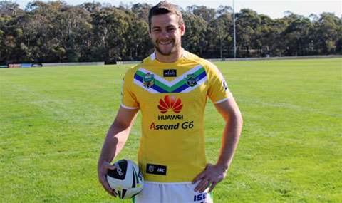
ImageResizer.ashx


The above yellow Huawei jersey from the year before was relatively popular, and there is obviously plenty of potential in green and yellow jersey designs.

If they'd released a yellow version of our home jersey, or any solid design instead of that eyesore, then it probably would have been pretty popular like the Huawei jersey from 2014, and there's a good chance that other yellow designs would have developed from that point.

So yeah, yellow could have have worked, they just botched it.
 

hellteam

First Grade
Messages
6,536
I think the Parra jersey would look better with solid blue shorts, with no yellow side panel on them. Would balance it out more

But I'm a big fan of the jersey. I'm not quite sure why
 

Perth Red

Post Whore
Messages
69,549
I quite liked how the new Storm jersey looked on the field last night. I wish the purple was a little more vibrant, though.

yeh thought it looked good, only spoilt by the red grilld sponsor logo on the back. Still no sleeve sponsor which is a worry for the games top club
 

Latest posts

Top