What's new
The Front Row Forums

Register a free account today to become a member of the world's largest Rugby League discussion forum! Once signed in, you'll be able to participate on this site by adding your own topics and posts, as well as connect with other members through your own private inbox!

The Game 2021 Jerseys, Sponsorship, Logos etc

Messages
8,480
View attachment 44280 View attachment 44281 View attachment 44282

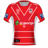
Home jersey: pretty much perfect, would prefer the Vee go up onto the shoulders, but overall they haven’t messed with it so I’m happy.

Alternate: disaster. Clearly trying to incorporate blood and bandages, red vee and Steelers jersey into one design. The result? Putrid.

Heritage: amazing, apart from the collar. No one wants to wear a collar like that in 2020.

Weve got a history of producing awful alternate jerseys but sadly this is the worst of the worst IMO... I honestly wonder who comes up with these designs,, and who in the dragons signs off on them.

The heritage is awesome and collar all fine by me. Much like the Qld jersey this year with a similar collar.. it works great.

But the horror of that alternate... the horror...
 

Diesel

Referee
Messages
23,782
The problem wi
I remember back when I first heard that Wests and Balmain were merging, I just assumed that they would drop orange from their colour scheme and have a white tiger theme.

It just makes so much sense, both old clubs would have been well represented in the brand, it makes logical sense in the context of the brand, it’s a unique twist on a very common sports brand, etc, etc.

For whatever, probably very stupid, reasons, they didn’t do that back in the day, but it’d still be the happy medium if both parties were willing to be reasonable.
The problem with the Wests Tigers is for the past 21 years, they’ve been two clubs playing as one team instead of ONE club, ONE team
 

Dawesy76

Juniors
Messages
278
Hear me out, that dragons away/alt. Same as it now, with. white V....

....or how about, no stripes or stripes, just all red jersey with a white V.
 
Last edited:

jargan83

Coach
Messages
15,008
I love them all. Shits on X-Blades gear from a great height. As I said on Jubilee Ave, other than the polos I reckon we have some excellent on and off field gear for 2021. First time I’ve ever pre-ordered a jersey too - need that heritage!

I was a bit worried after that away jersey leaked a couple of weeks back but having seen the range released on the Dragons website I'm impressed with most of it.

I too have just pre-ordered that heritage jersey!
 
Messages
8,480
Just to nitpick, blue should never been seen on a Dragons jersey. Lazy effort. Some pretty bog average jerseys creeping back in, Tigers worse, Raiders home worse.

Mate that’s not nitpicking, it’s absolute sense.

Bumper stickers on cars are a thing of the past, mainly because modern cars with bumper stickers look awful. But they’ve sadly re-invented themselves to appear on rugby league jerseys... the dragons are no exception..and they look hideous.

Sponsors drive dollars - I get that. But while some clubs are able to successfully integrate sponsors into their design and colour scheme (The Storm a prime example) others like mine sold out to bumper stickers long ago..

I visited the Dragons merch store at the leagues club in September during a trip back to NSW... I wanted to buy a bunch of gear I could take back to SA with me for my missus and her kiddies - but most of the gear on offer looked horrible with blue patches, orange patches, multiple sponsors “patched” onto merch...... it couldn’t look less integrated and unappealing. It was saddening.. It was disheartening..

But I did manage to pick up some “non-sponsored” street wear stuff for them though and they absolutely loved it. Wear it all the time. That’s where it’s at...

It may seem nitpicking to some but like you’ve suggested, blue DOES NOT belong on a dragons jersey.

Like Red does not belong on a bulldogs jersey...etc etc..

And NO TEAM should have shit house bumper stickers on their kit.

“MAKE JERSEYS GREAT AGAIN”
 
Last edited:

MugaB

Coach
Messages
15,391
Pretty sure auto correct hijacked the English language in this instance.

“Insipid” is what was intended, I assume.
Nope its not what i meant, i actually like it, just i didn't remember seeing that away version of their inagural jersey
 

flippikat

First Grade
Messages
5,277
Excuse the dodgy paint job but finishing the vee and removing a few stripes makes that Dragons jersey look a lot cleaner IMO.
View attachment 44291

This is how the "V plus stripes" should have been executed. Reminds me a little of a 1990s Balmain jersey that did a similar thing.

images
 

kdalymc

Bench
Messages
4,351
This is how the "V plus stripes" should have been executed. Reminds me a little of a 1990s Balmain jersey that did a similar thing.

images
i rememberd this the other day, and i think in 98 they just wore big bars, 95 and 96 the "blue stripe" jersey, so last time Balmain actually wore Balmain was 94..
 

GAZF

First Grade
Messages
8,756
This is how the "V plus stripes" should have been executed. Reminds me a little of a 1990s Balmain jersey that did a similar thing.

images
Why won't those gradient stripes die a dignified death? They're as 80's as snorting a line off a piano key neck tie.
 

Loose Cannon

Bench
Messages
4,068
Nope its not what i meant, i actually like it, just i didn't remember seeing that away version of their inagural jersey
I was suggesting Titans choice of vocabulary was auto corrected, if in fact they are marketing it as such, although I did quote your post for reference.

Personally I don’t dislike it either, it is very plain which isn’t a bad thing compared to their usual atrocities.

Checking back through to initial post re Titans away, perhaps “inspired by 2007” was just Klim’s interpretation. (My mistake, I read it as official club released statement).
 

This Year?

Immortal
Messages
36,327
This is how the "V plus stripes" should have been executed. Reminds me a little of a 1990s Balmain jersey that did a similar thing.

images

I like this idea. Maybe add the Illawarra hoops to the sleeves as well to break up the red.
Could even put them on the bottom of the jersey too, but that might make it look too busy.
 

sempmrh

Juniors
Messages
1,215
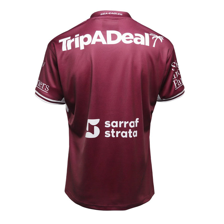
I think the Manly jerseys lose a little something by losing the striped collar from last year - even if it was a strange half and half thing.
 

flippikat

First Grade
Messages
5,277
Why won't those gradient stripes die a dignified death? They're as 80's as snorting a line off a piano key neck tie.

In some cases I think they work (eg separating two blocks of colour).. with a V as well is borderline.. but the worst was Parra's 1990s abomination. A real symbol of their post-dynasty malaise.

images


(Aaaaaaand that's about enough thread-drift from me. Back to 2021 from here on. Promise!)
 
Last edited:

Latest posts

Top