What's new
The Front Row Forums

Register a free account today to become a member of the world's largest Rugby League discussion forum! Once signed in, you'll be able to participate on this site by adding your own topics and posts, as well as connect with other members through your own private inbox!

The Game 2021 Jerseys, Sponsorship, Logos etc

flippikat

First Grade
Messages
5,306
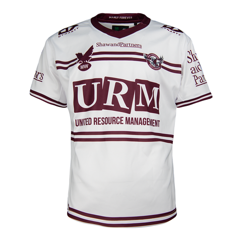
Manly Captains Run Jersey.. (apols if posted previous).

Why oh why isn't this one of their home/away jerseys.

Absolutely mint IMO. Design & Sponsors all come together perfectly. How a jersey should be.

2021_MW_Sea_Eagles_Replica_Captains_Run_Jersey_Mens_SEJRM509CAP_Front_480x480.png
Ea61IPFVAAALhb4.jpg

That absolutely baffles me. They've screwed up their home & alternates for a while now, then come up with THIS classy stuff for a warm-up shirt??

If I was a Manly fan, I'd be LIVID at that.
 

flippikat

First Grade
Messages
5,306
EDIT: Seriously, the whole Titan branding campaign is just so far beyond anything I have ever seen them put out before. It's great that they are going heavy on the gold!! That is what will make them stand out.

To be fair, initially I was disappointed that they went for two-blue & gold after ditching the "Gold Coast Dolphins" brand - I thought they should have kept the orange, turquoise & white from that Dolphins brand.. and was further dismayed as gold became less and less of a feature.. getting closer and closer to Cronulla territory with the blue.

But like you, I'm really pleased to see gold feature more prominently in their jersey now.. not a lot of other NRL teams use that colour, and it's there in the name too!
 

sempmrh

Juniors
Messages
1,216
Saw the Roosters and Storm gear in the flesh today. The jersey material is the same thickness as a training shirt so interesting to see how it handles games and more importantly how it sells.

$160 for a training shirt is a bit steep.

Typically the material used for retail jerseys is different to what is used for player issue jerseys. Saying that, however - the material used for the Castore retails is very similar to ISC’s player issue jersey material. So who knows?

My concern is the overlap collar for Storm (Roosters use a collar almost identical to ISC). It looks to be held together with a single bar tack stitch and could possibly be a weak point.
 
Messages
8,480
That absolutely baffles me. They've screwed up their home & alternates for a while now, then come up with THIS classy stuff for a warm-up shirt??

If I was a Manly fan, I'd be LIVID at that.

I’m with you.

That’s the best Manly jersey since the Pepsi days of the mid 90’s. By far IMO. But it’s merely a training kit.

If I was a manly fan and had 160 bucks to spend on any item for the coming season... it’s going straight on this captains run jersey.
 
Last edited:

Hello, I'm The Doctor

First Grade
Messages
9,124
To be fair, initially I was disappointed that they went for two-blue & gold after ditching the "Gold Coast Dolphins" brand - I thought they should have kept the orange, turquoise & white from that Dolphins brand..

Agreed. Even the worst of the Titans jumpers across the last decade would have been an iconic masterpiece is it had been done in the Dolphines Teal-Orange

and was further dismayed as gold became less and less of a feature.. getting closer and closer to Cronulla territory with the blue.

Worse, it was heading towards a NSW Blues look, which is the opposite of what a proud QLD team should be aiming for

But like you, I'm really pleased to see gold feature more prominently in their jersey now.. not a lot of other NRL teams use that colour, and it's there in the name too!

Yep, the shade of blue that they pick doesnt matter much (I personally love the Dark>Light Top>Bottom gradient as it gives it a top heavy, "strong shoulders" look, but it doesnt really matter). The perfect use of the Titans colours is with the blue as a frame/background and the Gold as the Centrepiece.

Now all they need to do is pick a single shade of Gold (distinct from the Parra jumper) and never ever change it. I like the dark, orangey colour they have picked here. Very distinct!
 

Quicksilver

Bench
Messages
4,366
I want a team to put a player number on front. I’ve seen a few examples floating around of it in years gone by (1970s?)

Good gimmick option for a sponsorless team
 

MugaB

Coach
Messages
15,390
Knights have released a heritage jersey.

Proudly celebrating the 20th anniversary of their 2001 Premiership with this jersey, displaying 2 stars above Knights logo representing premierships in 1997 & 2001.


1310-949.jpg
1311-949.jpg
This jersey looks great, and even the NIB green box logo hasn't ruined it, well done O'Neills!!!, i just wished they were able to fix there home jersey
 

It's Been Done

Juniors
Messages
723
Knights have released a heritage jersey.

Proudly celebrating the 20th anniversary of their 2001 Premiership with this jersey, displaying 2 stars above Knights logo representing premierships in 1997 & 2001.


1310-949.jpg
1311-949.jpg

Not bad at all. Even the nib box doesn't look as intrusive as it normally does, though then again, Flight Centre back in 2001 took up quite a bit of space on the jersey. But if they're celebrating the 1997 premiership, they're better bringing back the Red and Blue Stripes next year
 

DtotheE

Juniors
Messages
11
Not bad at all. Even the nib box doesn't look as intrusive as it normally does, though then again, Flight Centre back in 2001 took up quite a bit of space on the jersey. But if they're celebrating the 1997 premiership, they're better bringing back the Red and Blue Stripes next year


No no no the stripes have been done to death and then more... the stripes have been done and done, stick with our current jersey like the dragons and roosters have stuck with theirs.... have the other designs for the other events like WIL 9’s Anzac Indigenous or Heritage and change away jerseys if need be, but stick with the current home forever... but please can we have the horizontal red panels wrap around the back... the Knights country regional teams have the red panels wrap around the back and use yellow numbers! White numbers are fine but please can we get some pressure on the knights to get the red panels to wrap around the back as it was in the original design and then stick with that jersey for a home for the next 100 years like the Dragons, roosters and South’s....

And please forget about the bloody stripes!
 

DtotheE

Juniors
Messages
11
97 should be a half star...

Just kidding Novocastrians.
Should be larger and gold...
That win saved League in Australia... Manly win that game, Superleague would be the current competition, ARL would have died... that Knights win gave the ARL the negotiation power to form the NRL... we would still have Mariners, Rams and Reds, and more than just north Sydney and south Queensland would have gone... there would be no South Sydney, no Manly, no Wests or Balmain, no Illawarra (even though they are pretty much gone anyway) and (cold shudder) no Knights!
 

Latest posts

Top