What's new
The Front Row Forums

Register a free account today to become a member of the world's largest Rugby League discussion forum! Once signed in, you'll be able to participate on this site by adding your own topics and posts, as well as connect with other members through your own private inbox!

The Game 2022 Jerseys, Sponsorship, Logos etc

Frailty

First Grade
Messages
9,453
Other clubs need to do whatever it was we did to convince the sponsors to ditch their own colours. We don't exactly have massive bargaining power to laud over them, so it appears the other clubs are just either letting the sponsors dictate to them or they're getting paid more to not colour match.

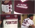
This will be it. Not to mention Manly are also giving PointsBet two sponsorship spaces.

I wish more teams would do it, but ones like Cronulla are bearable. If I were a Knights fan, I'd be livid with the nib sponsorship.
 

Timmah

LeagueUnlimited News Editor
Staff member
Messages
100,985
Same design but different predominant colour.
I’m fine with this, and don’t want the UK Super League/Premier League trend of absurdly designed away kits.
I hate the way they do that.
Yes, keep a traditional-style, easily recognisable kit for your main one. Absolutely.
But for an alternate jersey to be a completely different design AND colour set? Nup. Any casual observers of their games wouldn't know what the away team was. They even, on some teams alternate jerseys, even change the colours of the logo.

Personally, clubs should keep their colours on all jerseys (barring special occasions), but should be free to play around with whatever crazy designs they like on the alternate jerseys, so long as they do actually provide a point of contrast to the main.
This. Contrast in current club colours (plus use of white or black if necessary to assist contrast). Using wacky unrelated colours to the club like in SL is meh.
Given Wests and Gold Coast did logo updates for the "digital enhancements," I have to question which clubs will be next. I'd have to say the Dragons logo is definitely in need of a facelift, same with the Roosters and Manly. I think the rest are pretty 'digital safe.'
Can't see Dragons' main logo changing any time soon. Would create huge uproar.

Roosters I'll address below. Manly tend to agree.

Brisbane and Cronulla probably overdue I'd say. Cowboys could do away with the star too.
Roosters can't be far off a new logo. Pretty sure I read a while back that there's some agreement in place with the Opera House admins which expires soon. The right to have the Opera House's shape in the logo. A new deal would then come into play where the Roosters will have to start paying big bucks to them in order to keep the sails imagery in the logo. Other Sydney-based sporting teams are also going to have to change their logos or pay a lot of money too.

I foresee the Roosters reverting back to an updated version of their 1980s 'Eastern Suburbs' emblem.
RE Roosters I believe they have rights using the current logo til 2026 which is when it's up for renewal. Be interesting to see what direction they go (that logo will be 25+ years old by then, their longest if I'm not mistaken)
 

Frailty

First Grade
Messages
9,453
Brisbane and Cronulla probably overdue I'd say. Cowboys could do away with the star too.

RE Roosters I believe they have rights using the current logo til 2026 which is when it's up for renewal. Be interesting to see what direction they go (that logo will be 25+ years old by then, their longest if I'm not mistaken)
I'm sure I'm in the minority, but I'd like the Sharks to stick with the logo. Sure the text, in particular, is meh but considering it was the logo of the clubs first premiership I think it would be good to stick with. I do have attachments to the 80s/90s logo but to be honest - the shark doesn't look fierce (it looks dopey and whale like).

I wouldn't be surprised to see the Rooster use the logo they've been using on their training gear, etc. Simple logo that can be used on any colour.
 

yakstorm

First Grade
Messages
6,027
I'm not sure why people are so shocked that Pointsbet is both on the front and back of the Manly jerseys, it's not uncommon when a new major sponsor comes on for them to purchase / be gifted more than one spot.

Dragons (St George Bank), Roosters (Steggles) both did this originally, whilst Warriors (Vodafone), Cowboys (Toyota) and Wests Tigers (Brydens) still do it today.

Dragons with St George Bank on both the front & back of their kits.
images


Roosters with Steggles
images


Back in the 90s it was generally the norm for the front of jersey sponsor to also hold the upper back, though in fairness back then the money they'd get was a pittance compared to what Pointsbet is throwing around.
 

GAZF

First Grade
Messages
8,752
I'm not sure why people are so shocked that Pointsbet is both on the front and back of the Manly jerseys, it's not uncommon when a new major sponsor comes on for them to purchase / be gifted more than one spot.

Dragons (St George Bank), Roosters (Steggles) both did this originally, whilst Warriors (Vodafone), Cowboys (Toyota) and Wests Tigers (Brydens) still do it today.

Dragons with St George Bank on both the front & back of their kits.
images


Roosters with Steggles
images


Back in the 90s it was generally the norm for the front of jersey sponsor to also hold the upper back, though in fairness back then the money they'd get was a pittance compared to what Pointsbet is throwing around.
We've been mentally abused by the proliferation of jersey sponsors to the point that a design looks empty without them. Not having enough distinct sponsors is the next logical leap.
 

toomuchsoup

Juniors
Messages
2,255
Sharks, dogs, dragons, all have a light home jerseym that's why they bring out a dark away jersey, however it can only be used against each other so you only see them 2/3 times a year
I still don’t get what you mean… There’s so many teams that aren’t ‘dark’ or ‘light’ but somewhere in the middle. Sharks COULD wear their away against plenty of teams, but it’s only really necessary against the Titans. There’s no clash for the Sharks vs Dragons, sharks vs dogs and dogs vs dragons if they’re all in their home kits.

I’d also say it’s possible for 2 ‘light’ teams to not be considered a ‘clash’. For example, dragons vs Titans or dragons vs Raiders, Both ‘light’ home kits don’t clash at all
 

Craigshark

First Grade
Messages
6,874
This. Contrast in current club colours (plus use of white or black if necessary to assist contrast). Using wacky unrelated colours to the club like in SL is meh.

Can't see Dragons' main logo changing any time soon. Would create huge uproar.

Roosters I'll address below. Manly tend to agree.

Brisbane and Cronulla probably overdue I'd say. Cowboys could do away with the star too.

RE Roosters I believe they have rights using the current logo til 2026 which is when it's up for renewal. Be interesting to see what direction they go (that logo will be 25+ years old by then, their longest if I'm not mistaken)

there’s talk about of the sharks changing their branding ahead of the 2023 season.. safe to assume that would probably include a change to the logo
 

Saint Doc

Coach
Messages
11,090
Manly kits are fantastic. A+

Dragons wouldn’t change their logo. Our board are stuck in the 60’s. When you get an email from St George Leagues (which is essentially the St George half of the JV) this is what the email logo looks like (legitimately- multiple emails, multiple sources). So optimizing their logo for digital application is not high on their agen
95A87AB2-589E-4F31-9761-610AB8D7C573.jpeg

It was also non negotiable for the JV, so it would be hard to un do.
More realistically, they should use this as a secondary/digital logo, but use the main logo on jerseys
 

Latest posts

Top