toomuchsoup
Juniors
- Messages
- 2,255
Looks good, but it barely contrasts the home. Both have a pretty similar proportion of blue and white
Looks good, but it barely contrasts the home. Both have a pretty similar proportion of blue and white
I quite like it, interesting that it’s a new design rather than a heritage replica?PENRITH warm up shirt
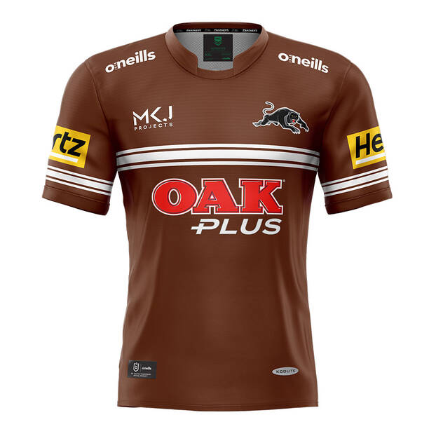
Repect the past, create the future. The Panthers 2022 Men's Warm Up Tee features the iconic brown and white colours, paying respect to the original chocolate soldiers.

You can't see it on the picture, the middle stripes also have the fading lines.The womens jersey looks 100% better than the mens. The stupid disappearing half lines in the patch area on the front does my head in. If you want to do it, drop it down and continue them through the full way. And the lack of little yellow arc line on the females is mint.
View attachment 57850
Is that a subtle chevron on the mens Parra chest?The womens jersey looks 100% better than the mens. The stupid disappearing half lines in the patch area on the front does my head in. If you want to do it, drop it down and continue them through the full way. And the lack of little yellow arc line on the females is mint.
View attachment 57850
Is that a subtle chevron on the mens Parra chest?
I quite like it, interesting that it’s a new design rather than a heritage replica?
I imagine its either a gel grips thing, or its macron trying to subtly add more of their brand onto the jerseyYeah, I was just going to post a similar question. There is definitely two different shades of blue.
It's one of those "it's so subtle, why even bother" instances.
Here is a better photo. They look normalish size, though the back is very busy...Not the best pic but the Eels may have gone with the smaller numbers on the back again so the sponsor is higher up.
View attachment 57856

I hadn't noticed it until you mentioned it... it looks terrible...You can't see it on the picture, the middle stripes also have the fading lines.
I'm not a fan of it. Nothing wrong with normal stripes

That is horrible lol. 8 brands, plus two logos plus a date then squeeze the numbers on. Getting as bad as F1.Here is a better photo. They look normalish size, though the back is very busy...
Given the badges are stitched, this is the retail version and wouldn't have the grips.I imagine its either a gel grips thing, or its macron trying to subtly add more of their brand onto the jersey


