What's new
The Front Row Forums

Register a free account today to become a member of the world's largest Rugby League discussion forum! Once signed in, you'll be able to participate on this site by adding your own topics and posts, as well as connect with other members through your own private inbox!

The Game 2022 Jerseys, Sponsorship, Logos etc

MugaB

Coach
Messages
11,822
Very nice. I had a similar idea recently but with stripesView attachment 55003
I like the stripes, but why aren't they leaning into a white tiger as the away, much like your 3rd kit, but just black and white, without the gold, and keep the 1st one as the home kit... the full black kit is boring, and doesn't suit a team called tigers... its just Wests Magpies pretending again
 

MugaB

Coach
Messages
11,822
Knights NRLW jersey for 2022. New style of NIB logo

The NIB still sucks lol,
Jersey design is still covered, and its a magnificent jersey, an 80s classic heritage,
I like it, but ill love it and buy it, when they lower the sponsor off the red lines, or piss it off completely..... NIB are just the worst
 

cooko

Juniors
Messages
485
Although the Roosters do well with their jerseys, would love them to go towards this from now on. We need to ditch that logo from the early 2000's.
Reports are that they will be using sky blue (which the roosters refer to as 'bondi blue') across their gear more in 2022. I think it's mostly the training range but could mean some more sky blue on the away and any other jerseys.
 

DIEHARDTITAN

Juniors
Messages
52
As a Broncos fan of the 90s I was really pissed off when they changed their logo to the chess piece and junked the Broncos running writing.

Glad to see it back. Maybe with the Dolphins coming in they are trying to reconnect with the 90s glory days.

I imagine this is popular with the fans. I'd love to see a new version of the bucking Bronco again too.
 

MugaB

Coach
Messages
11,822
As a Broncos fan of the 90s I was really pissed off when they changed their logo to the chess piece and junked the Broncos running writing.

Glad to see it back. Maybe with the Dolphins coming in they are trying to reconnect with the 90s glory days.

I imagine this is popular with the fans. I'd love to see a new version of the bucking Bronco again too.
20210717_043609.png
Here tell them to use it, free of charge...
Just get rid of that crap they are currently using
 

Hello, I'm The Doctor

First Grade
Messages
9,124
Official

FA_2vsrUcAgwFWV

Cool!!! (Im pretty sure I posted this like 3 years ago, but I dont need credit for the idea....)

All they need to do is put it of a badge (that Wests hexagon is pretty cool) and its perfect.
 

Illawarra Tiger

Juniors
Messages
75
I don’t mind the Tigers in hoops but I think they might look better in butchers stripes or irregular bars. The white jersey might look better with double black and gold hoops.
 

League Unlimited News

Administrator
Staff member
Messages
7,623
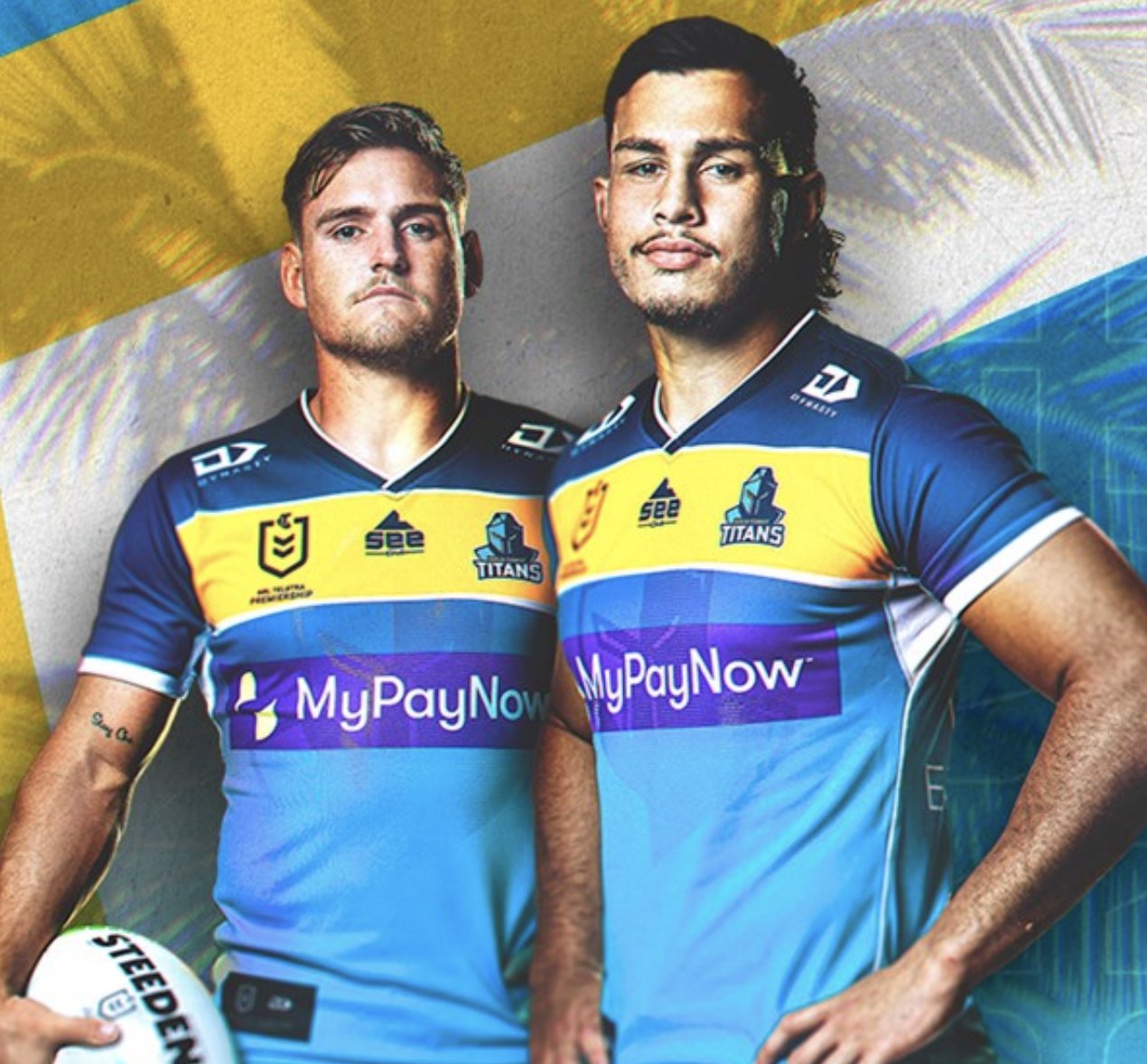
New Titans logo unveiled this morning along with new front of jersey sponsor. Same jersey design.

1634681242109.png

FCGDUGIUUAU3lNN


The Gold Coast Titans have today launched a new look ready to take the club and its crop of young stars into the future.

The re-designed logo brings in the Titans' core colours that were designed to reflect our Gold Coast home and modernises the iconic emblem.

The contemporary logo brings a steely determination, reflective of the ambitions of the current group of Titans players, coaches and staff, as we strive to make our communities proud, inspire them with energy and unite them through success.

At 11am today, Titans CEO Steve Mitchell will outline the Club's strategic roadmap to 2030. Mitchell will address the key areas of focus for the club and how we plan to arrive at these. Return here to read all of the details and hear directly from Steve Mitchell.

What the Titans players have said...

"I think this represents us as the new generation coming through on the Coast." - Tino Fa'asuamaleaui.

"I think it is exciting and I think it is fitting timing with the NRLW side coming into the club and join forces (with the men's side)." - Georgia Hale.


Why the change?

The club is determined to make it's communities proud and, after 15 years, the club has evolved and molded over this time. With renewed optimism and energy towards the future, the time was right to contemporise the logo to match the club's new determination. The colours remain true to their Gold Coast origins and as they were originally created to reflect the sun, surf and sea of the Coast we call home. The new look logo allows the club to maintain our strong, unique and highly recognisable brand, particularly across our popular digital channels.

Who designed the logo?

The Titans worked with local Gold Coast agency Guerrilla to create the new identity - involving owners, staff, players, coaches and Members in the journey to define the Titans' modern identity.

LINK: https://www.titans.com.au/news/2021/10/20/a-new-generation-of-titans/
 
Last edited:

Latest posts

Top