What's new
The Front Row Forums

Register a free account today to become a member of the world's largest Rugby League discussion forum! Once signed in, you'll be able to participate on this site by adding your own topics and posts, as well as connect with other members through your own private inbox!

The Game 2023 Jerseys, Sponsorship, Logos etc

Timmah

LeagueUnlimited News Editor
Staff member
Messages
100,990
Dolphins warm up jerseys have names and numbers which seem to correspond with the game numbers (the ones I've seen anyway). Bit of work to keep that up each week
Would that not be heritage numbering? So the first 17 today are all 1-17 and then any player debuting from next week onwards would get 18, 19 and so on?
 

It's Been Done

Juniors
Messages
719
Surprised to see the roosters in their home kit. Thought with the heat they would their wear white away.
With the jerseys being so thin and designed to allow hot air to escape both on the PIs and Retails, it might not be necessary these days (it definitely was prior printed jerseys). Though I'm not a professional athlete so I can't say how the colour of a jersey affects the players out on the field in the heat
 

Diesel

Referee
Messages
23,774
Would that not be heritage numbering? So the first 17 today are all 1-17 and then any player debuting from next week onwards would get 18, 19 and so on?
The captain, Bromwich is #1, fullback 2, winger 3…
 

MugaB

Coach
Messages
15,384
What’s the reason for white away jerseys? While sone teams can only play white, the Newcastle away clashed with the Warriors home this week. Cowboys/Broncos could play a predominantly gold away jersey, Raiders have 3 other colours to choose from other than white, Roosters could play in red.
If white is part of their colors, then its not an issue for me... the knights probably should have a red alternative (blue shoulders), ive said this many times before, Roosters inagural 1908 jersey is a red jersey with navy and white hoops, not sure why they dont use that, broncos too, they had a yellow inagural '88 jersey, (personally thats my favorite), cowboys a few years back had a silver kit... that is something they shouldve stuck with.
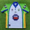
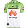
Canberra in white, looks really good, it reminds me of vikings in the snow, or ice giants of norse myths..
 

mn_tibor

Juniors
Messages
226
Am I right in thinking this is the third year of this jersey? Must be the first time in a long time that we’ve had something more than 2 years
Yeah I'm pretty sure. Maybe they are doing it to alternate between new home and away jersey each year. Also there is the city jersey that got leaked in kids sizes. Possibly they figure between new home, city and at least one of ANZAC/Indigenous/WIL that's enough. I've never seen a club purposefully limit the number of new jerseys though!
 

GAZF

First Grade
Messages
8,756
If white is part of their colors, then its not an issue for me... the knights probably should have a red alternative (blue shoulders), ive said this many times before, Roosters inagural 1908 jersey is a red jersey with navy and white hoops, not sure why they dont use that, broncos too, they had a yellow inagural '88 jersey, (personally thats my favorite), cowboys a few years back had a silver kit... that is something they shouldve stuck with.
Canberra in white, looks really good, it reminds me of vikings in the snow, or ice giants of norse myths..

Agree on Cowboys. In fact, the white feels superfluous on their home design, as it's so close to that shade of silver anyway.

Knights would also be a solids candidate for a silver jersey - on theme and a differentiation from the other red/blue teams.

The Raiders away is perfectly fine as a retro design, but drifts too far from the core look. Woefully short on green.
 

MugaB

Coach
Messages
15,384
Agree on Cowboys. In fact, the white feels superfluous on their home design, as it's so close to that shade of silver anyway.

Knights would also be a solids candidate for a silver jersey - on theme and a differentiation from the other red/blue teams.

The Raiders away is perfectly fine as a retro design, but drifts too far from the core look. Woefully short on green.
Knights had a silver one around 2015, think it was a 7s jersey, wery wery good...
Red, Blue, Silver, it would be better than copying the roosters
And cowboys should be taking a leaf out of the dolphins play book, Just go Navy, Silver, White, get rid of the gold, stand out as the blue and silver team, much like that of dallas
 
Last edited:

Timmah

LeagueUnlimited News Editor
Staff member
Messages
100,990
Knights would also be a solids candidate for a silver jersey - on theme and a differentiation from the other red/blue teams.

The Raiders away is perfectly fine as a retro design, but drifts too far from the core look. Woefully short on green.
Knights did try a silver/faint grey look when they were with Kooga in the late 2000's, didn't look particularly good.

1678078100400.png

Raiders away is a simple fix - wear green bloody shorts. They look like a Warriors or Bulldogs kit with blue shorts.
 

Timmah

LeagueUnlimited News Editor
Staff member
Messages
100,990
The captain, Bromwich is #1, fullback 2, winger 3…
close enough. Point being any new player coming into the team in the coming weeks will be 18, then 19, and so on. Makes enough sense to me!
 

MugaB

Coach
Messages
15,384
Knights did try a silver/faint grey look when they were with Kooga in the late 2000's, didn't look particularly good.

View attachment 70911
It look way better than the white dribble they are wearing now, best part it actually looks befitting of a team called the knights

Raiders are going for the mountains look, as in snowy mountains, i personally like it, it also used to be what they wore as an away a long time ago...
But what i dont like is the sponsor coverage OVER the stripes, would look tremendously better if they sat below or above them, or half on them, ruins the design only showing a bit on the rib area
 

GAZF

First Grade
Messages
8,756
Knights did try a silver/faint grey look when they were with Kooga in the late 2000's, didn't look particularly good.
The Knights had a string of poorly executed designs with Kooga. The colours could be salvaged as per the 9's design though.
Raiders away is a simple fix - wear green bloody shorts. They look like a Warriors or Bulldogs kit with blue shorts.
Either this or run with something similar to the 2019/20 away design with standard green socks
Canberra in white, looks really good, it reminds me of vikings in the snow, or ice giants of norse myths..
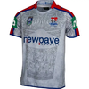
Raiders are going for the mountains look, as in snowy mountains.
Drawing long bows here. Opinions aside, it just doesn't fit well with the rest of the club identity, nor does it stand out amongst a number of other clubs. I'm guessing that the Raiders went with blue shorts for this design as the original insipid shade of green would have looked terrible on the old shorts material, if it could have been reproduced at all.
 

flippikat

First Grade
Messages
5,262
Raiders away is a simple fix - wear green bloody shorts. They look like a Warriors or Bulldogs kit with blue shorts.
They could also add some more green in the trim, or a green section on the mainly white jersey, for instance...
 

Attachments

  • download (1).jpeg
    download (1).jpeg
    12.1 KB · Views: 2
  • images (74).jpeg
    images (74).jpeg
    19.9 KB · Views: 2

beave

Coach
Messages
15,679
Knights had a silver one around 2015, think it was a 7s jersey, wery wery good...
Red, Blue, Silver, it wouod be better than copying the roosters
And cowboys should be taking a leaf out of the dolphins play book, Just go Navy, Silver, White, get rid of the gold, stand out as the blue and silver team, much like that of dallas
The NQ graphic designer Marie worked with Dynasty on the jersey design. She was interviewed on a podcast late last year and talks about trying to get rid of the yellow (and the star in the logo) as much as she could. I've always said in the late 90's for some reason the club merch went away from navy, grey and white to mostly just navy and yellow and she says the same thing. It looks cheap and is very confusing as all the general merch when you walked into the team store looked like it could have been parra's.

The original jersey the Cowboys had, the yellow was only an accent colour by being 2 thin stripes across the sleeves and body. I'm okay with the current jerseys having a highly reduced amount of yellow in it compared to the previous 20 years and mirroring the colour proportioning of 1995.

The yellow is probably needed in all honesty to avoid legal clownery by the Dallas Cowboys.
 

Latest posts

Top