What's new
The Front Row Forums

Register a free account today to become a member of the world's largest Rugby League discussion forum! Once signed in, you'll be able to participate on this site by adding your own topics and posts, as well as connect with other members through your own private inbox!

The Game 2023 Jerseys, Sponsorship, Logos etc

flippikat

First Grade
Messages
5,221
Because it's boring, lacks creativity, and preaches to the choir. It's a lazy excuse to stifle creativity and prevent the next generation from being able to put their mark on the game.

I'd say it's a nostalgia sale for old men as well, but it's not even that as after a while everybody already owns the design, so you're not really moving heaps of product. You're just allowing old men to remain comfortable in their nostalgia at the expense of appealing to the tastes of younger generations.

The most successful sports merchandising campaign of the last roughly 5 years was the NHL and Adidas' Reverse Retro campaigns (google it), and attitudes like yours are why the NRL doesn't have a strong jersey collecting culture.
Just had a look at the "Reverse Retro" jerseys, and that looks like a great idea - basically taking a retro design, but flipping the colours right?

I know Souths have done a white spin on their "minties" jersey, but a red variation would be cool to see.

Likewise a green version of the 1995 original Warriors jersey (no, not the Khaki green they used for an ANZAC jersey, the green of the club colours) - as a Warriors fan, I'd grab that in a heartbeat.
 

greenBV4

Bench
Messages
2,510
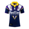
Only so many times you can do one without repeating the design and then you end up with an abortion, ala Melbourne every year...
tbf we don't have many designs that work with modern sponsors (and we butcher our home away kits as well 9/10 anyway)

I dont mind this years though
1683535624746.jpeg


also side note, I bloody hate how some clubs dont centre the club and comp logos, instead opting to align the bottom of the embroided text like above (the text is another rant I could start, why is it needed)
 
Last edited:

The Great Dane

First Grade
Messages
7,957
Just had a look at the "Reverse Retro" jerseys, and that looks like a great idea - basically taking a retro design, but flipping the colours right?
The Reverse Retro concept was to take old design elements and present them in a different way.

Sometimes that meant as little as taking an old jersey design and changing the colours around, but other times it was more than that.

They took old designs and presented them in the team's new colour scheme. They took a collection of old or cult design elements and created what was effectively a completely new design out of them. In some cases they used it as a chance to celebrate the old brands of relocated clubs, and on occasion they even celebrated the brands of minor league teams that predated the current NHL side.

Here's a couple of lists that give good descriptions of each jersey in both waves of the RRs-
https://www.espn.com.au/nhl/insider...l-31-nhl-reverse-retro-jerseys-2020-21-season
https://www.espn.com.au/nhl/story/_/id/34829213/ranking-all-32-nhl-reverse-retro-jerseys-2022-23

It was genus, and it's been a massive success. Most of them sold out almost instantly, which is pretty impressive when you consider that there's been 63 individual designs in the RR range.
Nothing like it could happen in the NRL as a noisy minority of wankers on the internet would never stop moaning about the fact that they aren't exact replicas of designs from the 80s or 90s depending on the club.
 

MugaB

Coach
Messages
15,043
The Reverse Retro concept was to take old design elements and present them in a different way.

Sometimes that meant as little as taking an old jersey design and changing the colours around, but other times it was more than that.

They took old designs and presented them in the team's new colour scheme. They took a collection of old or cult design elements and created what was effectively a completely new design out of them. In some cases they used it as a chance to celebrate the old brands of relocated clubs, and on occasion they even celebrated the brands of minor league teams that predated the current NHL side.

Here's a couple of lists that give good descriptions of each jersey in both waves of the RRs-
https://www.espn.com.au/nhl/insider...l-31-nhl-reverse-retro-jerseys-2020-21-season
https://www.espn.com.au/nhl/story/_/id/34829213/ranking-all-32-nhl-reverse-retro-jerseys-2022-23

It was genus, and it's been a massive success. Most of them sold out almost instantly, which is pretty impressive when you consider that there's been 63 individual designs in the RR range.
Nothing like it could happen in the NRL as a noisy minority of wankers on the internet would never stop moaning about the fact that they aren't exact replicas of designs from the 80s or 90s depending on the club.
Yet penriths training jerseys sell out every year, with these brown and white retro concepts, and tget only wear them for 10mins prior to a game, not sure why other teams aren't doing the same
 

The Great Dane

First Grade
Messages
7,957
Yet penriths training jerseys sell out every year, with these brown and white retro concepts, and tget only wear them for 10mins prior to a game, not sure why other teams aren't doing the same
I don't think you understand my criticism...

I'm not saying that teams should never reissue jerseys. What I'm saying is that the NRL is way too married to certain designs and is terrified of innovation, and that's not a good thing.

Penrith is actually a great example. In the current atmosphere a change as radical as the one from the chocolate soldiers to allsorts would not be possible. It would have been pilloried for not respecting tradition and done away with after a season, and Penrith would be without what is considered to be their greatest jersey design as a result.

It actually makes you wonder how many greats designs have been left on the cutting room floor because of a fear of the backlash from a minority of the fanbase.
 

MugaB

Coach
Messages
15,043
I don't think you understand my criticism...

I'm not saying that teams should never reissue jerseys. What I'm saying is that the NRL is way too married to certain designs and is terrified of innovation, and that's not a good thing.

Penrith is actually a great example. In the current atmosphere a change as radical as the one from the chocolate soldiers to allsorts would not be possible. It would have been pilloried for not respecting tradition and done away with after a season, and Penrith would be without what is considered to be their greatest jersey design as a result.

It actually makes you wonder how many greats designs have been left on the cutting room floor because of a fear of the backlash from a minority of the fanbase.
I understood your criticism, its just an issue with the Clubs or Graphic designers being so shit with the change and application of the jersey design, thats what suffers and the canberra retreat was the best example, i liked the colors, but the wavey chest line then the transition from the past blue to navy was probably too quick... penriths 90 design and colors was far better than any of its brown/white jerseys, thats why it worked, stepping away from that afterwards had the same issue for them too, thats why its basically back... canberra without a main lime colored jersey, isn't canberra, its just becomes cookie cutter cowboys/knights/eels/roosters,
Like i said i like the newer colors they tried, just not the application of it, lime green still needed to be the main color not the navy shoulders, if the design was better im fairly sure it would have changed, personally i like the current kits, they stand out and are bright, its not the nostalgic aspect of it, its just works, it reminds me of how how penrith wear their pink away, its plain and bright and just works
 

yakstorm

First Grade
Messages
6,037
Im really liking the new titans jerseys, the gold/yellow tops suit them, they have always lacked something in most of their jerseys, sundays game verse the eels, they looked like a brand new team, i know it was very fluro but it just worked
It did feel very beachy and something youd expect a Gold Coast team to wear, even though they don't wear that much yellow/gold usually.

Considering Brisbane & Parramatta seem to be avoiding using gold in any significant manner, the Titans should just take it.
 

GAZF

First Grade
Messages
8,752
View attachment 73912


also side note, I bloody hate how some clubs dont centre the club and comp logos, instead opting to align the bottom of the embroided text like above (the text is another rant I could start, why is it needed)

The logos are geometrically aligned, but not optically aligned. The bolt on the Storm logo makes it so that the bulk of the logo's "mass" is in the bottom 2/3rds. They have a similar issue horizontally.

keyframedownloadcontroller
The Knights couldn't even align the wordmark in their own logo
It's either lazy, unintuitive design or some dumb requirement/feedback put onto the designer. The smartest way to handle placement is to make a clipping box around the logo that centers the optical center of the logo, so that anyone with access to the vector can optically center the logo in applications in the way the designer intended.
 

The Great Dane

First Grade
Messages
7,957
I understood your criticism, its just an issue with the Clubs or Graphic designers being so shit with the change and application of the jersey design, thats what suffers and the canberra retreat was the best example, i liked the colors, but the wavey chest line then the transition from the past blue to navy was probably too quick... penriths 90 design and colors was far better than any of its brown/white jerseys, thats why it worked, stepping away from that afterwards had the same issue for them too, thats why its basically back... canberra without a main lime colored jersey, isn't canberra, its just becomes cookie cutter cowboys/knights/eels/roosters,
Like i said i like the newer colors they tried, just not the application of it, lime green still needed to be the main color not the navy shoulders, if the design was better im fairly sure it would have changed, personally i like the current kits, they stand out and are bright, its not the nostalgic aspect of it, its just works, it reminds me of how how penrith wear their pink away, its plain and bright and just works
If the allsorts jersey had come out today you'd be sitting here saying "Penrith without a brown jersey isn't Penrith", "I liked the colours they tried, but the application was wrong", "without the brown we aren't unique, it's just another black jersey with a cookie cutter design", etc, whilst celebrating the fact that they'd reinstated the chocolate soldiers.

You'd be speaking out of both sides of your mouth, and you probably wouldn't even realise you were doing it.
 

Latest posts

Top